The Complete Guide to Bookshelf Styling
By Tereza Hower | Published May 21, 2026 | Updated May 27, 2026
The first apartment had a secondhand bookcase shoved in a corner, stuffed corner to corner with paperbacks and a few framed photos balanced on top of the rows. It looked like storage, because that is what it was. The second place had a built-in flanking the fireplace, and I styled it within an inch of its life. Every object spaced. Every book turned the same direction. It looked like a magazine spread, and not in a good way. The version that finally works, in the current living room, sits between those two extremes.
Most shelves are about two-thirds full. A few objects lean against the back, always in groups of two or three. One shelf, the third from the top, is intentionally empty. That single empty shelf does more for the whole piece than any styling trick I have tried, and I have tried most of them. Good bookshelf styling is mostly about restraint and a few rules of thumb you can apply without thinking about it.
This guide covers the rules I use in my own home, the mistakes I made for years before sorting them out, and how the same principles shift across rooms and styles. If you are looking for the full system rather than another roundup of pretty photos, this is it.
Key Takeaways
- Aim for shelves about two-thirds full, never wall to wall, never half empty.
- Lean objects against the back of the shelf in groups of two or three for visual depth.
- Leave one shelf intentionally empty as the eye’s resting point.
- Mix vertical book spines with horizontal stacks topped by a small object.
- Edit by tone and material, not by category, when you bring in non-book items.
What makes bookshelf styling actually work?
Bookshelf styling is the practice of arranging books and objects on open shelves so the result reads as composed rather than cluttered or sparse. The goal is a piece of furniture that holds your stuff and earns its place visually at the same time.
The shelves that work share three traits. They have breathing room, they have rhythm, and they have a point of view about what belongs there. Breathing room means objects are not crammed against each other. Rhythm means your eye has somewhere to land and somewhere to rest, alternating across the height of the unit. A point of view means you have made choices about what is on display and what is not, rather than treating the bookshelf as overflow storage.
If you take only one idea from this guide, take the breathing room one. Most shelves fail because they are too full, not because the objects are wrong.
The Thirds Rule and Why Most Shelves Look Off
The thirds rule is the framework I come back to every time I restyle a unit. On each shelf, divide the horizontal space mentally into three sections. One third is vertical books, one third is a horizontal stack or a single object, and one third is air. The proportions can shift slightly, but if you start there, you are most of the way home.
Crammed shelves fail because the eye has nothing to do. There is no contrast, no rhythm, no place to rest. Sparse shelves fail because there is too much air and not enough anchor, which reads as unfinished. The thirds rule produces the in-between state that looks intentional from across the room and still functions as a bookshelf when you walk up to it.
It works on tall narrow ladder shelves, wide built-ins, modular units, and standalone bookcases. The shelf depth changes, but the proportional logic does not. Once you have used it for a month, you will stop thinking about it consciously.
How do you balance books and objects?
Books and objects should be in conversation, not competing. The mistake most beginning stylists make is treating each shelf like a vignette in a store, with three to four objects fighting for attention. The shelves that read well usually have a clear lead. Either the books are doing the work and the objects are quiet, or one or two objects are doing the work and the books are arranged simply behind them.
A rough ratio: roughly 70 percent books to 30 percent objects across the full unit. Some shelves will be all books and others will be more sparsely arranged with a single sculpture or stack, and that variation is the whole point. If every shelf has the same density of objects, the whole piece flattens visually.
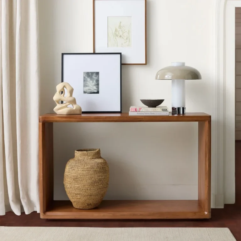
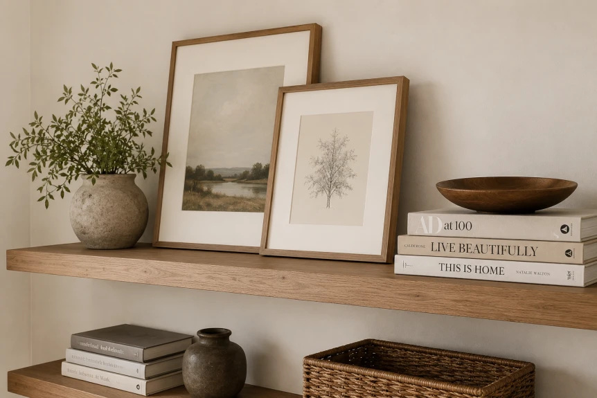
Objects I keep coming back to: small ceramics in matte glazes, framed art that leans rather than hangs, a single brass or wood object with weight, and a stack of two or three art books capped with a smaller item. I do not use plants on bookshelves anymore. The water rings are not worth it, and the bookshelves I admire most rarely have greenery on them.
What is the leaning principle?
Leaning is the single technique that makes bookshelves look styled by a professional. Frames, small art prints, and even slim books or trays lean against the back wall of the shelf rather than standing flush or hanging. The lean introduces depth and a slightly casual angle that fights the rigid geometry of a bookcase.
The rule I follow: lean in groups of two or three, never one and never four. A single leaned frame looks accidental. Two reads as deliberate. Three is the maximum before it tips into clutter. Layer slightly, so one frame is in front and the other is half hidden behind it. The angle should be subtle, not theatrical.
The Case for One Intentionally Empty Shelf
Leave one shelf empty. This is the rule I argue for most and the one almost nobody follows. On a six-shelf unit, one shelf has nothing on it. Or close to nothing. Maybe a single low object, maybe entirely bare. It is the visual exhale that lets every other shelf read as composed instead of overstuffed.
The instinct is to fill, because empty shelves feel wasteful. But a shelf full of nothing is not wasted. It is doing work. It pulls the eye, gives the unit a sense of generosity rather than abundance, and provides a clean spot for a single object to be seen properly when you want it to be.
Place the empty shelf roughly a third or two-thirds of the way up the unit, not dead center and not at the top or bottom. Eye level works. Slightly above eye level works better. It becomes a small, quiet asymmetry in a piece of furniture that is otherwise relentlessly grid-shaped.
Which books should stay visible?
Not all of them. The bookshelves I admire most have been edited, even if the owners would not describe them that way. Books worth keeping on open display generally fall into three groups. The ones you genuinely return to. The ones whose spines are part of who you are. And the ones that are visually compelling regardless of whether you have read them.
The middle category is where most people get stuck. A spine that says something about your reading life is worth its place. A spine that says nothing and that you will not open again is taking up real estate. The first time I culled my shelves, I removed about 40 percent of the books and the rooms looked better immediately. Most of those went into closed storage rather than the donation bin, which made the edit easier to commit to.
If you have many more books than your shelves can hold, the answer is not denser packing. It is editing what stays out, with the overflow stored elsewhere. There is a dedicated post in this cluster on how to style a bookshelf when you own too many books that walks through the system.
Vertical and Horizontal: Mixing Spine Treatments
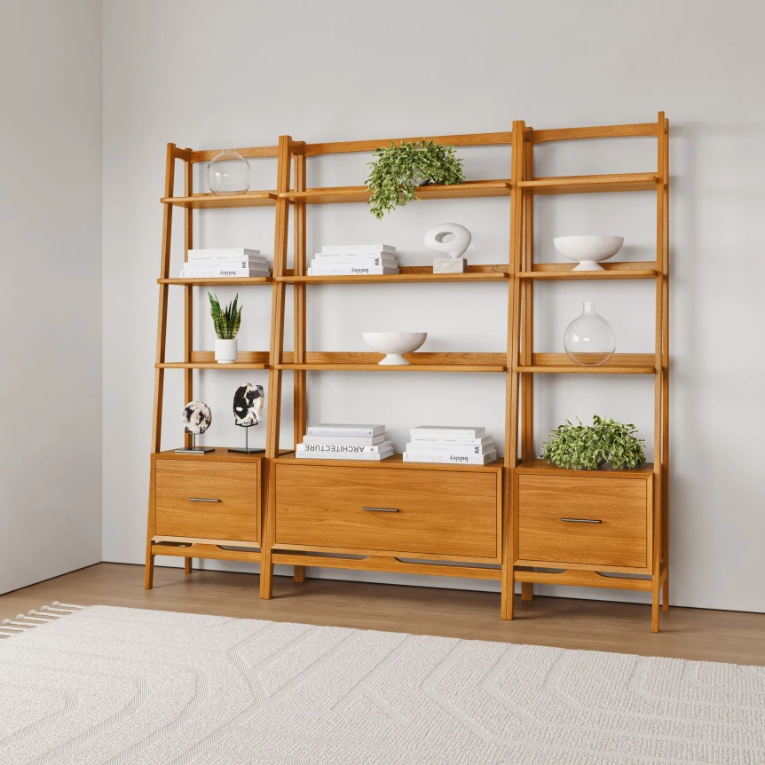
A shelf with only vertical book spines reads as a library. A shelf with only horizontal stacks reads as a coffee table moved upward. The good shelves alternate. One shelf might be roughly 70 percent vertical with a short horizontal stack at one end serving as a bookend. The next shelf might invert the ratio.
Horizontal stacks should be no more than four or five books tall, capped with a small object that earns the perch. A ceramic vase, a small brass piece, a single softcover with a strong cover design. The stack itself does double duty: it bookends adjacent vertical spines on the same shelf and it gives an object somewhere to sit at the right height.
For the vertical books, I do not align spines flush with the front edge of the shelf. I pull them forward about a quarter inch from the back, which lets the shelf depth read as a soft shadow behind them rather than a void. It is one of those small moves that you cannot quite name when you see it, but you feel the difference.
Color, Texture, and the Quiet Layer
Bookshelves often go wrong on color before they go wrong on anything else. A unit with too many bright dust jackets and too many competing object tones reads as visual static, no matter how thoughtfully you have arranged it. The shelves that read calmly have a quiet base palette and one or two deliberate accent moments.
I do not color code my books. I tried it for a full year and reverted, for reasons covered in the case for and against color coding bookshelves. What I do instead is group books with quiet spines (linen, cloth, neutral paperback) into longer runs, and isolate the loud jackets to a few specific places where the color is doing intentional work.
Texture matters as much as color. A wood shelf with leather-bound vintage books, linen cloth covers, a ceramic vessel, and a brass tray uses four materials in close conversation. That is a complete texture palette. If you find yourself adding a fifth, you are probably starting to compete with yourself.
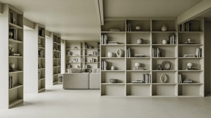
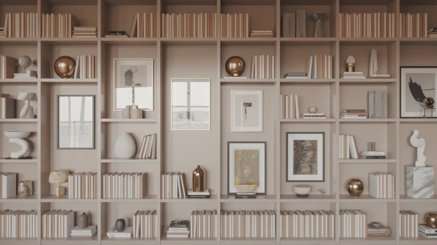
Styling by Shelf Type: Open, Closed, Modular, Built In
The same styling principles adapt across shelf types, but the constraints differ. Open shelves give you nothing to hide behind, so the editing has to be tighter. Closed-back shelves let you use the back wall as a visual ground. Modular cube systems force a per-cube composition. Built-ins read as architecture, which raises the styling bar.
| Shelf Type | Best For | Styling Approach | Common Mistake |
|---|---|---|---|
| Open shelving (no back panel) | Modern, minimalist, small spaces | Sparse arrangements, fewer objects, intentional negative space | Treating it like a regular bookshelf and overfilling |
| Closed back bookcase | Traditional, eclectic, book-heavy collections | Layered leaning frames against the back panel, deeper vignettes | Ignoring the back wall and missing the depth opportunity |
| Modular cube system | Renters, growing collections, flexible rooms | Treat each cube as its own composition with one or two pieces | Filling every cube to the same density |
| Built in shelving | Permanent installation, larger living rooms, libraries | Architectural symmetry on the outer shelves, looser styling at center | Over-styling every shelf identically |
If you are deciding between freestanding and built-in for a new install, the tradeoffs are covered in detail in built in versus freestanding bookshelves. The short version: built-ins look better and resell better only if you are staying in the home. Renters and frequent movers should buy freestanding and put the money into a unit that is worth moving.
Bookshelf Styling by Room
The same shelf reads differently in a living room than it does in a bedroom, an office, or a hallway. Context shifts the styling brief. In a living room, the bookshelf is often a focal piece and earns more visual weight and more layered objects. In a bedroom, the shelves should feel quieter, with fewer hard objects and more soft material like cloth books and a single small lamp or ceramic.
For living room shelving specifically, the styling has to hold up at three distances: from across the room (the silhouette), from the sofa (the medium read), and from arm’s length (the object-level detail). Most photographed shelves only work at one distance. The shelves you live with have to work at all three. There is a dedicated guide on styling open shelving in a living room that goes deeper on the multi-distance approach.
Home office shelves benefit from being more functional than decorative. Reference books, archived papers, a few personal objects. I keep my office shelves at about 80 percent fill rather than the 70 I aim for in the living room, because the office is not a room I am hosting in. The looser styling rules are not laziness. They are honest about how the room is used.
Common Mistakes in Bookshelf Styling
The mistakes I see most often, in my own past styling and in homes I have walked into, fall into a short and predictable list.
Filling every shelf to the same density. This is the most common one and the easiest to fix. Vary the fullness. Let some shelves breathe.
Too many small objects scattered across too many shelves. A single tray with three small objects on it reads as composed. The same three objects spaced across three shelves reads as visual noise. Group small things.
Standing every book at attention. The military line up of vertical spines all the way across every shelf flattens the unit. Break the line with horizontal stacks every few feet.
Ignoring the back wall. If your shelves have a back panel, paint it. A back panel in a slightly deeper tone than the room walls (a warm taupe behind soft white walls, for instance) makes the entire unit recede and the styled objects pop. It is the cheapest upgrade you can make to a freestanding bookcase.
Buying objects to fill the shelf. The shelves I see most often go wrong are the ones styled with a single shopping trip’s worth of stuff. The shelves that read as personal are styled with objects that arrived over years. If you do not have the right objects yet, leave the space empty until something good comes through.
How long does good bookshelf styling actually take?
An afternoon for a first pass. A few weeks of small adjustments before it settles. The shelves I am happiest with were not styled in a single session. They were styled, lived with for two weeks, restyled, lived with again, and adjusted in small ways every time I dusted them. A bookshelf is one of the few pieces of furniture in the home that benefits from being seen as ongoing rather than finished.
Take photos as you go. Bookshelves are notorious for looking great in person and reading as cluttered in a photograph, or the reverse. The camera flattens depth, which is exactly the thing your styling is trying to create. If a shelf looks good in a phone photo from across the room, it is probably working.
Style-Specific Bookshelf Treatments
Bookshelves can read very differently depending on the larger style language of the room. The same unit styled in a Japandi home looks almost nothing like the same unit styled in a bohemian one, even with similar books and similar object counts. The principles transfer; the execution shifts.
For a deep dive on this, bookshelf styling by style walks through Japandi, mid century modern, minimalist, and industrial approaches with the specific moves each one calls for. For broader style context, the cornerstone style guides remain the best place to start: Japandi interior design, minimalist interior design, mid century modern design, Scandinavian interior design, and industrial interior design.
How to Buy the Right Bookshelf Before You Style It
The shelf itself does about half the styling work for you. A shelf with adjustable shelves, a back panel, and shelf depth of at least 12 inches gives you flexibility. A shelf with fixed shelves, no back, and 9 inches of depth fights you the whole way. If you are buying new, prioritize adjustable spacing first, depth second, material third. A solid wood unit is worth twice what a veneered one costs, and you will keep it twice as long.
For more on the broader furniture selection in modern living rooms, the modern living room design guide covers the bookcase in context with the rest of the room. For storage that is not a bookshelf but performs adjacent work, the sideboard buying guide is the companion read.
Recommended Resources and Related Guides
The cluster around this pillar covers every adjacent question that comes up once you start styling shelves seriously. Each post is built to stand on its own, but they sequence well if read together.
- How to Style Open Shelving in a Living Room: the multi-distance approach to shelving as a focal piece, with the specific moves for open back units.
- Modern Bookshelf Ideas: the difference between the shelf you wish you had and the shelf that actually fits your life.
- Built In vs Freestanding Bookshelves: the financial and design tradeoffs, with the renter’s case for freestanding.
- Bookshelf Styling When You Have Too Many Books: the editing exercise that finally fixed my shelves.
- Color Coding Books: When It Works and When It Doesn’t: a year-long experiment and what I learned from reverting.
- Bookshelf Styling by Style: how the same shelf reads in Japandi, mid century modern, minimalist, and industrial homes.
Final Thoughts on the Bookshelf as a Long Game
The bookshelves you will love a decade from now are not the ones you finished in an afternoon. They are the ones you have been arranging and rearranging for years, accumulating the right objects slowly, and editing books in and out as your reading life shifts. The styling principles in this guide are scaffolding. The real work is the patience to live with a not-yet-right shelf long enough to know what it is missing.
If you are starting fresh, the next read worth your time is the cluster post on modern bookshelf ideas, which gets into the difference between aspirational shelves and the ones that actually function in real homes.
Frequently Asked Questions
How full should a styled bookshelf actually be?
Aim for about two-thirds full across the unit, with variation between shelves. Some shelves can be denser and at least one should be near empty. The shelves that read as cluttered are typically over 85 percent full. The shelves that read as unfinished are usually under 50 percent. The two-thirds target is the sweet spot that reads as composed without looking staged.
Do I need to color code my books for a bookshelf to look styled?
No, and most homes look better without it. Color coding can work in monochromatic interiors or as a deliberate design statement, but it makes books harder to find and it can read as performative rather than personal. Quiet edits, grouped tonal runs, and selective hiding of loud dust jackets accomplish the same calm effect without the rainbow shelf appearance.
What is the empty shelf rule in bookshelf styling?
Leave one shelf in the unit intentionally empty or near empty as a visual resting point. Position it slightly above eye level when possible. The empty shelf gives the entire piece a sense of generosity and lets the other shelves read as composed rather than overstuffed. It is the single highest-leverage move in bookshelf styling and the one most people skip.
How do you balance books with objects on a styled shelf?
Roughly 70 percent books and 30 percent objects across the full unit, with variation shelf to shelf. Some shelves should be all books, others should be more sparsely arranged. Group small objects together rather than scattering them across multiple shelves. Lean frames in twos or threes against the back of the shelf for depth. Avoid one object per shelf, which tends to read as repetitive.
Should book spines be flush with the front edge of the shelf?
Pull them forward by about a quarter inch from the back panel, but do not push them to the front edge of the shelf. The slight gap behind the spines creates a soft shadow that adds depth without exposing the shelf depth. This is one of the small adjustments that separates carefully styled shelves from rushed ones.