The Complete Guide to Modern Entryway Design
By Tereza Hower | Published June 5, 2026
The entryway is the most overworked few square feet in a home and the least planned. It absorbs keys, shoes, bags, mail, weather, and the first impression a guest forms before they have said a word, yet most people furnish it with whatever was left over from another room. Good modern entryway design starts from the opposite direction. It treats the space as a small system with three jobs to do, then chooses pieces that do those jobs without crowding the one thing an entry needs most, which is room to move.
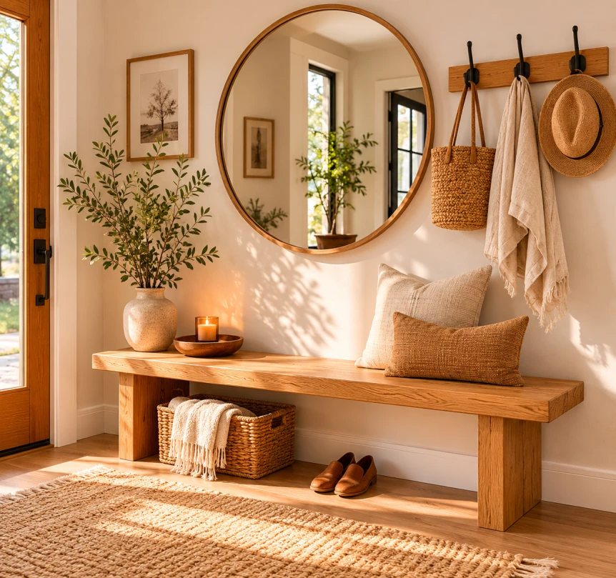
That clarity took our editor a while to reach. The first version of her own entry packed a deep console, a bench, a coat rack, and a runner into a narrow corridor, and the result felt busy and slightly hostile to anyone trying to take off a coat. The fix was subtraction. A slim bench, a row of wall hooks at two heights, and one well placed mirror did everything the heavier setup tried to do, and the floor finally read as a path instead of an obstacle course. That bench, hook, and mirror trio is the backbone of most entries that work, and it anchors the approach in this guide.
This guide covers the full picture: how to plan the layout for the kind of entry you actually have, how to size each piece so it fits the traffic path, how to light the space in layers, and which materials survive the daily abuse an entry takes. Whether you have a generous foyer or a strip of wall beside the door, the same principles apply.
Key Takeaways
- A modern entryway solves three things at once: a landing spot for daily items, storage that hides clutter, and a clear transition into the home.
- Plan the traffic path first and protect at least thirty six inches of clear width, then size furniture to the wall that remains.
- A bench, wall hooks, and a mirror handle most entries better than a single large piece.
- Layered lighting at the door does more for first impressions than any decorative object.
- Hard wearing flooring and a washable runner protect the most abused floor in the house.
What Makes Modern Entryway Design Work?
A modern entryway reads as calm, low on visual noise, and built around clean lines and honest materials. Think white oak, walnut, blackened steel, stone, and matte finishes over ornate carving or glossy lacquer. The space looks edited rather than decorated, with a few pieces that earn their position instead of a gallery of small objects competing for attention.
Restraint is the operating principle. Modern entryway design favors open floor, a limited palette, and storage that closes. The look is warm rather than clinical, so natural wood tones and a soft textile or two keep it from feeling like a showroom. The goal is a space that feels intentional the moment you step through the door, not one that announces how much was spent on it.
What ties a modern entry together is consistency. One wood tone, one or two neutrals, and a single metal finish carried across the hooks, lighting, and hardware. That discipline is what separates a considered entry from a collected one, where every piece arrived from a different source and never quite agrees with the rest.
This sensibility carries across our style verticals. A Japandi approach to interiors leans on pale wood and quiet contrast, while a mid century modern entry might bring in tapered legs and a walnut tone. The structure of a good entry stays the same regardless of which style you build it in.
The Three Functions Every Entryway Has to Solve
Before choosing a single object, decide what the space has to do. Almost every entry needs to handle three things, and trouble usually starts when one of them is ignored. Solve all three and the space works whether it is two square feet or twenty.
A landing spot
This is the surface where keys, mail, sunglasses, and a phone land the second you walk in. Without one, those items migrate to the kitchen counter within a week. A console top, a small wall shelf, or a tray on a bench all qualify. The landing spot should be the first horizontal surface within arm’s reach of the door, because anything further in gets bypassed.
Storage that hides the mess
Coats, shoes, bags, and seasonal gear need a home that closes or tucks away. Open hooks work for daily coats, but a closed cabinet or under bench bins keep the clutter that would otherwise define the space out of sight. The right balance is open access for what you grab every day and concealed storage for everything else.
A clean transition
The entry is a threshold, not a destination. It should move people smoothly from outside to inside, which means an unobstructed path and a floor that signals you have arrived. A change in flooring, a runner, or a shift in lighting all mark the transition. When the path is clear, the space feels generous even when it is small.
How Do You Design an Entryway With No Real Foyer?
Most homes do not have a dedicated foyer. The door opens straight into a living room, a hallway, or a sliver of wall beside a staircase. The fix is to define an entry zone rather than build a room. A runner, a single piece of furniture against the wall, and a light fixture overhead are enough to tell the eye that this strip is the entrance.
When floor space is tight, go vertical and go shallow. A wall mounted shelf with hooks below it takes up no floor at all. A console under twelve inches deep holds a lamp and a tray without narrowing the walkway. The deeper guidance on working in a few square feet lives in our piece on small entryway ideas that make a real difference, which is worth reading if your entry is more of a pinch point than a room.
For homes where the entry shares space with the kitchen or back door, the function shifts toward a working drop zone. That is the territory of a modern mudroom design, which trades the styled surface for hard wearing storage built to take daily abuse.
How Should You Plan the Layout by Entry Type?
Entries fall into a few common shapes, and each one calls for a different plan. Matching your approach to the type you have is faster than copying a layout that was designed for a different space.
The dedicated foyer
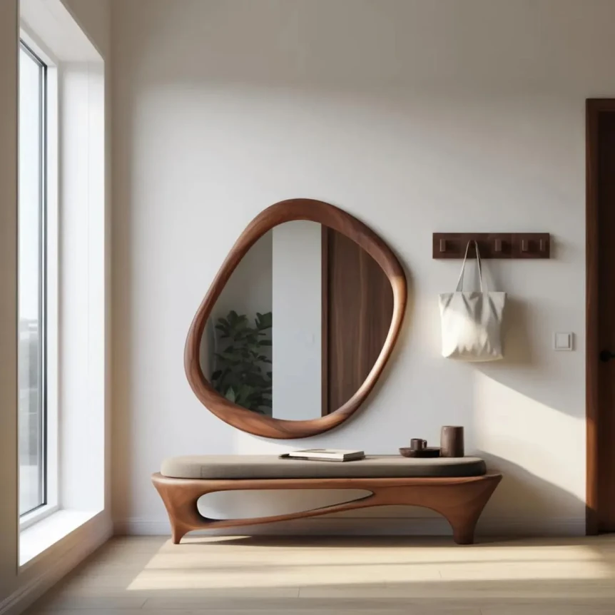
A true foyer gives you room for a console or bench, a rug, overhead lighting, and a generous mirror. The risk here is over filling the space because you can. Keep the center of the floor open, anchor one wall with the main furniture piece, and let the rug define the zone. A round pedestal table with a single arrangement works in a wide foyer where you are not pressed for storage.
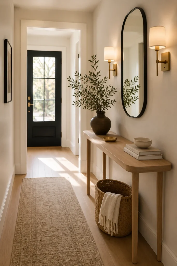
The hallway entry
When the door opens into a corridor, depth is the enemy. A shallow console or a wall mounted shelf keeps the path clear, and a runner reinforces the line of travel. Hooks and a slim mirror handle the rest without stealing width. This is the most common entry shape and the one where shallow furniture matters most.
The open plan entry
When the door spills straight into the living room, the entry has to be carved out of the larger space. A low storage piece such as a sideboard or low storage cabinet can back onto the room and define the boundary while giving you closed storage and a landing surface. A runner or a shift in flooring tells the eye where outside ends and the living space begins.
The side or back door
The door the family actually uses is rarely the front one, and it usually leads to a working drop zone rather than a styled entry. Here, lean into durability and storage over presentation, which is the mudroom approach covered later in this guide.
Which Core Pieces Does an Entry Need?
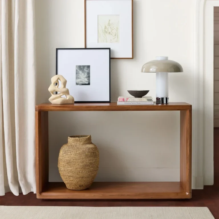
Four pieces do most of the work in an entry: the bench, the console, the hall tree, and the mirror. You rarely need all four. The right combination depends on how much floor and wall you have to work with, and on whether the space leans toward sitting and storing or toward a quick styled surface.
| Piece | Best for | Footprint | What it solves |
|---|---|---|---|
| Bench with storage | Families, shoe heavy households | Floor, medium | Seating plus hidden storage |
| Console table | Narrow entries, styled surfaces | Floor, shallow | Landing spot and display |
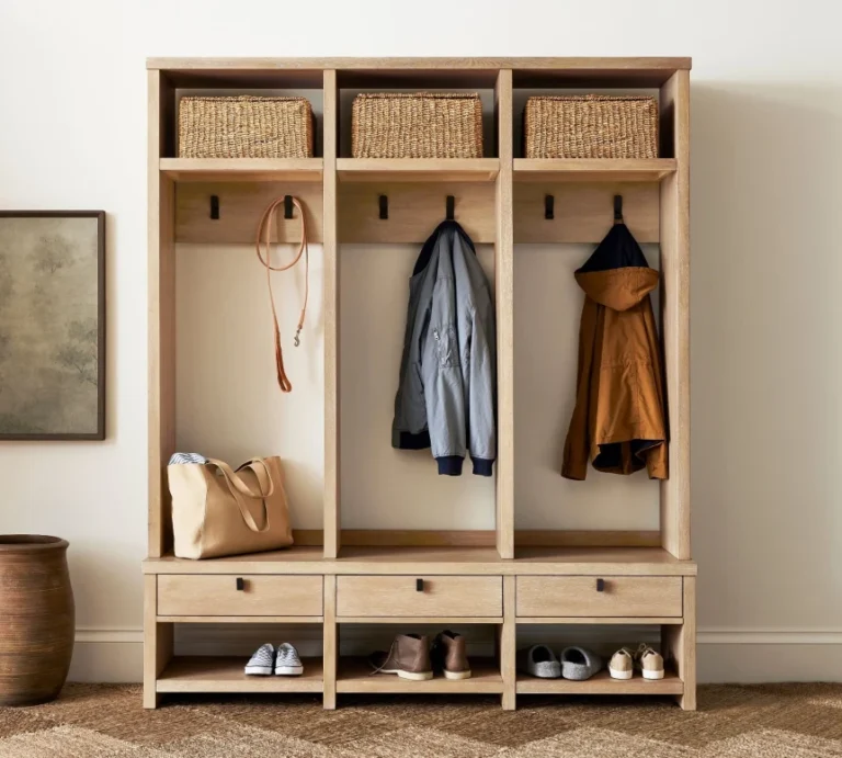
| Hall tree | No closet near the door | Floor and wall, tall | Coats, bags, and a bench in one |
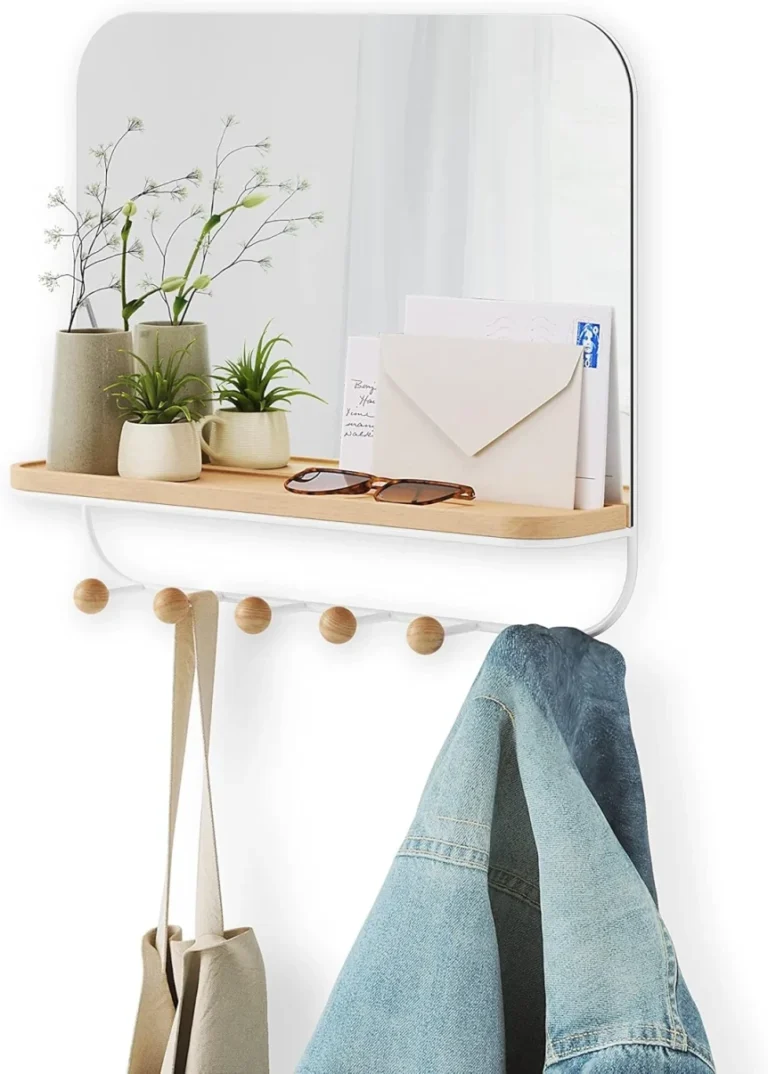
| Mirror | Every entry | Wall only | Light, depth, last look check |
A bench earns its place when shoes pile up and people need somewhere to sit while pulling boots on. The fuller case for choosing one, including lidded versus open base designs, is in our guide to entryway bench and storage solutions. A console suits a narrow entry where seating is not realistic, and the question of how to size and style one is covered in our piece on console tables for modern entryways.
A hall tree combines hooks, a bench, and sometimes a shelf into a single freestanding unit, which makes it the most efficient choice when there is no coat closet nearby. Our hall tree buying guide walks through sizing and build quality. The mirror is the one piece almost every entry should include, since it bounces light, adds apparent depth, and gives a place for a final check before you leave.
Why Does Scale Matter More Than Style in an Entry?
An entry punishes oversized furniture faster than any other room because the traffic path is so narrow. A console that would look modest in a living room can swallow a hallway. The rule of thumb is to leave at least thirty six inches of clear walking width, and to keep any piece shallow enough that a person carrying bags can pass without turning sideways.
Measure the path before the wall. Stand where you enter, note where you naturally turn, and protect that line. Then size the furniture to whatever wall is left. This ordering is the single most useful habit in entryway planning, and it is the one most people skip in favor of falling for a piece first and forcing it to fit.
What Are the Right Dimensions for Entry Furniture?
Concrete numbers save a lot of guesswork. These are the dimensions that keep an entry comfortable rather than cramped, drawn from how people actually move and reach in the space.
- Clear walkway: at least thirty six inches, with forty two to forty eight inches feeling generous.
- Console depth: ten to fourteen inches, staying under twelve in a tight hallway.
- Console and surface height: thirty to thirty four inches, comfortable for setting things down.
- Bench seat height: around eighteen inches, with a depth of fourteen to sixteen inches.
- Coat hooks: adult coats at roughly sixty two to sixty six inches, a lower row at forty to forty eight inches for children.
- Mirror over a console: leave a gap of six to eight inches between the surface and the bottom of the mirror.
These are starting points, not rules. Adjust hook heights to the people who use them and mirror height to the average eye level in your household. The numbers exist to stop the common errors, a console too deep to pass, a bench too low to sit on, hooks a child can never reach.
Entryway Storage That Actually Works
Storage fails in entries when it asks too much of the person walking in. Anything that requires opening a drawer, unstacking bins, or bending down rarely gets used during the rushed minute of arrival. The most reliable systems pair easy open storage for the daily items with closed storage for the rest.
- Wall hooks at two heights, one for adults and one for children, handle coats and bags with zero fuss.
- A bench with a lidded base or open cubbies keeps shoes off the floor.
- A shallow cabinet or closed console hides mail, chargers, and clutter.
- A single tray or bowl on the landing surface corrals keys and small items.
Think in terms of daily versus occasional. The coat you wear every day belongs on an open hook within reach. The gloves you need three months a year belong in a closed bin up high. Sorting storage by frequency of use is what keeps the visible part of the entry calm while still holding everything.
If the entry shares a wall with a living or dining zone, a low storage piece can do double duty. A sideboard or low storage cabinet placed at the entry gives you closed storage and a generous landing surface in one piece, which works well in open plan homes where the door spills into the main living area.
Lighting the Entry in Layers
Lighting does more for the feel of an entry than any decorative object, and most entries are lit by a single overhead fixture that flattens the whole space. The better approach borrows the three layer method used throughout the home: an ambient source overhead, a task light at the landing surface, and a small accent to add warmth at night.
A flush mount or pendant covers the ambient layer. A small lamp on the console or a pair of wall sconces beside the mirror handles task light, which is what you actually use to find keys or check a coat. A low warm accent, even a plug in puck under a bench, softens the space after dark. Keep every bulb in the warm white range of 2700 to 3000 kelvin, and choose a color rendering index of 90 or higher so wood and skin tones read true.
The full breakdown, including fixture heights and how to light an entry with no surface for a lamp, lives in our guide to entryway lighting ideas, and the broader method is in our complete guide to lighting every room.
Flooring and Durability
The entry floor takes more grit, water, and traffic than any other surface in the house, so it should be the most durable. Porcelain tile, sealed concrete, and engineered wood with a tough aluminum oxide finish all hold up. Luxury vinyl plank is a budget friendly option that shrugs off water. Whatever the base floor, a washable runner or a flat weave rug protects it and signals the transition zone underfoot.
Choose a runner you can throw in the wash or hose down, since this is not the place for a delicate textile. A low pile in a forgiving color hides daily dirt between cleanings, and a darker or patterned weave disguises the inevitable scuffs. The runner also defines the entry visually, which matters most in homes where the door opens into a larger room with no architectural break.
Add a boot tray or a hard mat just inside the door to catch the worst of the water and mud in one contained spot. A small mat at the threshold means the runner and the floor beyond it stay cleaner for longer.
What Palette Suits a Modern Entry?
A modern entry reads best with a tight palette: one wood tone, one or two neutrals, and a single metal finish carried across the hooks, lighting, and hardware. Consistency in the metal is the detail that separates a considered entry from a collected one. Matte black, brushed brass, and aged nickel each set a different mood, but mixing all three reads as accidental.
For wall color, a soft warm neutral or a moody contrast both work, depending on how much light the entry gets. A dark entry can carry a deep color confidently because you pass through it rather than linger, so a charcoal, a forest green, or a deep clay reads dramatic rather than oppressive. A bright entry suits a warm white or a greige that keeps the space feeling open.
If you want help pairing the entry with adjacent rooms, our guide to modern paint colors covers how to keep tones continuous across zones so the entry flows into the rooms it opens onto rather than fighting them.
Styling the Surface Without Clutter
The landing surface is where good entries go wrong, because it invites accumulation. The discipline is to style it with a few intentional objects and leave room for the daily items that will inevitably land there. A lamp, a tray, a small stack of two or three books, and one sculptural object or a low vessel is plenty.
Keep a working corner of the surface clear on purpose. That open space is where keys and mail go, and protecting it stops the whole surface from becoming a dumping ground. The styled objects frame the function rather than competing with it. A mirror or a single piece of wall art above the surface finishes the vignette without adding floor clutter.
Vary the height of what you place on the surface so the eye has somewhere to travel. A tall lamp on one side, a low stack of books in the middle, and a small object on the other reads as composed, while a row of items at the same height reads as a shelf. This simple height variation is the whole trick to a surface that looks styled rather than stacked.
How Does Entryway Design Change by Style?
The structure of a good entry stays the same across styles, but the materials and finishes shift. The same bench, hook, and mirror trio can read minimalist, warm, or industrial depending on what it is made of.
A minimalist entry strips back to a single floating shelf, concealed hooks, and a frameless mirror, with nothing on the surface but a small tray. A Scandinavian entry brings in pale wood, a woven runner, and a soft neutral wall. An industrial entry leans on blackened steel hooks, a reclaimed wood bench, and an exposed bulb fixture.
Decide the style first, then choose materials that fit it, and let the entry echo the rooms it opens onto. An entry that contradicts the home behind it feels disconnected, while one that previews the palette ahead reads as intentional.
Common Mistakes in Entryway Design
Most entry problems trace back to a handful of repeat errors. Recognizing them is faster than learning each one the hard way.
- Over furnishing a narrow space, which blocks the path and makes a small entry feel smaller.
- Choosing a console too deep for the walkway, forcing people to edge past it.
- Relying on a single overhead light that flattens the space and casts no warmth.
- Skipping closed storage, so coats and shoes define the first thing guests see.
- Hanging hooks too high for children, which guarantees their coats hit the floor.
- Using a delicate rug that cannot survive wet shoes and daily grit.
- Mixing several metal finishes so the entry reads collected rather than considered.
The thread running through all of these is treating the entry like a display rather than a working threshold. Design for the rushed thirty seconds of arrival first, and the space will look good as a byproduct of working well.
Entryway vs Mudroom: What Is the Difference?
An entryway is the front facing arrival space, styled for first impressions and built around a clean transition. A mudroom is the working version, usually near a side or back door, designed to absorb dirt, wet gear, and the daily churn of a busy household. One is about presentation, the other about containment.
Many homes have both, or one space that has to play both roles. When a single entry handles styled arrival and muddy boots, lean toward mudroom durability with a few entry touches, since function should win at the door. The full treatment of the working space is in our modern mudroom design and storage guide.
Recommended Resources and Related Guides
- Small Entryway Ideas That Make a Real Difference: how to define an entry and add real function in just a few square feet.
- Modern Mudroom Design and Storage: the durable, working counterpart to the styled entry, built for daily mess.
- Entryway Lighting Ideas: the three layer approach to lighting the door for warmth and function.
- Entryway Bench and Storage Solutions: choosing a bench that adds seating and hidden storage without crowding the path.
- Console Tables for Modern Entryways: how to size, place, and style a console so it fits the space.
Frequently Asked Questions
Where to Start
If you take one idea from this guide, let it be the order of operations: protect the path, solve the three functions, then style what is left. A modern entryway design that respects how people actually move through the door will look composed without trying. Start with the bench, hooks, and mirror trio, add storage only where the clutter demands it, and light the space in layers.
When you are ready to dig into a specific piece, the small entryway guide is the best next read for tight spaces, and the entryway bench and storage guide is the place to go if seating and hidden storage are your priority.