Color Coded Bookshelf: When It Works and When It Doesn’t
By Tereza Hower | Published May 22, 2026 | Updated May 27, 2026
A color coded bookshelf looks better in photographs than almost any other styling approach. That is the honest case for it, and the part I find most people get right. The rainbow gradient or the careful tonal sort produces a visual calm that resists most other methods. Photographers love it. Magazines feature it. The Instagram aesthetic of the past several years rewards it consistently.
It is also, in my experience, a slow grinding daily annoyance to live with. I tried color coding the bookshelf in my last apartment for a full year. I committed to the experiment, sorted everything carefully by spine tone, photographed the result twice (it really did look striking), and then spent twelve months never being able to find a single book without scanning the entire wall. By month nine, I was lifting books out of their tonal placement and stacking them in unsorted piles for a week before forcing them back into place. By month twelve, I gave up and reverted to a category-based sort, with quiet tonal grouping where it naturally happened. The shelf looked nearly as good and finally worked as a library again.
Key Takeaways
- Color coded bookshelves photograph beautifully but compromise daily usability significantly.
- The system works best for display-only collections or rooms with very few books accessed regularly.
- Tonal grouping by category gets most of the visual calm without the access problem.
- The reversion cost is real: re-sorting takes a full afternoon and the change is hard to commit to.
- Most homes are better served by a quieter, more functional system that still attends to spine color.
What is color coding on a bookshelf?
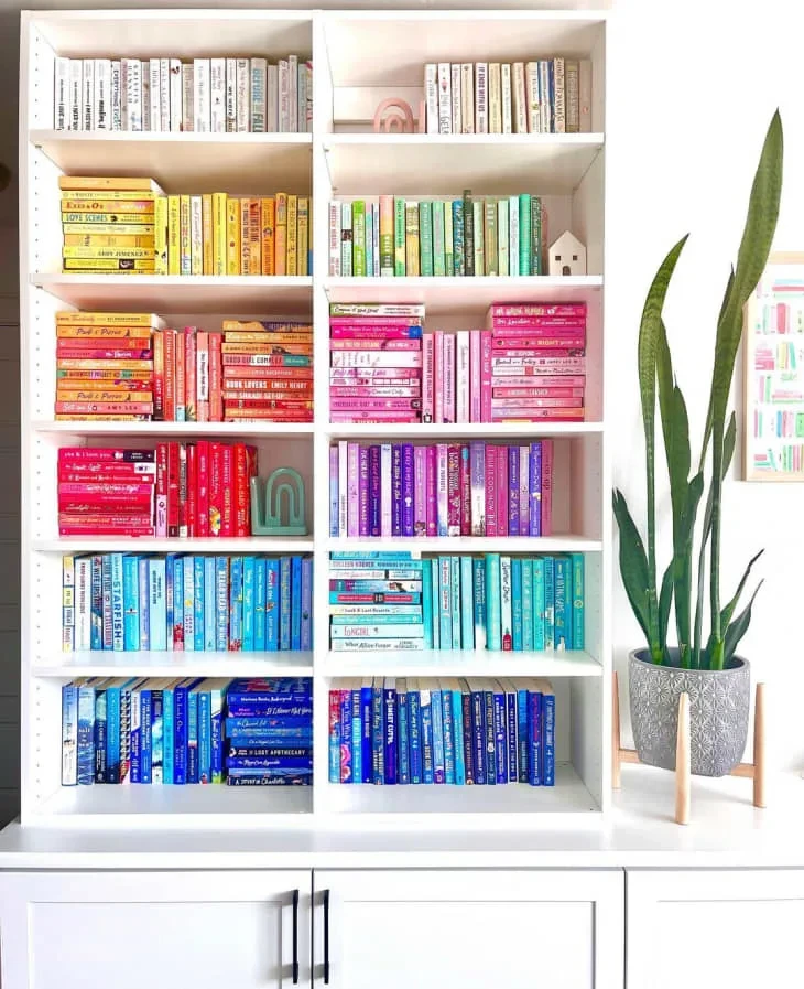
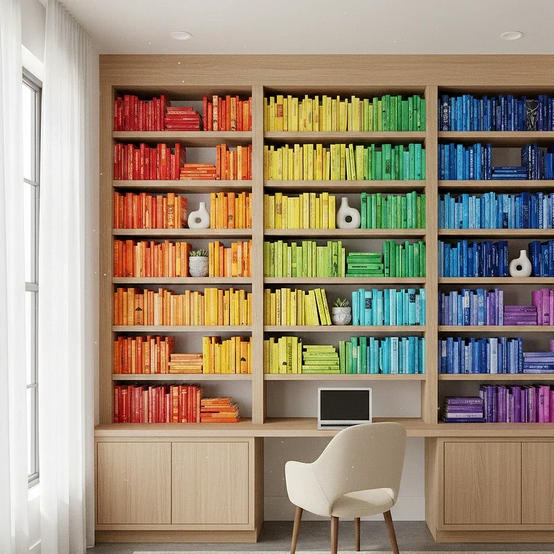
Color coding is the practice of arranging books by spine color rather than by author, subject, or any traditional library organization. The most common version is a full rainbow gradient running across or down the shelves. Other variations include sorting by tonal family (warm versus cool, light versus dark) or organizing all books of one color into a single block while sorting other shelves more conventionally.
The visual appeal is real. A color coded shelf reads as composed and intentional even at low information density. The eye moves smoothly across the gradient, the unit looks polished, and the styling effort is front-loaded into the sort rather than spread across small ongoing decisions. It is one of the few bookshelf styling techniques where the work is mostly done once.
The full styling principles for a non-color-coded approach sit in the complete guide to bookshelf styling. This post is about the specific tradeoffs of the color coded option, when it actually fits, and when it does not.
What does color coding solve?
It solves the visual chaos of mixed dust jackets and inconsistent spine treatments in modern publishing. Most home libraries contain a wide range of cover designs: hardcovers from different decades, paperbacks in vibrant pulp colors, design books with thick white spines, and the occasional bright neon thriller. Color coding takes that chaos and imposes a single organizing principle on it.
It also solves the problem of a shelf that holds many genres in mixed reading patterns. A traditional library uses category as the organizer (fiction, history, design, cooking), but a home shelf often holds too few of each category to justify the dedicated section. Color becomes a substitute organizer when category-based grouping does not produce enough visual coherence.
And it solves the photograph problem. If your home gets photographed for any reason (selling, social media, magazine features, professional work), the color coded shelf delivers a result that reads as polished even when the rest of the styling is rough. It is the most camera-ready bookshelf approach by a comfortable margin.
What does color coding break?
It breaks finding things. This is the central problem and the one most enthusiasts underestimate before they try it. You cannot scan for a title alphabetically. You cannot find an author’s other books without remembering what their spine color is. You cannot pull a related book to compare ideas without a multi-minute hunt. The library function of the bookshelf, the part that lets you use it as a tool for thinking, collapses.
It breaks book pairing and association. Part of the value of a bookshelf, beyond the books themselves, is the relationships between adjacent volumes. The cookbook next to the food memoir. The architecture monograph next to the design history that influenced it. Color coding scatters these pairings randomly, which is fine for a display piece and frustrating for an active reading life.
It breaks new book absorption. When a new book arrives, you have to either find space within the existing color block (often pushing other books out of place) or accept that the gradient is now imperfect. Either response makes adding to the collection feel like a maintenance task rather than the pleasure it should be. By month six of my experiment, I was buying fewer books because the absorption cost was annoying.
When does color coding actually work?
For a small, mostly decorative collection. If you have one or two shelves of books that are primarily on display rather than in active use, the access cost of color coding evaporates because you rarely pull the books down. The aesthetic value remains. This is the most common case where color coding holds up over time.
For homes with very few books accessed regularly. If you read on a kindle or tablet for most of your reading life, and the physical books on your shelf are reference titles, art books, or sentimental keeps that you rarely open, color coding does not interfere with daily use. The shelf functions as decor, and styling priorities outweigh access priorities.
For rooms photographed often. Show homes, professional creative spaces, hospitality settings, and homes that get featured publicly often justify the color coded approach. The camera-ready benefit is real and important in these contexts, and the access tradeoff is acceptable because the shelf is primarily working as imagery.
For maximalist and bohemian interiors with deliberate visual density. In rooms that already lean toward layered, accumulated detail, the imposed order of color coding gives the eye somewhere to rest. The contrast between the orderly shelf and the busier surrounding room produces a balance that other organizing methods struggle to deliver. The bohemian interior design guide covers the larger style language where this can work.
What works better for most homes?
Tonal grouping by category. Books stay sorted in the conventional way (fiction, design, cookbooks, history) but within each section you let the natural color groupings emerge. Most design books have quiet spines and group well together visually. Most novels in modern publishing have varied covers, so a fiction shelf reads as a deliberate mixed block.
This approach gets you maybe 70 percent of the visual calm of a fully color coded shelf, with 100 percent of the access functionality. The books are still findable. New books can be absorbed without disrupting the system. And the visual rhythm across category-defined blocks is more dynamic than a single uninterrupted color sweep.
If certain books have aggressively clashing covers that ruin the section they belong in (the bright orange thriller in the middle of an otherwise quiet fiction shelf), the right move is to relocate that title to closed storage or a less prominent shelf rather than trying to absorb it. The cluster post on styling a shelf with too many books covers the overflow approach in detail.
The hybrid approach that actually works
The system I settled on after reverting is something like this. Books are organized loosely by category, with categories occupying contiguous sections of the shelf. Within each section, I let books group by spine tone when it happens naturally and do not force it when it does not. One shelf is left for design and art books, which produces a quiet, tonally consistent block almost by itself. Another shelf is reserved for fiction in mixed colors, which reads as a deliberate accent against the quieter shelves.
The books I find genuinely visually disruptive (mass market thrillers with neon spines, three identical series volumes with garish covers, the occasional textbook in unfortunate maroon) go to a less prominent shelf or to closed storage. The hybrid lets the shelf function as a working library while still looking composed. It is not as photogenic as the full color sort, but it works as a real bookshelf in a real home.
Common mistakes with color coding
Committing to color coding before testing it. The aesthetic appeal is so strong in photographs that people commit to a full re-sort without trying a smaller version first. Try color sorting one shelf for a month before doing the whole unit. If you find yourself unable to find books on that shelf, you have your answer before you have invested an afternoon.
Ignoring the books that do not fit the gradient. White-spined books outnumber every other color in modern publishing, so the white block tends to be huge and visually heavy. The color coded shelf often ends up dominated by white, with thin slivers of other colors. The “rainbow shelf” rarely looks like a rainbow in practice.
Trying to maintain it during heavy reading periods. If you are actively reading a stack of books at the moment (taking them off and putting them back over weeks), the color sort breaks down constantly. The system works best for static collections, not dynamic ones.
Underestimating the reversion cost. Going from color coded back to a functional sort is a four to six hour project for a typical home library. The longer you live with the color sort, the harder the reversion feels emotionally, even when you have decided it is not working. Knowing the cost upfront makes the trial period easier to justify and easier to walk back.
The Year I Tried It
The full year of color coding the apartment shelves was not wasted. It taught me that the visual case for color organization is genuine, and that the failure mode for me was specifically about how often I pull books down. For someone who reads less in print, or whose books are primarily decorative, the year would have ended differently. The honest answer is not that color coding does not work. It is that it works for a smaller set of homes than the photography would suggest.
If you have been thinking about doing it, the lower stakes version is to color sort one shelf and live with it for a month. If you find yourself reaching for those books and not finding them, you have learned something cheaply. If you find that the visual calm of that one shelf is worth the small access cost, you can scale up with confidence. The full commitment without the trial is the version I would advise against.
For the styling approach I settled on after the year ended, the pillar guide to bookshelf styling walks through the framework. For style-specific applications across Japandi, mid century modern, minimalist, and industrial interiors, bookshelf styling by style covers how those approaches handle the color question differently.
Frequently Asked Questions
Is a color coded bookshelf practical for everyday use?
For most homes, no. The aesthetic appeal is real but the daily access cost is significant. You cannot find books by author or title without scanning the whole unit, related books are scattered randomly, and new acquisitions disrupt the gradient. The exception is collections that are mostly decorative or rarely accessed, where the access cost evaporates.
How do you maintain a color coded bookshelf as you buy new books?
Each new book has to be slotted into the existing color block, which usually means shifting other books to make space. Over time, the gradient drifts as the color proportions change with new acquisitions. Most people either give up maintenance after a few months or stop buying physical books to preserve the system. Neither is an ideal outcome.
What is a less extreme alternative to fully color coding bookshelves?
Tonal grouping within category sorts. Keep books organized by traditional category (fiction, design, history) and let books group by spine tone naturally within each section. Most design books have quiet spines and look composed together; fiction sections read as deliberately mixed. The result gets most of the visual calm of color coding without losing functional access.
Does color coding books work in a minimalist home?
Sometimes, particularly for smaller curated collections where access is secondary to display. Minimalist interiors often benefit from the visual quiet that color coding produces, and minimalist homes typically own fewer books that get pulled down regularly. For larger working libraries, even in minimalist spaces, a tonal grouping by category approach holds up better over time.
How long does it take to revert a color coded bookshelf back to a normal sort?
Roughly four to six hours for a typical home library of several hundred books. The reversion involves pulling everything off the shelves, re-sorting by your chosen organizing principle, and re-shelving. Going from color back to functional is harder emotionally than the original color sort because the visual change is so visible during the in-between phase.