Paint & Color
By Tereza Hower | Published May 29, 2026
The cool gray I had picked for my home office read as undeniably blue by mid afternoon. I had chosen it from a swatch on a south facing showroom wall, where it looked exactly like the soft, putty toned neutral I wanted. In the actual room, north facing, with light bouncing off a single window onto a jute rug, the same color shifted to the temperature of dishwater.
I lived with that wall for four months before repainting. The replacement was Pale Oak by Benjamin Moore (OC-20), a warm off neutral with enough yellow undertone to hold its ground in cooler light without crossing into beige. That single repaint is the reason I now spend more time studying a room’s light than studying paint swatches when choosing wall color.
This guide covers modern paint colors that read as current rather than dated, and that work in real rooms rather than in showroom photographs. The category has shifted decisively in the last several years, away from the cool grays that defined the previous trend cycle and toward a softer, more material centered palette. The change matters because paint is the cheapest, fastest decision in a room that can also be the most regretted.
What follows is a working framework: the modern paint color families worth knowing, the colors that have aged badly, how natural light changes everything, and how to choose paint that suits your specific space rather than someone else’s photograph of theirs.What follows is a working framework: the modern paint color families worth knowing, the colors that have aged badly, how natural light changes everything, and how to choose paint that suits your specific space rather than someone else’s photograph of theirs.What follows is a working framework: the modern paint color families worth knowing, the colors that have aged badly, how natural light changes everything, and how to choose paint that suits your specific space rather than someone else’s photograph of theirs.What follows is a working framework: the modern paint color families worth knowing, the colors that have aged badly, how natural light changes everything, and how to choose paint that suits your specific space rather than someone else’s photograph of theirs.
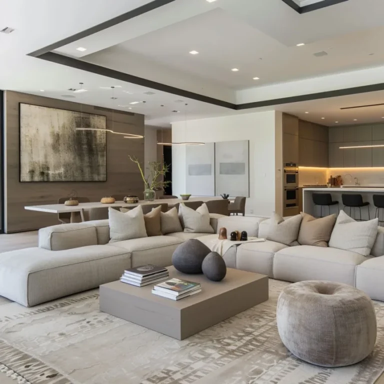
A modern paint color is one that reads as quiet rather than loud, warm without being yellow, and grounded without being heavy. The current modern palette favors colors with visible material undertones. Think the warmth of unbleached linen, the dustiness of old plaster, the softness of oat milk, the depth of charred wood.
The previous generation of modern paint colors leaned toward optical cleanliness, often translated as cool whites and grays with blue or violet undertones. Those colors read as architectural in magazine photography but turned clinical in real homes, especially in rooms with limited natural light. The shift to warmer modern palettes is partly a correction to that experience.
You can usually identify a modern paint color by what it does not do. It does not announce itself. It does not compete with the wood, fabric, and ceramic in the room. It reads first as light, second as color, and only third as a specific name on a chip.
There are five color families that account for nearly every wall paint specified in current design publications. Each has a distinct mood, light sensitivity, and best room context. Understanding them as families rather than individual swatches makes paint selection significantly less random.
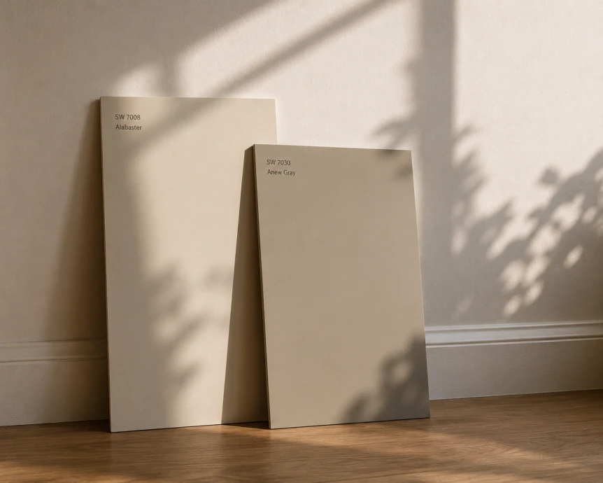
Warm whites are the most versatile category in modern paint. They serve as wall color when a room has strong material interest elsewhere (wood floors, textiles, art) and want a quiet background. The reference colors here are Benjamin Moore White Dove (OC-17), Benjamin Moore Swiss Coffee (OC-45), Sherwin Williams Alabaster (SW 7008), and Farrow & Ball Pointing (No. 2003).
The mistake people make with warm whites is choosing them based on the swatch in a paint store, where overhead fluorescent lighting flattens them out. A warm white that looks correct in a paint store can read distinctly yellow in north facing light or noticeably pink in late afternoon sun. The category requires more on wall testing than any other.
Pair warm whites with natural wood tones, linen and cotton upholstery, and matte ceramic. They read poorly against high gloss black or chrome, which makes the wall look beige by contrast. For a deeper look at this category, see our guide to the best white paint colors for modern interiors.
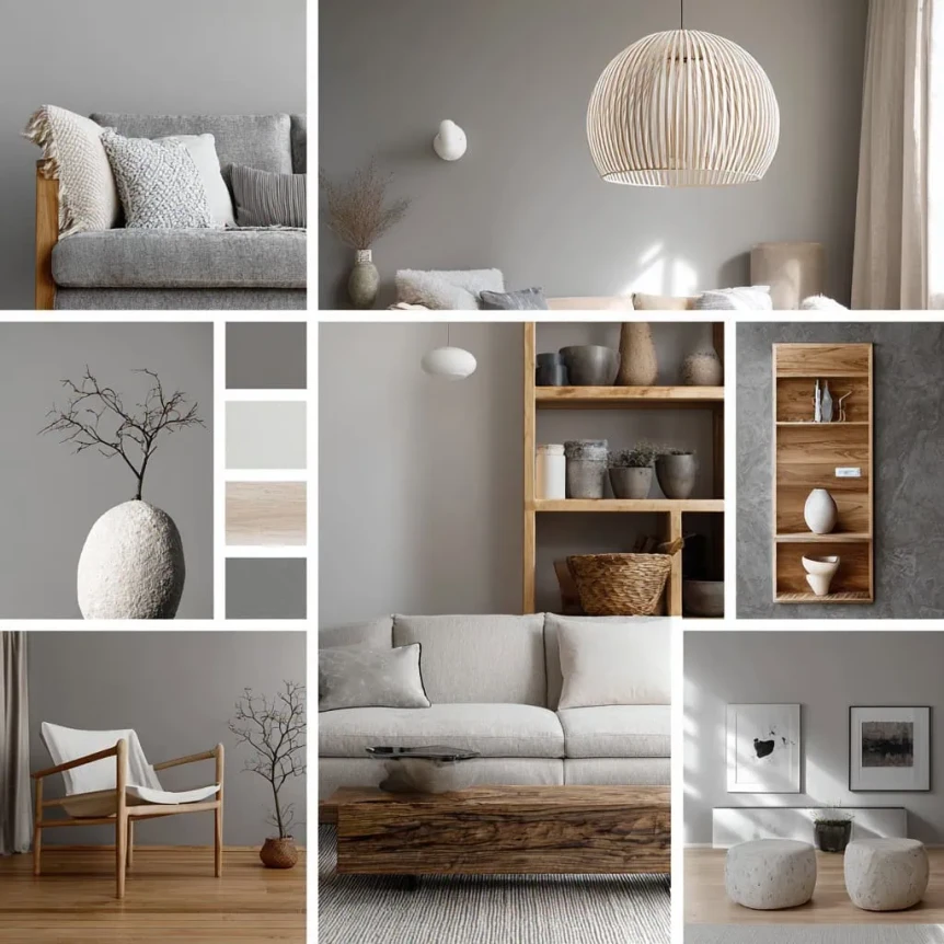
Greige is the category that replaced cool gray. The current versions lean warmer and softer than the greiges of the previous decade. Reference colors include Benjamin Moore Pale Oak (OC-20), Sherwin Williams Agreeable Gray (SW 7029), Sherwin Williams Accessible Beige (SW 7036), and Farrow & Ball Skimming Stone (No. 241).
The defining quality of a modern greige is that it does not commit to either gray or beige. It reads gray against warm wood, beige against cool wood, and slightly green or pink in certain lights. This flexibility is its strength. The same color can be used throughout a whole home without feeling repetitive, because each room’s light and material context shifts the read.
Warm earthy neutrals are the fastest growing category in modern paint. These are colors named for materials and landscapes rather than for abstractions. Setting Plaster, Slipper Satin, Templeton Gray, Limestone, Edgecomb Gray, Shaker Beige. Each carries a specific material reference that translates directly to mood.
The category works because it is grounded. A clay toned wall has presence without weight. It cooperates with natural wood, brass, terracotta, woven jute, and the warm whites and oat tones in upholstery. The full breakdown is in our guide to warm earthy paint colors that work in modern homes.
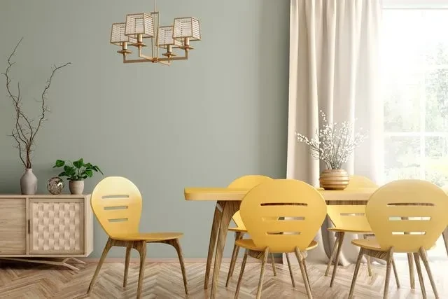
Muted green is the modern accent color. Not bright green, not olive drab, but the softer middle ground that reads as sage, eucalyptus, or aged copper. The reference colors are Farrow & Ball Mizzle (No. 266), Sherwin Williams Evergreen Fog (SW 9130), Benjamin Moore Saybrook Sage (HC-114), and Farrow & Ball French Gray (No. 18).
These greens function as neutrals more than as colors. They sit comfortably alongside wood and white, and they shift through the day from gray green to green gray to nearly olive depending on light. They work best in rooms with one or two natural material anchors (a wood floor, a leather chair) rather than in fully painted, fully upholstered spaces.
The fifth modern family is the deep neutral: charcoals, slate blacks, deep blue greens, and bottle inks. Reference colors include Benjamin Moore Hale Navy (HC-154), Farrow & Ball Off Black (No. 57), Sherwin Williams Iron Ore (SW 7069), and Benjamin Moore Tarrytown Green (HC-134).
Deep neutrals are used sparingly in modern interiors. They define an envelope (a small enclosed room, a study, a powder room) or wrap built ins and millwork to create depth. The mistake is using them on a single accent wall in an otherwise pale room, which now reads as a trend from a decade past.
Cool gray walls dominated the early to mid 2010s and have been retreating ever since. The shift is not arbitrary. Cool grays were specified into millions of homes, often as a default safe choice, and the cumulative result was a generation of interiors that read as flat, blue tinted, and curiously joyless in everyday light.
The technical issue is undertone. Most popular cool grays of the previous cycle (Stonington Gray, Pewter Mug, Coventry Gray, Repose Gray at the cooler end) carry blue or blue violet undertones. In rooms with abundant southern light those undertones recede. In north facing rooms, in basements, in rooms with cool LED bulbs, they advance and the walls read distinctly blue. Most homes do not have enough warm light to neutralize that effect.
The cultural shift is also real. Cool gray reads now as the visual signature of speculative builder homes and rental flips. The greiges and warm whites replacing them carry softer associations: small craft hotels, restored townhouses, design publication interiors. The same homeowner who chose Repose Gray in 2014 is now choosing Pale Oak or Agreeable Beige in 2026.
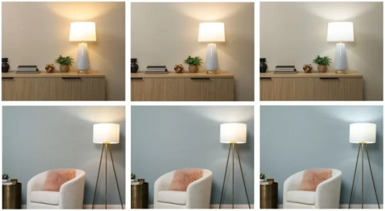
Light direction is the single most important variable in how a paint color reads on the wall. The same color, identically applied, can look like three different paints in three different rooms. Understanding the four orientations is the closest thing to a shortcut in paint selection.
North facing rooms receive indirect, cool light all day. They flatten warm colors and exaggerate cool ones. A paint that reads as soft greige in a south facing showroom will read as cold blue gray in a north facing bedroom. The fix is to choose colors at least one half step warmer than what looks correct on the chip.
South facing rooms receive direct, warm light for most of the day. They forgive cool paint and intensify warm paint. A warm white in a south facing kitchen can read distinctly yellow by afternoon. The fix is to choose colors at least one half step cooler than what looks correct in the can.
East facing rooms get warm light in the morning and shift cool in the afternoon. West facing rooms do the opposite, cool in the morning and warm to peak intensity at sunset. Both orientations reward paint colors with neutral undertones that hold steady across light shifts, rather than colors that depend on a specific light condition to look right.
For a full breakdown of how to evaluate light before committing to paint, see our guide to choosing paint colors that work in your light.
Modern paint families read differently within each style vertical. A warm white in a Japandi room is not the same as a warm white in a mid century modern living room, even if the paint code is identical. The surrounding wood, light, and texture do most of the work.
Japandi rooms typically use warm off whites and soft greiges as primary wall color, with one accent in a deep ink (charcoal, dark green, almost black) on millwork or a feature wall. The palette references unfinished wood, raw linen, and aged ceramic. See our breakdown of Japandi color palettes that set the tone.
Scandinavian interiors lean toward the warm whites end of the family, often pure off whites like Swiss Coffee or White Dove paired with a single moody color in a study or bedroom. The strategy is brightness as a backdrop for layered textile and natural wood. Our full guide is Scandinavian color palettes for a bright, calm home.
Modern minimalist interiors range from strict white box rooms to warmer whites and oat greiges. The contemporary version (sometimes called warm minimalism) sits firmly in the soft greige and warm white categories rather than the pure cool whites of strict minimalism. See warm minimalism vs modern minimalism for the distinction.
Mid century modern paint palettes use warm whites as base, with bolder accent colors (mustard, deep teal, terracotta) drawn from the period’s textile palette. The walls usually stay quiet so that walnut furniture and patterned textiles can lead. Full breakdown in our mid century modern color palettes and patterns guide.
Industrial rooms anchor on cool whites, deep charcoals, and the raw concrete and metal already in the space. Paint is used to either expose or quiet the existing structural elements. See our industrial color palettes and materials reference.
Bohemian interiors use the most varied modern paint palette, with warm whites as backdrops for moodier rooms in clay, mustard, deep terracotta, or muted teal. The category invites bold wall color in single rooms (a bedroom, a dining room) rather than across the home. Full reference in our boho color palettes for every room guide.
The table below summarizes the five modern paint families across their characteristic mood, best light context, and the styles they most commonly serve.
| Family | Mood | Best Light | Reference Colors | Best For |
|---|---|---|---|---|
| Warm whites and off whites | Quiet, airy, neutral | South, east, west | White Dove, Swiss Coffee, Alabaster, Pointing | Living rooms, kitchens, bedrooms with strong material interest |
| Soft greiges and oat tones | Grounded, flexible, calm | Any orientation | Pale Oak, Agreeable Gray, Accessible Beige, Skimming Stone | Whole home neutrals, transitional spaces, north facing rooms |
| Warm earthy neutrals | Material, soft, lived in | South, west | Setting Plaster, Edgecomb Gray, Limestone, Shaker Beige | Entryways, bedrooms, dining rooms, low light spaces |
| Muted greens and clay tones | Quiet, organic, restful | East, north (with caution) | Mizzle, Evergreen Fog, Saybrook Sage, French Gray | Bedrooms, studies, libraries, accent walls |
| Deep neutrals and inky tones | Enveloping, atmospheric, dramatic | Any (with sufficient lighting) | Hale Navy, Off Black, Iron Ore, Tarrytown Green | Powder rooms, studies, drenched small rooms, millwork |
Most paint regret traces to one of six predictable errors. Knowing them ahead of time is the only real way to avoid the four months of dishwater walls I lived with in my office.
Paint store lighting is calibrated to flatter swatches. The color you see under fluorescent panels above a polished chip is not the color you will see on your wall. Always bring swatches home and check them on every wall, at every time of day, before deciding.
Every neutral has an undertone (gray with blue, beige with pink, white with yellow). The undertone is invisible at chip size and unmistakable at wall size. Place candidate colors next to a pure white sheet of paper to read the undertone before committing.
Paint color reads differently against the furniture, art, and textiles that will live in the room. Choosing wall color in an empty room is choosing color against drywall and subflooring. Wait until at least the major furniture is in place, or test paint near the actual fabrics and finishes that will share the space.
People sometimes pick cool gray walls to balance warm wood floors or warm leather furniture. The result is a room that feels visually divided. Warm with warm and cool with cool reads as integrated. Mixing the two reads as compromise.
Painting one wall a saturated color in an otherwise pale room reads now as a trend signature from the previous decade. Modern accent strategies wrap an architectural feature (a niche, a built in, a chimney breast) or commit to color drenching the whole room, rather than picking a single wall as a billboard. The full discussion is in our guide to accent wall paint colors that do not feel dated.
Paint in a photograph has been edited, color graded, and lit for a single ideal moment. The Pale Oak in an Instagram bedroom shot at sunset is not the Pale Oak in your north facing office at 3 pm. The most reliable visual reference is paint on a real wall in a similar light condition, not paint in a styled image.
Proper paint testing takes a week and saves months of regret. The protocol is straightforward and consistently skipped by people who later repaint.
Buy sample pots of three to five candidate colors. Brush each onto a two foot square of poster board, two coats, edge to edge. Lean the boards against different walls in the actual room. View them at 7 am, noon, 4 pm, and after dark with the room’s evening lighting in use. Move the boards around the room over several days.
The poster board approach is better than painting directly on the wall because it lets you see the color against the wall it will replace, the trim, the floor, the furniture, and at different distances. Painting samples directly on the wall biases the color against the surrounding original wall, which is rarely the same temperature you will end up with.
One final test before buying gallons. Photograph the boards in the morning, midday, and evening with the same phone camera. Looking at the photographs side by side reveals temperature shifts your eye adjusts away in person. The color that holds steady across all three photographs is the color most likely to read as you expect.
Open concept layouts ask one question that closed plans do not: should the kitchen, dining, and living zones share a paint color, or should each zone read separately. The current answer in modern interiors is overwhelmingly shared color, with material and lighting changes doing the zoning work instead.
Switching wall color between adjacent zones in an open plan tends to read as architectural disagreement. Continuity through one warm white or one soft greige, with island materials, rug placement, and pendant lighting doing the zone work, reads as intentional. The full breakdown is in our guide to paint color combinations for open concept homes.
Color drenching is the practice of painting walls, trim, doors, and sometimes ceiling all in the same color. It is the most discussed modern paint trend, and the most misapplied. The technique works in small enclosed rooms (powder rooms, studies, reading nooks) where it creates a sense of envelope and depth. It rarely works in large rooms or open plans.
The deciding factor is room size and architectural definition. A 6 by 7 powder room drenched in Hague Blue feels intimate and intentional. A 14 by 18 living room drenched in the same color feels like a paint mistake. The full guidance, including when to skip it entirely, is in our color drenching guide.
The Paint Colors and Palettes cluster on Curated by Hower covers each of the modern paint families and decisions in depth. The full set of related guides:
For broader color context across style verticals, see the modern color schemes for living rooms guide, the modern bedroom color schemes reference, and the style specific palettes for Japandi, Scandinavian, minimalist, mid century modern, industrial, and bohemian interiors.
The most consistently specified modern paint colors are warm whites (Benjamin Moore White Dove, Sherwin Williams Alabaster, Benjamin Moore Swiss Coffee), soft greiges (Benjamin Moore Pale Oak, Sherwin Williams Agreeable Gray, Sherwin Williams Accessible Beige), and warm earthy neutrals (Farrow and Ball Setting Plaster, Benjamin Moore Edgecomb Gray, Benjamin Moore Shaker Beige). The category has moved decisively away from cool grays toward warmer, softer wall colors.
Cool gray walls now read as dated to most design audiences and are the most commonly repainted color in current remodels. Warm grays and greiges (which carry beige or oat undertones rather than blue undertones) remain popular and continue to be specified widely. The shift is from cool gray to warm greige, not from gray to color.
Low light rooms need paint colors with warm undertones to compensate for the lack of warm natural light. Choose colors at least one half step warmer than what looks correct on the chip. Reference candidates include Benjamin Moore Pale Oak, Benjamin Moore White Dove, and Sherwin Williams Alabaster. Avoid cool grays and any color with visible blue or violet undertones.
For resale appeal, a warm off white or soft greige in a flexible undertone is the strongest choice. Benjamin Moore White Dove, Benjamin Moore Pale Oak, and Sherwin Williams Agreeable Gray are widely accepted by buyers and photograph well in listing images. Avoid bold accent walls or saturated whole room colors when painting for resale.
In small enclosed rooms, painting ceiling and walls the same color (color drenching) creates a sense of intentional envelope. In standard sized rooms with eight to nine foot ceilings, a warm white ceiling against a darker wall color is the more flexible choice. Pure white ceilings against warm white walls can read as a temperature mismatch and are worth avoiding.
The paint color question is rarely about finding the perfect shade. It is about understanding the room you have, the light it receives, and the materials already in it, and then choosing paint that supports all three. Most of the regretted walls I have seen were chosen by people who studied paint chips instead of studying their rooms. Start with the next cluster post on how to choose paint colors that work in your light if light orientation is the variable you have not yet evaluated.