How to Choose Paint Colors That Work in Your Light
By Tereza Hower | Published June 2, 2026
Light direction shapes how you read a paint color more than the color itself does. The same paint, identically applied, will look like three different colors in three different rooms of the same house. This is the single most underestimated variable in paint selection, and the reason choosing paint color for a room from a swatch in a paint store is the most common mistake people make.
The clearest lesson I have on this came from my own home office: a small north facing room where a cool gray I had carefully selected from a swatch read as flatly blue once it was actually on the wall. The story is in the complete guide to modern paint colors. What I want to give you here is the framework that came out of that experience: a working method for reading your room’s light before choosing paint, so you can avoid the four months of dishwater walls I lived with before repainting.
This guide covers the four light orientations, what each one does to paint color, the color families that succeed in each, and a step by step protocol for testing paint before you commit.
Key Takeaways
- Light direction (north, south, east, west) is the most important variable in how paint color reads on the wall.
- North facing rooms need warmer paints to compensate for cool indirect light.
- South facing rooms can take cooler paints because warm natural light provides the temperature balance.
- East and west facing rooms experience temperature shifts during the day and reward paints that hold steady across light conditions.
- Always test paint as two foot square samples in the actual room, at multiple times of day, before committing.
Why Does Light Direction Change Paint Color?
Paint pigment does not change. What changes is the light wavelength reaching the wall and reflecting back to your eye. North light is dominated by cool diffused wavelengths. South light is dominated by direct warm wavelengths. East and west light shifts through the day as the sun moves.
When cool light hits a paint with warm undertones, the wavelengths cancel each other out and the wall reads as neutral. When cool light hits a paint with cool undertones, the wavelengths reinforce and the wall reads as distinctly cool. The same paint with the same pigment can therefore look completely different in two rooms of the same home.
This is why a paint chip in a south facing showroom rarely matches the read in a north facing bedroom, and why design photography of a paint color (which is shot in carefully managed light) is an unreliable guide for your own room.
How Do North Facing Rooms Affect Paint Color?
North facing rooms receive indirect, cool, diffused light throughout the day. The light is consistent (which is good for tasks like reading and art) but it is also cool in temperature. North light flattens warm colors and exaggerates cool ones.
Practical consequences. A paint with a blue or violet undertone (cool grays, most cool whites) will read distinctly cool in a north facing room. A paint with a warm undertone (greiges with yellow oat, warm whites with pink putty, warm earthy neutrals) will read as more neutral than warm, because the cool light cancels some of the warmth. The fix is to choose paint at least one half step warmer than what looks correct on the chip.
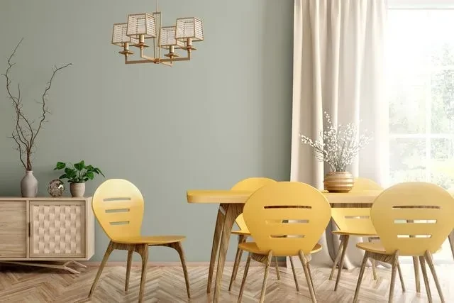
The strongest paint families for north facing rooms are warm whites (White Dove, Swiss Coffee, Alabaster), warm greiges and oats (Pale Oak, Edgecomb Gray, Accessible Beige), and warm earthy neutrals (Setting Plaster, Skimming Stone). Avoid cool grays, cool whites, and any paint where the undertone is visible blue or violet. The cluster post on warm earthy paint colors covers the warm options in more depth.
How Do South Facing Rooms Affect Paint Color?
South facing rooms receive direct, warm light for most of the day. The light is intense and golden by mid afternoon. South light forgives cool paint and intensifies warm paint.
Practical consequences. A paint that reads as a soft warm white in a north facing showroom will read as distinctly yellow in a south facing kitchen by afternoon. A paint that reads as cool gray in a north facing room will read as neutral or even slightly warm in a south facing one. The fix is to choose paint at least one half step cooler than what looks correct in the paint store, or to commit to warmer paint with the understanding that the room will read clearly warm in afternoon light.
The strongest paint families for south facing rooms are clean warm whites (White Dove, Alabaster), cooler greiges (Pale Oak in particular, sometimes even Repose Gray at the warmer end of the cool gray family), and the softer warm earthy options (Skimming Stone, Pale Oak). The risk in south facing rooms is choosing a paint that is too warm and ending up with a room that reads yellow or pink by 4 pm.
How Do East Facing Rooms Affect Paint Color?
East facing rooms receive warm direct light in the morning and shift to cool indirect light by early afternoon. The temperature swing is significant: a paint that reads warm at 8 am can read distinctly cool by 2 pm.
Practical consequences. East facing rooms reward paint colors with neutral undertones that hold steady across light shifts rather than paints that depend on a specific light condition. The safest choices are warm whites with minimal undertone (White Dove, Alabaster) and soft warm greiges (Pale Oak, Skimming Stone). Strong undertones (pink plaster, yellow oat, blue gray) will swing dramatically in east light and read as inconsistent through the day.
For east facing bedrooms specifically, choosing a paint that holds steady in cool afternoon light matters more than choosing one that flatters morning light. You will spend more waking hours in the afternoon read than the morning one.
How Do West Facing Rooms Affect Paint Color?
West facing rooms are the opposite of east facing. Cool indirect light in the morning, warm direct light building to peak intensity at sunset. The afternoon and evening light is the warmest light in any home.
Practical consequences. West facing rooms will read distinctly warm in the late afternoon regardless of the paint chosen. The risk is choosing a paint that is already warm and ending up with a room that reads pink or yellow at sunset. The fix is to default toward the cooler end of the warm white and greige families (White Dove, Alabaster, Pale Oak) and to avoid the pinker or yellower warm earthy options (Setting Plaster, Swiss Coffee, Shaker Beige) unless the warm sunset read is the intentional mood.
West facing kitchens are particularly prone to over warm paint mistakes. Simply White or Swiss Coffee in a west facing kitchen will read distinctly yellow by 6 pm. White Dove or Alabaster will hold steady.
What If My Room Faces No Direct Sun at All?
Some rooms (interior bathrooms, hallways, basement spaces) receive no direct natural light. These rooms read entirely under artificial light, which is its own variable. Warm white bulbs (2700K to 3000K) will exaggerate warm undertones and flatten cool ones. Cool white bulbs (4000K and higher) will do the opposite.
For rooms with no natural light, choose paint based on the bulb temperature you use in that room. Warm bulbs reward soft warm whites and greiges. Cool bulbs are harder to flatter with paint and usually mean a brighter, cleaner white (Alabaster, Cloud White) reads better than a warm earthy color, which can look discolored under cool LED light.
How Should You Test a Paint Color in Your Light?
The testing protocol matters more than the paint shortlist. The protocol below is the one I use now and the one that would have saved me the cool gray office repaint.
Step one. Identify the orientation of the room. Stand in the room at noon on a clear day and note where the light is coming from. North, south, east, or west. If the room has two or more exposures, note both and the dominant one.
Step two. Shortlist three to five paint colors. Use the families that suit your orientation (warm for north, cooler for south, neutral for east and west). Avoid choosing solely from photographs or chips in the paint store.
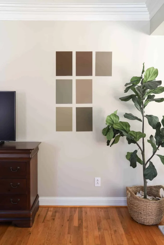
Step three. Buy sample pots and paint each color onto a two foot square of poster board, two coats, edge to edge. Lean the boards against different walls of the room. Do not paint directly onto the wall: this biases the color against the surrounding original wall, which is rarely accurate.
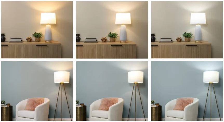
Step four. View the boards at four times: 7 am, noon, 4 pm, and after dark with the room’s evening lighting on. Photograph the boards at each time with your phone camera. Looking at the photographs side by side reveals temperature shifts your eye adjusts away in person.
Step five. The color that reads as intended across all four time periods, in both eyes and camera, is the color to buy in gallons. The color that reads correctly at only one time of day is the color to skip.
Paint Color by Light Orientation Reference Table
| Orientation | Light Character | Best Families | Avoid | Reference Colors |
|---|---|---|---|---|
| North facing | Cool, indirect, consistent | Warm whites, warm greiges, warm earthy | Cool grays, cool whites, blue or violet undertones | White Dove, Pale Oak, Setting Plaster, Skimming Stone |
| South facing | Warm, direct, intense by afternoon | Clean warm whites, cooler greiges | Strong yellow undertones, pinker warm earthy | White Dove, Alabaster, Pale Oak |
| East facing | Warm in AM, cool in PM | Neutral warm whites, soft greiges | Strong undertones (will swing through the day) | White Dove, Alabaster, Pale Oak, Skimming Stone |
| West facing | Cool in AM, warm peak at sunset | Cooler warm whites, cooler greiges | Pinker or yellower warm earthy colors | White Dove, Alabaster, Pale Oak |
| No natural light | Bulb temperature dependent | Match paint family to bulb temperature | Strong warm earthy under cool LED bulbs | Alabaster, Cloud White, Pale Oak (warm bulbs) |
What Are the Common Light Related Paint Mistakes?
Three mistakes account for most light related paint regrets.
Choosing paint at a friend’s house and assuming it will read the same
The most common pattern. Someone sees a paint color in a friend’s living room, asks for the name, and applies it in their own home. The friend’s room is south facing, the new room is north facing, and the paint reads completely different. Always test the color in your own room before buying gallons.
Choosing paint by Instagram photography
Paint in a styled photograph has been edited for a single ideal moment, often at golden hour with controlled light. The same paint at 11 am on a gray day in a north facing room will read entirely differently. Photography is useful for shortlisting candidates and unreliable for final selection.
Testing in the wrong location
Testing paint near a window (where the light is strongest) and assuming it will look the same on the opposite wall (where the light is weakest) is a recipe for surprise. Test on every wall of the room, especially the wall furthest from natural light.
What If You Cannot Test Paint Before Painting?
If a renovation timeline does not allow proper sample testing (this happens when a contractor needs paint specified before the room is ready for samples), the safest fallback is one of the universal modern whites: White Dove, Alabaster, or Pale Oak as a greige. These three paints have the broadest light tolerance and are the least likely to fail in any orientation.
For more dramatic paint choices (deep neutrals, saturated greens, warm earthy clay tones), sample testing is genuinely necessary. There is no equivalent universal safe choice in those categories. For more on which colors are flexible enough to skip testing, see the complete guide to modern paint colors. The cluster posts on best white paint colors and warm earthy paint colors cover the safest landing colors in each family.
Frequently Asked Questions
What is the best paint color for a north facing room?
North facing rooms need warmer paint colors to compensate for cool indirect light. The most reliable choices are Benjamin Moore White Dove for whites, Benjamin Moore Pale Oak for greiges, and Farrow and Ball Setting Plaster or Benjamin Moore Edgecomb Gray for warmer earthy neutrals. Avoid cool grays and any paint with visible blue or violet undertones.
How does light affect paint color?
Light direction is the most important variable in how a paint color reads on the wall. North light is cool and flattens warm colors. South light is warm and intensifies warm colors. East light shifts from warm in the morning to cool in the afternoon. West light shifts from cool in the morning to warm at sunset. The same paint will read differently in each.
Should I paint a sample on the wall or on poster board?
Paint samples on a two foot square of poster board, not directly on the wall. Painting on the wall biases the new color against the surrounding original color, which is rarely accurate. Poster board lets you move the sample to different walls and view it against different adjacent surfaces (trim, floor, furniture) to evaluate how the color reads in context.
What is the safest paint color when I cannot test before painting?
The safest universal modern paints are Benjamin Moore White Dove (OC-17), Sherwin Williams Alabaster (SW 7008), and Benjamin Moore Pale Oak (OC-20). All three perform well across light orientations and are unlikely to fail in any room. For deeper or more saturated colors, proper sample testing is necessary and there is no equivalent universal safe choice.
How long should I leave a paint sample on the wall before deciding?
Leave paint samples in the room for at least three to five days. View them at 7 am, noon, 4 pm, and after dark with the room’s evening lighting in use. Photograph the samples at each time with your phone to compare. The color that holds steady across all time periods is the one most likely to read as intended after the full room is painted.
Choosing paint color for a room based on its light is the difference between the paint you imagined and the paint you actually live with. The framework here covers the four orientations and the testing protocol. If you have a specific color family in mind, continue with the warm earthy paint colors guide or the best white paint colors reference. For the broader paint conversation including style specific palettes, return to the complete guide to modern paint colors.