Accent Wall Paint Colors That Don’t Feel Dated
By Tereza Hower | Published May 31, 2026 | Updated May 29, 2026
Most accent walls age badly. The single saturated wall in an otherwise pale room is the most recognizable paint trend of the previous decade, and it carries its decade with it. A navy accent wall, a charcoal accent wall, a deep teal feature wall behind a sofa: all of them now read as a specific moment in residential design that has passed.
That does not mean every accent wall is dated. The strategies that still work are different from the strategies of ten years ago. They wrap architecture rather than announce it. They commit to depth rather than contrast. They treat color as envelope rather than billboard.
I painted a deep navy accent wall in my first apartment around the time the trend peaked. It looked correct for about eighteen months and visibly dated for the next three years before I finally repainted. The lesson I took from that wall is what shapes this guide: the accent strategies that have aged well are not single statement walls. They are color choices that read as integrated into the architecture rather than imposed on it.
Key Takeaways
- Single statement accent walls in otherwise pale rooms now read as a specific dated trend from the previous decade.
- Accent strategies that still work wrap an architectural feature (a niche, a built in, a chimney breast) rather than designating a flat wall.
- Color drenching a small enclosed room is the modern replacement for the accent wall in a large room.
- If you commit to a single accent wall, choose the wall with architectural reason (the wall a fireplace sits on, the wall behind built ins) rather than the largest blank wall.
- The strongest accent wall paint colors are deep neutrals and muted greens, not bright contrast colors.
Why Do Most Accent Walls Read as Dated?
The accent wall as a design move peaked around 2014 to 2018 and was specified into nearly every renovation guide of the period. The standard formula was a single saturated wall (navy, charcoal, deep teal, sometimes a warm rust) in a room otherwise painted in a cool gray or warm white. The intent was visual interest. The actual result, in most rooms, was a wall that read as decoration laid over architecture rather than as part of it.
What happened next is what happens to every dominant trend. The formula became overused, then visible, then identifiable as a date stamp. A navy accent wall now reads to the trained eye as a renovation from the mid 2010s in the same way that mauve carpet and oak laminate read as the late 1980s. The paint itself is fine. The placement is what reads as dated.
The deeper issue is that single saturated walls rarely have architectural reason. They are usually chosen because the wall is the largest visible surface, not because the wall plays a structural role in the room. Modern accent strategies invert that logic.
What Accent Wall Strategies Still Work?
The accent strategies that have aged well are the ones that follow architecture rather than impose on it. Three approaches account for nearly all of them.
Wrapping a built in
Painting the inside of a built in bookshelf, a niche, or a recessed wall feature in a deeper color than the surrounding walls is the most reliable accent strategy in modern interiors. The color reads as intentional architecture rather than as decoration because it follows a structural feature. A bookshelf interior in Hague Blue against off white walls, or a media niche in Iron Ore against warm greige, will still read as current ten years from now in a way that a single navy wall will not.
Color drenching a small room
For people who want a moment of bold color in their home, color drenching a small enclosed room (a powder room, a study, a reading nook) is the more durable choice than an accent wall in a large room. The room reads as enveloped rather than half painted. The strategy works because it commits fully to the color and uses the room’s size to contain the intensity. The full discussion is in our guide to color drenching.
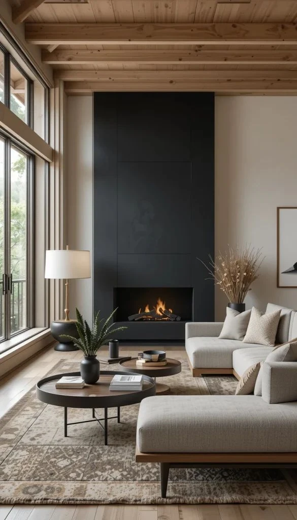
Painting a fireplace wall or chimney breast
If the room has a fireplace, painting the wall it sits on (or the chimney breast specifically) in a deeper color treats the fireplace as the architectural reason for the color. This is the version of the accent wall that has aged best, because the fireplace gives the color a job to do. The strategy works in mid century modern and Japandi rooms in particular, where the painted chimney breast is part of a tradition of architectural color rather than a recent trend.
What Are the Best Accent Wall Paint Colors?
If you are committed to an accent wall and have architectural reason for one (a fireplace, built ins, a recessed area), the paint colors that hold up best are the deep neutrals and muted greens. The colors to avoid are the saturated mid tones that read most clearly as the previous trend cycle.
Hale Navy by Benjamin Moore (HC-154)
A deep, slightly muted navy with a black undertone that keeps it from reading as primary or trendy. Works best as a built in interior, a powder room drench, or a chimney breast wrap in mid century modern or modern transitional rooms.
Iron Ore by Sherwin Williams (SW 7069)
A near black with a soft warm undertone. Reads as charcoal rather than black, which keeps it from feeling severe. Works as a fireplace wall, a media niche, or a built in interior. Holds up well across light orientations.
Evergreen Fog by Sherwin Williams (SW 9130)
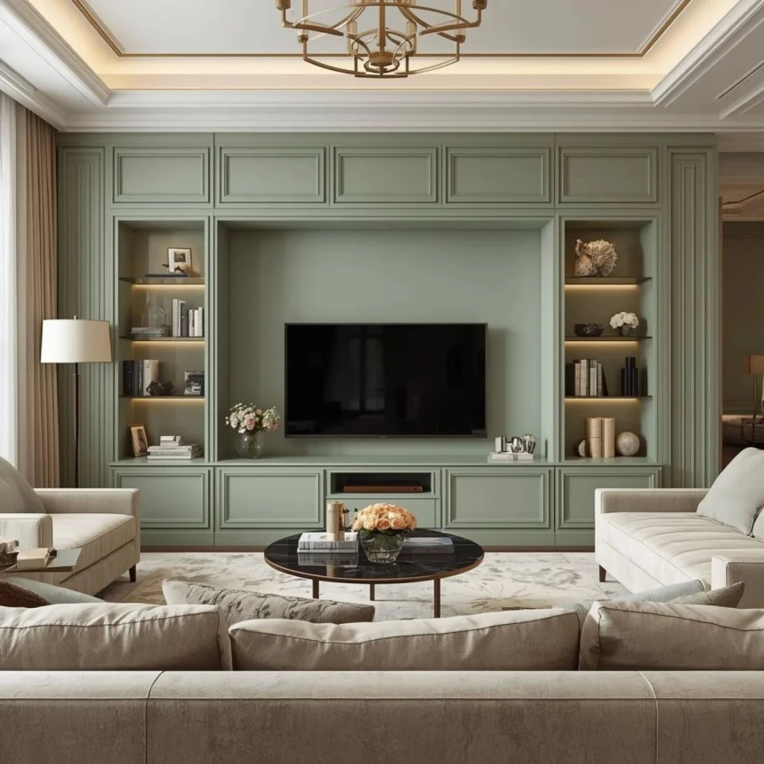
A muted sage green with strong gray undertones that keep it from reading as decorative. Functions as a neutral more than as a color, which is why it ages well. Best on a chimney breast or as a small room color drench.
Tarrytown Green by Benjamin Moore (HC-134)
A deep green with brown undertones that reads as aged or library green rather than as a current trend color. Best on built ins, dining room walls in color drenched rooms, and study or library treatments.
Hague Blue by Farrow & Ball (No. 30)
The reference color for English style deep blue. Used most often in color drenched powder rooms and studies. Has a slightly more sophisticated read than Hale Navy because of its softer pigment depth.
Accent Wall Paint Strategies Comparison
| Strategy | Best Application | Ages Well? | Reference Colors |
|---|---|---|---|
| Single saturated wall | Large blank wall in pale room | No, reads as previous decade trend | Avoid |
| Built in or niche wrap | Bookshelves, media niches, recessed alcoves | Yes, follows architecture | Hale Navy, Iron Ore, Tarrytown Green |
| Chimney breast or fireplace wall | Rooms with central fireplace feature | Yes, architectural reason | Evergreen Fog, Tarrytown Green, Iron Ore |
| Small room color drench | Powder rooms, studies, reading nooks | Yes, full commitment to color | Hague Blue, Hale Navy, Setting Plaster |
| Half wall or wainscoting | Dining rooms, entries, mudrooms | Yes, traditional architectural treatment | Iron Ore, Evergreen Fog, Hale Navy |
What Are the Common Accent Wall Mistakes?
Three patterns produce most of the accent wall regret. All of them are avoidable with a different framing of the question.
Painting the wall behind the sofa
This is the most common accent wall placement and the worst. The wall behind the sofa has no architectural reason to be colored differently from the others. Once the room is furnished, the sofa often blocks most of the painted wall, and the visible portion reads as awkward color framing rather than as designed.
Choosing a saturated mid tone
Mid tone saturated colors (kelly green, royal blue, brick red, mustard yellow) are the colors that read most strongly as previous trend cycle. If you commit to a single colored wall, choose a deep neutral or muted green that reads as architectural rather than decorative. Hale Navy, Iron Ore, Evergreen Fog, Tarrytown Green.
Pairing the accent wall with a cool gray base
The classic accent wall pairing of saturated color against cool gray walls is the most recognizable combination from the previous decade. Even with a current accent color, a cool gray base will pull the whole composition into the dated read. If you want an accent today, pair it with a warm white or warm greige base.
Is an Accent Wall Worth Doing at All?
For most rooms, the honest answer is no. The accent wall is a strategy that solved a specific design problem (rooms with too much pale surface) that has been better solved by other means: textured wall coverings, gallery walls, vertical wood paneling, more interesting furniture against quiet walls.
If you want a room that feels less pale or less flat, consider one of those alternatives before reaching for an accent wall. If you want a moment of color and you have a small enclosed room available, drench that room in color rather than painting a single wall in a larger room. The result reads as intentional rather than as residual trend. For the framework on when drenching makes sense, see our color drenching guide.
For the broader paint conversation, the complete guide to modern paint colors covers the families that work as wall paint in current modern interiors. The open concept paint combinations guide is relevant if you are considering accent strategies across a layout with multiple zones.
Frequently Asked Questions
Are accent walls out of style?
Single statement accent walls in otherwise pale rooms read as dated in current modern interiors. The strategy was over specified during the mid 2010s and has visibly aged. Accent strategies that still work follow architecture (built ins, fireplace walls, niches) rather than designating a flat wall as a feature.
What is the best accent wall paint color right now?
The accent wall paint colors that age best are deep neutrals and muted greens rather than saturated mid tones. Reference colors include Benjamin Moore Hale Navy (HC-154), Sherwin Williams Iron Ore (SW 7069), Sherwin Williams Evergreen Fog (SW 9130), Benjamin Moore Tarrytown Green (HC-134), and Farrow and Ball Hague Blue (No. 30).
Which wall should be the accent wall in a living room?
The accent wall should have an architectural reason: a fireplace, a built in bookshelf, a recessed alcove. Painting the wall behind the sofa as a default accent wall is the most common mistake and the placement that reads most clearly as dated. If your room has no architectural feature, skip the accent wall.
Can a deep navy still work as an accent color?
Yes, deep navy still works when applied to an architectural feature rather than a single flat wall. Hale Navy on a chimney breast, in a built in bookshelf, or as a small room color drench reads as integrated. The same color on the wall behind a sofa reads as a recognizable trend from the previous decade.
What is the alternative to an accent wall?
The strongest alternatives are color drenching a small enclosed room (powder room, study, reading nook), painting the inside of a built in shelf or niche, wrapping a fireplace chimney breast, or adding architectural detail like vertical wood paneling or wainscoting. All four read as more durable than a single saturated accent wall.
If you are tempted by an accent wall, the more durable question is what architectural feature in the room actually deserves color. The strongest modern accent strategies follow architecture rather than impose on it. For the broader picture, return to the complete guide to modern paint colors or read the case for committing fully to a single color in our color drenching guide.