Paint Color Combinations for Open Concept Homes
By Tereza Hower | Published June 1, 2026 | Updated May 29, 2026
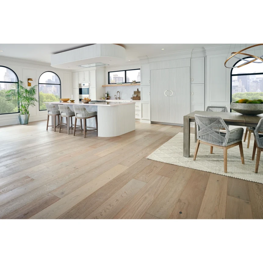
A friend who renovated her townhouse last year started by specifying three different paint colors for her open plan main floor. A warm white for the kitchen, a soft greige for the dining area, a slightly deeper greige for the living area at the far end. She painted samples on the wall at each zone and the transitions, viewed from the kitchen island, read as a series of disagreements. The wall changed temperature twice between the stove and the sofa.
She repainted the entire main floor in one color, Benjamin Moore Pale Oak (OC-20), and let the materials do the zoning. Oak floors in the kitchen, a jute rug in the dining area, a wool rug in the living zone. Three pendant lights at different heights. The result read as one continuous home with three identifiable rooms rather than as three different paint specifications fighting for attention. The lesson was straightforward: open concept paint colors work through continuity, not contrast.
This guide covers the working rules for paint in open concept layouts, the rare cases where multiple paint colors make sense, and the strategies for creating zone definition without reaching for paint as the tool.
Key Takeaways
- Open concept layouts work best with a single wall paint color carried across all zones.
- Zone definition should come from material change (flooring, rugs, lighting) rather than paint change.
- Switching wall color between adjacent zones in an open plan reads as architectural disagreement.
- The strongest open concept paints are flexible warm greiges and warm whites that hold steady across light orientations.
- Rare exceptions for two colors include color drenching a kitchen island wall or wrapping a specific architectural feature.
Why Does One Paint Color Work Best in Open Concept Layouts?
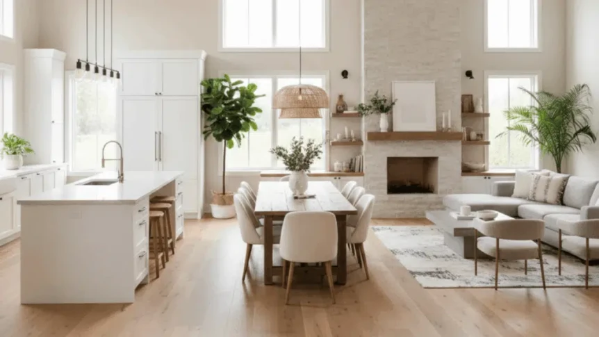
Open concept layouts dissolve the walls that used to create natural paint transitions. In a traditional floor plan, doorways and walls handle the visual handoffs between rooms. In an open plan, the kitchen flows into the dining flows into the living. There is no architectural reason for the wall paint to change.
When wall paint changes anyway, the eye reads each transition as deliberate. Without a doorway or wall to justify the change, the only available interpretation is decoration. The result reads as paint specified zone by zone rather than as a coherent home. This is the most common open concept paint mistake.
The fix is to choose one wall paint that suits the dominant light orientation of the space and carry it across all zones. The zones still read as distinct because the floor materials, rugs, ceiling lighting, and furniture all change. Paint is the one element that should stay constant.
What Are the Best Open Concept Paint Colors?
Open concept paint needs to be flexible. The same color often appears in three different light conditions across the layout (a north facing kitchen, an east facing dining area, a south facing living zone). The color that holds steady across all of them is the one to commit to.
Pale Oak by Benjamin Moore (OC-20)
The most reliable open concept paint. A soft warm greige that reads gray against warm wood and beige against cool wood, with enough flexibility to hold its undertone across light orientations. Works in nearly any open plan and is forgiving when the light shifts dramatically across the space.
White Dove by Benjamin Moore (OC-17)
The brighter open concept default. A soft warm white that reads consistently across light conditions. Best for open plans with strong material interest (natural wood floors, exposed beams, leather and linen furniture) where the wall paint should recede to let materials lead.
Agreeable Gray by Sherwin Williams (SW 7029)
The Sherwin Williams equivalent to Pale Oak. A flexible warm greige with a slightly cooler base that some open plans prefer. Reads as gray in well lit zones and as greige in lower light zones. The compromise color when one part of the open plan is brighter than the rest.
Accessible Beige by Sherwin Williams (SW 7036)
For open plans that lean lower light overall, Accessible Beige carries more built in warmth than Pale Oak or Agreeable Gray. Best in north facing open plans, in homes with limited window placement, or in spaces where the natural light is uneven across zones.
Skimming Stone by Farrow & Ball (No. 241)
The most editorial open concept choice. A polished plaster warm white that reads as soft across light conditions. Best when the open plan has clean architecture and material interest worth highlighting (cathedral ceilings, exposed beams, large windows).
How Do You Create Zone Definition Without Changing Paint?
Open concept zones become distinct through material change, lighting, and furniture placement. Paint is not the tool for zoning. Four other tools handle it well.
Rugs that define edges
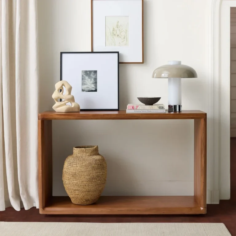
A rug under the dining table defines the dining zone. A larger rug under the living area furniture defines the living zone. The kitchen is anchored by the island or the cabinet line rather than by a rug. Three distinct rug choices (sometimes a hard floor in the kitchen, then jute under the dining table, then wool in the living area) handle most zoning without changing wall paint.
Lighting at different heights
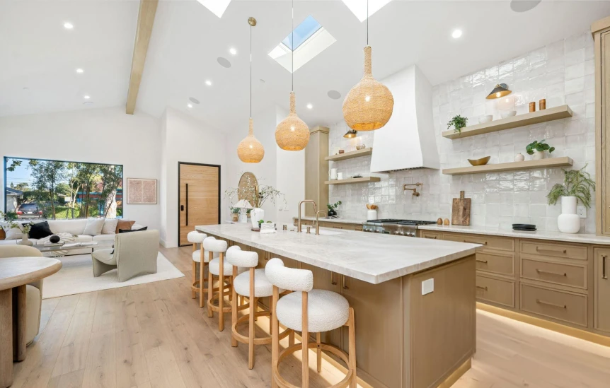
Pendant lights over the kitchen island, a chandelier or pendant over the dining table, floor lamps and table lamps in the living area. Each zone has its own light source at its own height. The eye reads three distinct light circles as three distinct rooms even when the wall paint is continuous.
Furniture arrangement
Furniture grouping defines zones independent of paint. A sectional sofa with its back facing the dining area creates a clear visual edge between living and dining. A console table behind the sofa adds another layer of separation. The living zone reads as distinct because the furniture says it is.
Flooring transitions
When the open plan includes a flooring transition (tile in the kitchen meeting wood in the dining and living), the floor material itself does the zoning. Paint can continue across the transition while the flooring change marks the kitchen as a different zone. This is the most architectural approach to open concept zoning.
When Should You Use More Than One Paint Color in an Open Plan?
The rule of single paint color across open plans has two real exceptions. Both involve architectural reason, not zone designation.
Wrapping a kitchen island wall or banquette
If the open plan has a built in banquette, a banquette wall, or a kitchen island that includes a back wall, painting that specific feature in a deeper color works because the architecture justifies it. The deeper color reads as integrated into the millwork rather than as a zone change. Iron Ore, Hale Navy, or Evergreen Fog on a banquette wall against Pale Oak everywhere else, for example.
Color drenching a side room that opens to the main space
If the open plan opens to a separate enclosed room (a study, a powder room, a butler pantry), drenching that smaller room in a deeper color works because the room has architectural definition. The transition between the open plan paint and the drenched room paint happens at a doorway, which gives the paint change a structural reason.
What does not work as an exception is painting the kitchen wall a different color from the living wall when both are in the same open volume. There is no architectural reason for the change, and the eye reads it as a zoning attempt.
Open Concept Paint Strategy Comparison
| Strategy | Works In Open Plans? | Architectural Reason | Best For |
|---|---|---|---|
| One paint color across all zones | Yes, default approach | Continuity matches the open volume | Most open concept layouts |
| Different paint per zone (kitchen, dining, living) | No, reads as zoning attempt | None, no walls to justify change | Avoid |
| Wrapped banquette or island back wall | Yes, in specific cases | Architectural feature | Modern kitchens with built in seating |
| Color drenched side room off open plan | Yes | Doorway justifies transition | Studies, powder rooms, butler pantries |
| Trim paint different from wall paint | Yes, conventional | Architectural detail | Any open plan |
What About the Ceiling and Trim in an Open Plan?
Ceilings and trim in open concept layouts follow the same continuity principle as walls. One ceiling color across the whole volume. One trim color across all zones. The temperature of both should match the wall family (warm white trim with warm greige walls, slightly cleaner warm white ceiling with the same warm greige walls).
For open plans with cathedral ceilings or sloped ceilings, the ceiling color matters more than in standard ceilings. A warm white like White Dove or Pointing reads as integrated. A pure bright white can read as the brightest surface in the room and pulls the eye upward. The full discussion of ceiling color decisions is in our guide to best white paint colors for modern interiors.
What Are the Common Open Concept Paint Mistakes?
Three patterns produce most of the open concept paint regret.
Painting each zone its own color
The default mistake. Kitchen white, dining greige, living slightly darker greige. Reads as paint specified by a list of rooms rather than by the actual open volume. The fix is one color across all zones, with materials doing the zoning.
Using a single accent wall to mark a zone
Painting a single wall in the living area a different color from the rest of the open plan is the open plan version of the dated accent wall. The wall has no architectural reason to be different. The full reasoning is in our guide to accent wall paint colors.
Choosing paint without considering all light conditions
Open plans usually have multiple window orientations. A paint that reads correctly in the south facing dining zone may read distinctly cool in the north facing kitchen zone. The fix is to choose a flexible paint (Pale Oak, White Dove, Agreeable Gray) and test it on every wall of the open volume before committing. The light orientation framework is in our guide to choosing paint colors for your light.
How Do You Handle Paint at the Stairs and Hallways?
Stairs and hallways adjacent to the open plan should typically carry the same wall paint as the main volume. The transition out of the open plan into a stairway or hall is not an architectural break significant enough to justify a paint change. Continuity reads as one home rather than as a series of paint specifications.
The exception is the second floor. Once you climb out of the open plan and enter a hallway that connects bedrooms (which often have their own paint colors), the second floor hallway can carry a different paint than the main floor. The stair landing is the natural transition. Below the landing, match the open plan. Above the landing, the second floor has its own rules.
For the broader paint conversation including the families that work across open plans, see the complete guide to modern paint colors. For the principles behind painting an entire small room one color (which is the open plan rule scaled down), see our color drenching guide.
Frequently Asked Questions
Should an open concept space have one paint color or multiple?
Open concept spaces work best with one paint color carried across all zones. The eye reads color changes between adjacent zones as architectural disagreement because there are no walls to justify the transition. Zone definition should come from materials (flooring, rugs, lighting) rather than from paint.
What is the best paint color for an open concept kitchen and living room?
The most reliable choices are Benjamin Moore Pale Oak (OC-20), Benjamin Moore White Dove (OC-17), Sherwin Williams Agreeable Gray (SW 7029), and Sherwin Williams Accessible Beige (SW 7036). All four hold their undertone across light orientations, which matters in open plans where the space often crosses multiple window exposures.
Can you paint the kitchen a different color from the living room in an open plan?
Generally no. Painting the kitchen wall a different color from the living wall reads as a zoning attempt rather than as architectural intent, because there is no wall between them to justify the change. The exceptions involve architectural features (a banquette back wall, a kitchen island wall) where the paint follows millwork rather than designates a zone.
How do you separate zones in an open plan without paint?
Use rugs to define dining and living areas, lighting at different heights to create distinct overhead anchors, furniture arrangement to create visual edges (a sectional with its back to the dining area), and flooring transitions where the architecture allows. All four work better than paint as zoning tools.
Should the ceiling be the same color in open concept layouts?
Yes, the ceiling should be one color across the entire open volume. A warm white like Benjamin Moore White Dove or Farrow and Ball Pointing reads as integrated with the wall family. Pure bright white ceilings against warm walls create a temperature mismatch and pull the eye upward, which is rarely the intent in an open plan.
The single paint principle is the most useful rule for open concept layouts and the one most often broken. Continuity through paint, definition through materials. If you take only one decision from this guide, make it the commitment to one wall color across the open volume. For the broader paint families that work in modern open plans, return to the complete guide to modern paint colors.