Mid-Century Modern Color Palettes and Patterns: How to Build the Right Scheme
By Tereza Hower | Published April 14, 2026 | Updated April 15, 2026
Color is one of the most recognizable and enjoyable aspects of mid-century modern design. The palette is specific enough to be distinctive but flexible enough to work across a wide range of rooms and personal preferences. Understanding how mid-century modern color actually works, which tones form the foundation, which accent colors are characteristic, and how pattern fits in, makes it much easier to build a scheme that feels coherent rather than assembled.
The Foundation: Warm Neutrals
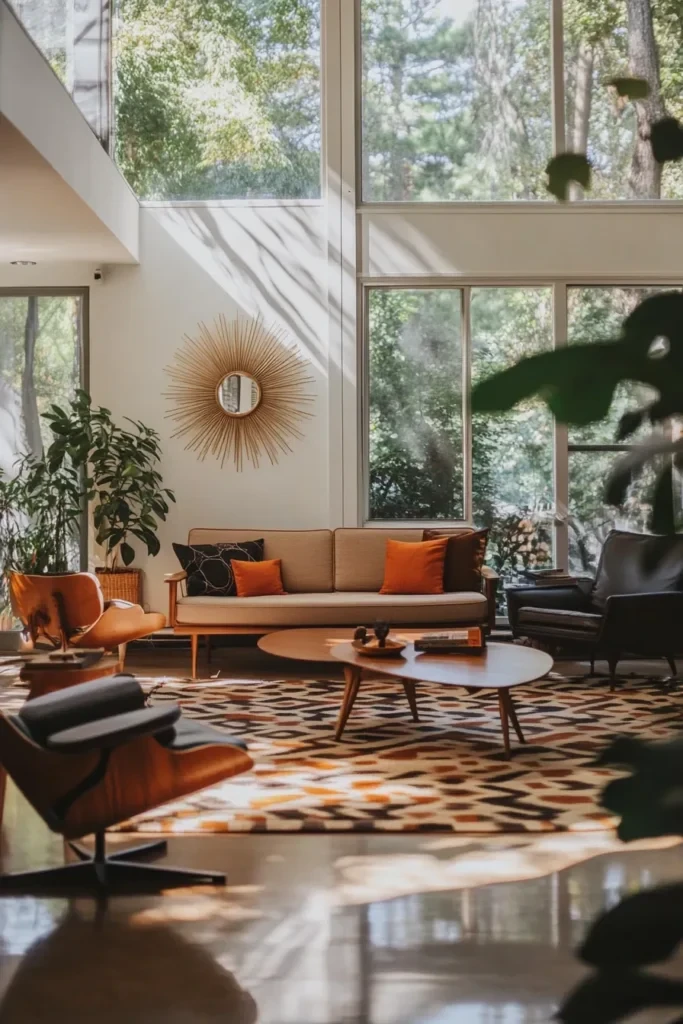
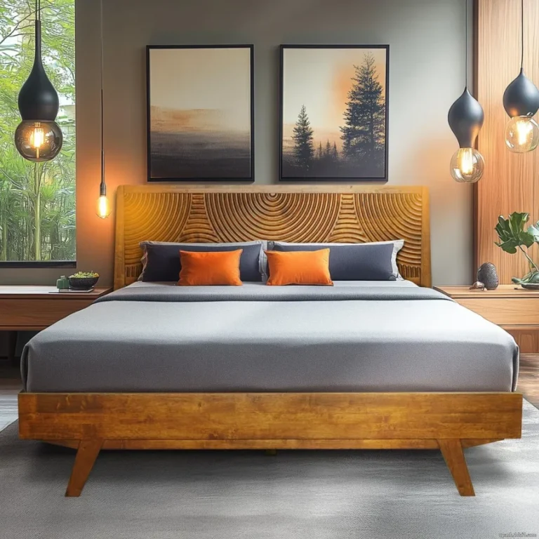
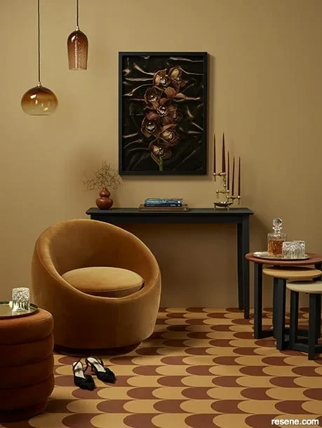
Mid-century modern rooms are typically built on a warm neutral base. This is the foundation that allows the furniture, the wood tones, and the accent colors to do the visual work without the walls and larger surfaces competing. Warm whites, creams, soft beiges, and warm greige tones all form this foundation effectively.
Why Warm Rather Than Cool
The emphasis on warmth is intentional. Mid-century modern furniture is predominantly built from walnut, teak, and other warm-toned woods. Cool gray or blue-white walls create a visual tension with these warm wood tones that works against the cohesion of the room. A warm neutral, even a very subtle one, creates a base that the wood tones read against naturally.
Testing Your Neutral
The same principles that apply to any paint color apply here: test the color in your specific light before committing. A warm white that looks perfect in a south-facing room with afternoon sun can read as yellow or orange in a north-facing room with cool indirect light. Always test samples at different times of day before making a final decision.
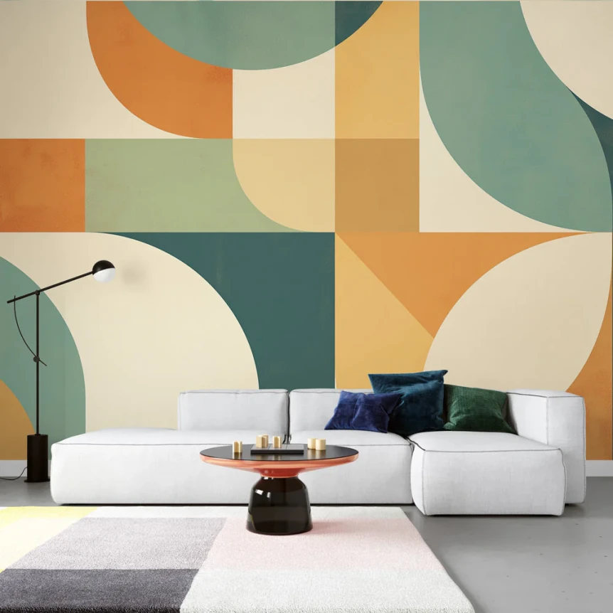
Characteristic Mid-Century Accent Colors
The accent colors of mid-century modern design are some of the most specific and recognizable in any interior design style. They were shaped by the optimism and graphic boldness of the postwar period and remain strongly associated with the aesthetic today.
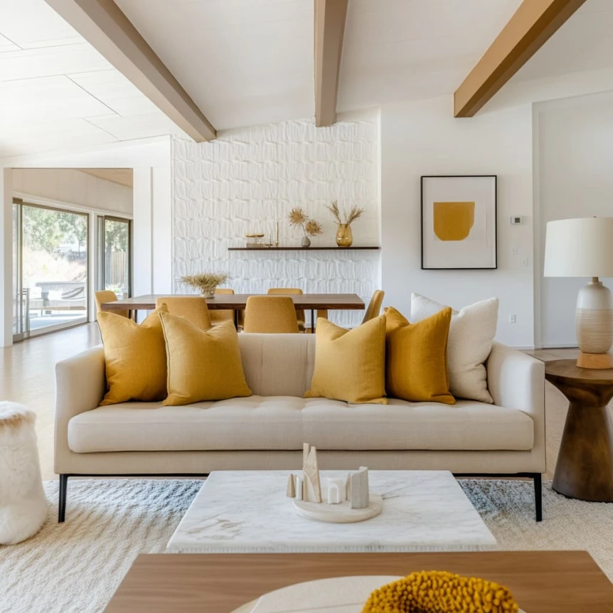
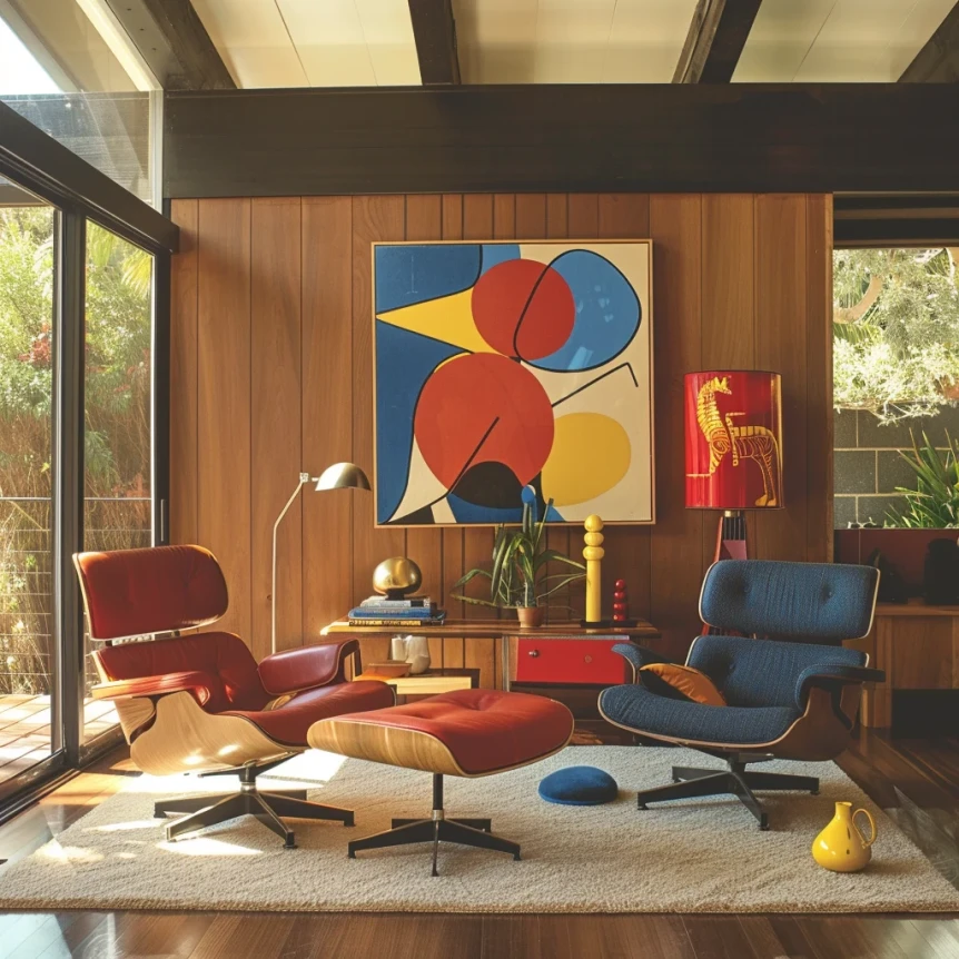
Mustard and Golden Yellow
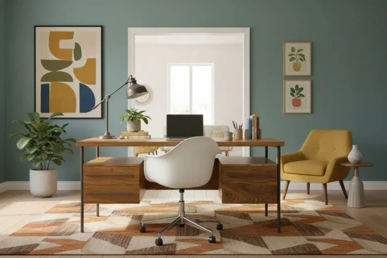
Mustard is perhaps the single most characteristic mid-century modern color. It appears in upholstery, cushions, rugs, and art throughout the period and remains one of the strongest choices for introducing mid-century character into a neutral room. It works particularly well with walnut furniture and warm white walls.
Burnt Orange and Terracotta
Warm oranges and terracottas were central to the mid-century palette and have seen a strong contemporary revival. They work well as upholstery colors, cushion accents, or even on a single accent wall behind a bed or credenza. They pair naturally with walnut and brass and create a warmth that cooler accent colors can’t match.
Teal and Peacock Blue
Deep teal and peacock blue provide contrast and visual depth in a mid-century modern room without the coolness of a true blue. They work best as upholstery colors on a lounge chair or sofa, where a single strong piece can anchor the palette for the room. Against warm white walls and walnut furniture, teal reads as sophisticated and considered rather than simply bold.
Avocado and Olive Green
Muted greens in the avocado and olive family are among the most characteristically mid-century colors available. They connect the interior to the natural world in keeping with the style’s founding principles and work well in both warm and cool-toned mid-century rooms. Olive and sage green have become particularly popular in contemporary interpretations of the style.
How to Use Accent Colors
The key to using mid-century modern accent colors well is restraint and repetition. Choose one or two accent colors for a room and let them appear in multiple places: in the sofa upholstery and echoed in a cushion or throw, in a rug and repeated in a piece of art or a ceramic object. This creates a sense of intention rather than accident.
Avoid using more than two accent colors in a single room. Mid-century modern at its best is edited, not maximalist. More than two accent colors starts to compete with the furniture forms that should be doing the visual work.
Pattern in Mid-Century Modern Design
Pattern in mid-century modern interiors is geometric, abstract, or atomic rather than representational or floral. It appears in rugs, cushions, upholstery fabrics, and occasionally wallpaper, though wallpaper is less central to the style than in other aesthetics.
Geometric Patterns
Geometric patterns, diamonds, chevrons, hexagons, and starburst forms, are the most characteristic mid-century modern patterns. They appear most often in rugs, where they anchor the seating area and introduce color and texture simultaneously. A geometric rug in warm tones is one of the single most effective ways to establish a mid-century modern aesthetic in a room.
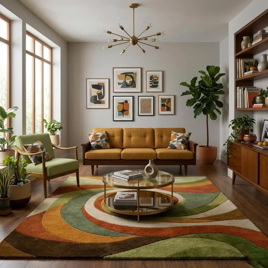
Abstract and Organic Patterns
Abstract patterns in fabric and art were popular throughout the mid-century period and continue to suit the style well. Biomorphic forms, freeform shapes that suggest natural objects without depicting them explicitly, appear in both fabric design and in the period’s abstract art. These patterns add visual interest without the rigidity of strictly geometric designs.
Where Pattern Works Best
Pattern in a mid-century modern room works best when it’s large-scale and used in one or two places rather than throughout. A large geometric rug, a patterned accent chair, or a statement piece of art are all appropriate applications. Avoid using pattern on too many surfaces simultaneously, where it will compete with the furniture forms rather than complementing them.
For how these color principles apply to specific rooms, see Mid-Century Modern Living Room Ideas and Mid-Century Modern Bedroom Ideas. For lighting that complements your palette, read Mid-Century Modern Lighting Ideas. For accessories that reinforce your color choices, see Mid-Century Modern Decor and Accessories. And for the full style guide, visit The Complete Guide to Mid-Century Modern Design.
Frequently Asked Questions
What are the most characteristic mid-century modern colors?
Mustard yellow, burnt orange, teal, avocado green, and warm brown are the most recognizable mid-century modern accent colors. They’re used against a warm neutral base of creams, warm whites, and soft beiges, with the natural wood tones of walnut and teak furniture providing the primary color foundation.
How many accent colors should a mid-century modern room have?
One or two accent colors is the right amount. Choose them intentionally and let them appear in multiple places in the room, so the palette feels considered rather than accidental. More than two accent colors starts to compete with the furniture forms and works against the visual calm that defines the style at its best.
What patterns are typical of mid-century modern design?
Geometric patterns (diamonds, chevrons, hexagons, starbursts) and abstract organic forms are the most characteristic. They appear in rugs, cushion fabrics, and upholstery rather than on walls. Avoid floral or representational patterns, which belong to different aesthetic traditions.
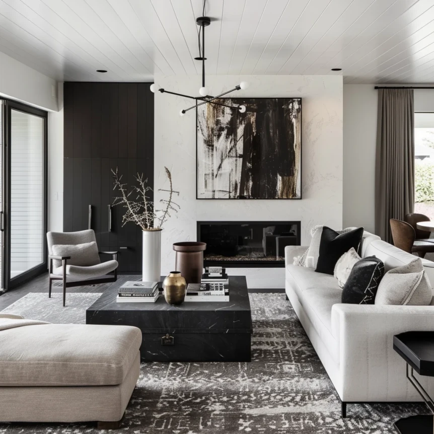
Can I use dark colors in a mid-century modern room?
Yes, particularly on a single accent wall or in upholstery. Deep teal, forest green, and near-black are all used in mid-century modern interiors when applied deliberately. The key is to balance dark elements with the warm wood tones and lighter walls that form the foundation of the palette, rather than applying dark colors throughout.
Build from Warm Neutrals Outward
The most reliable approach to mid-century modern color is to start with a warm neutral base, let the furniture’s wood tones establish the primary color story, and introduce one or two characteristic accent colors through upholstery, rugs, and accessories. This sequence produces cohesion almost automatically and leaves room for personal expression through the specific accent colors you choose.
For the complete style guide, return to The Complete Guide to Mid-Century Modern Design.