Minimalist Color Palettes for Every Room
By Tereza Hower | Published April 11, 2026 | Updated April 12, 2026
Color in minimalist design isn’t absent. It’s just disciplined. The right palette gives a minimalist room its calm, intentional feeling, while the wrong one can make it feel either sterile or unfocused. Choosing colors well is one of the most important decisions you’ll make, and unlike furniture or decor, paint and material colors are difficult to change once they’re in place.
This guide breaks down the most effective minimalist color palettes, explains how each one works, and gives practical advice on applying them in different rooms throughout your home.
How Minimalist Color Works
Most minimalist palettes are built around a small number of closely related tones. A dominant neutral covers the largest surfaces (walls, floors, larger furniture). A secondary tone adds gentle variation. One or two darker grounding elements provide contrast and visual weight. That’s usually it. The discipline of working within a tight palette is what creates the visual calm that defines the style.
For the broader principles behind minimalism, see our complete guide to minimalist interior design.
The Warm White Palette
Core Colors
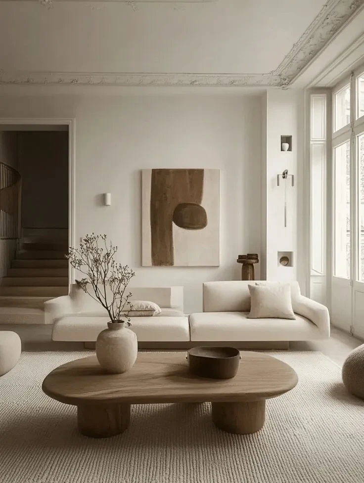
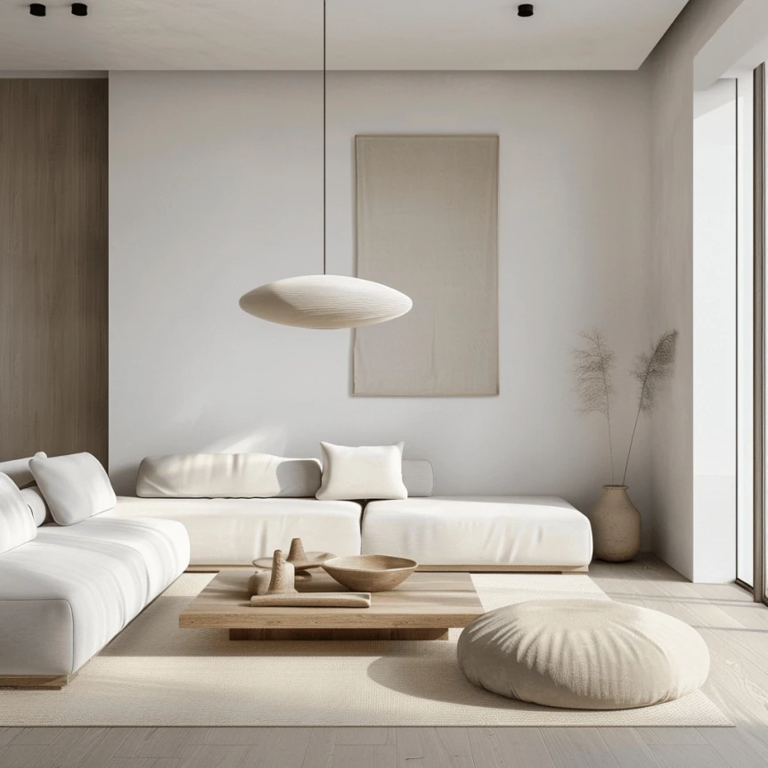
Warm white, soft cream, light beige, and natural wood. This is the most versatile and forgiving minimalist palette. It works in almost any room and feels both clean and inviting. The warm undertones prevent the space from feeling clinical, which is the most common problem with all white minimalism.
How to Apply It
Use warm white on walls (not pure cool white). Choose floors in light wood or warm tile. Furniture in cream or beige upholstery, with natural wood pieces for warmth. Add a single grounding element through a darker accent like a charcoal cushion or a black framed art piece.
Where It Works
This palette suits any room but is particularly effective in living rooms, bedrooms, and kitchens. It’s also ideal for smaller spaces because the light tones make rooms feel larger. For specific room applications, see our guides to minimalist living room ideas and minimalist bedroom design ideas.
The Cool Monochrome Palette
Core Colors
Pure white, light cool gray, charcoal, and matte black. This is the more traditional, gallery inspired version of minimalism. It’s graphic, slightly cooler, and creates strong visual contrast between light and dark elements.
How to Apply It
Walls in pure white or very light gray. Floors in light wood, polished concrete, or large format tile. Furniture in white, light gray, or black, with strong contrast between the lightest and darkest elements. The key is the play of light and shadow, which becomes the main visual interest.
Best Rooms For This Palette
Cool monochrome works in modern apartments, lofts, and homes with strong architectural features. It’s especially effective in spaces with abundant natural light, where the play of light on white surfaces creates atmosphere on its own. It can feel cold in rooms with limited natural light or where you want a cozier environment.
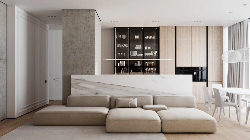
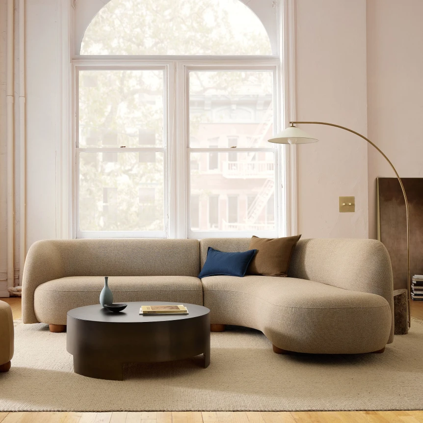
The Soft Neutral Palette
Core Colors
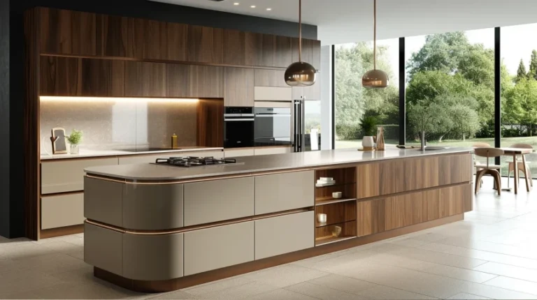
Warm greige, soft taupe, light stone, mushroom, and cream. This palette sits between warm white and cool monochrome, offering more depth than pure white but more warmth than gray. It’s currently one of the most popular minimalist palettes because it feels sophisticated without being either stark or overly warm.
How to Apply It
Use warm greige or soft taupe on the walls. Floors in medium wood tones or stone. Furniture in cream, mushroom, or light tan, with one darker grounding piece in deep charcoal or warm brown. The variations between different neutral tones create subtle interest without disrupting the calm.
When This Palette Excels
Soft neutrals work beautifully in living rooms, bedrooms, dining rooms, and home offices. They suit transitional spaces and create rooms that feel quietly sophisticated. They’re also forgiving with mixed lighting conditions, looking good throughout the day.
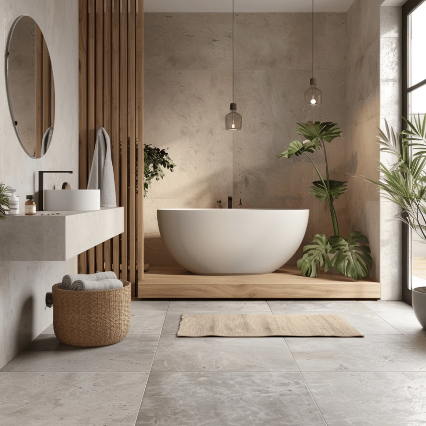
The Earthy Minimalist Palette
Core Colors
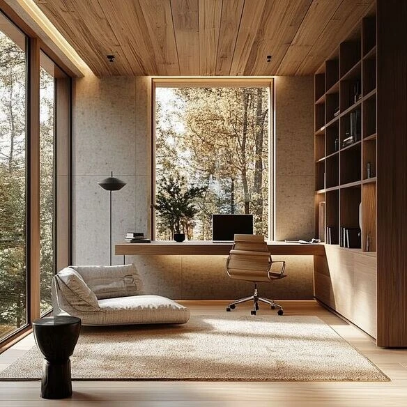
Warm beige, clay, soft terracotta, sage green, and natural wood. This palette pulls minimalism toward warmer, earthier territory. It maintains the discipline and restraint of minimalism but adds gentle natural color drawn from the landscape. It’s the foundation of warm minimalism.
How to Apply It
Walls in warm beige or soft cream. Floors in natural wood. Furniture in cream and beige with subtle clay or sage accents through cushions, ceramics, or art. The key is keeping the accent colors muted. A bright sage green will feel out of place. A dusty, muted sage will feel calm and natural.
Best Applications
Earthy minimalism works in living rooms, bedrooms, and spaces where you want a soft, nurturing atmosphere. It’s particularly effective in rooms with natural light and views to outdoor greenery, where the indoor palette echoes the natural world outside. For more on this approach, see our comparison of warm minimalism vs. modern minimalism.
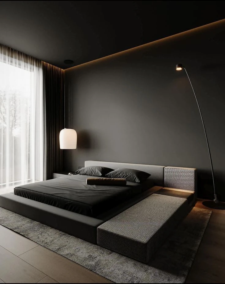
The Dramatic Dark Palette
Core Colors
Deep charcoal, matte black, dark walnut, soft cream, and warm white. This is minimalism turned moody. It uses a dark dominant color that creates an enveloping, intimate atmosphere while maintaining the disciplined simplicity of the style.
How to Apply It
Walls in deep charcoal or matte black. Floors in dark wood or polished concrete. Furniture in lighter tones to create contrast: cream upholstery, warm white textiles, light wood accents. Lighting becomes critical, since dark walls absorb light. Use multiple light sources at varied heights with warm bulbs.
When to Use This Palette
Dramatic dark minimalism works beautifully in libraries, home offices, dens, dining rooms, and bedrooms where you want an enveloping, cocoon like atmosphere. It’s not the right choice for every space, but it can be stunning in the right room.
How to Choose the Right Palette
Consider Your Light
Rooms with abundant natural light can handle cooler, lighter palettes that would feel sterile in darker spaces. North facing rooms or spaces with limited windows benefit from warmer palettes that compensate for the lack of sunlight.
Think About Function
Bedrooms generally call for softer, calmer palettes that support rest. Living rooms can handle more variety. Kitchens often work best with light, bright palettes that feel hygienic. Dramatic dark palettes work in spaces dedicated to focus or relaxation rather than active use.
Start With What You Have
If you already own quality furniture or have features you love (a particular wood floor, a stone fireplace, exposed brick), pull your palette from those existing elements. This grounds the palette in something tangible and ensures cohesion from the start.
Adding Accent Color
Minimalist palettes can include accent color, but the rules are strict. Limit accents to one or two muted tones. Apply them through small elements: a cushion, a piece of art, a single piece of furniture. The accent should feel like a quiet exception to the neutral palette, not a competing voice. Sage green, dusty rose, soft clay, and muted blue are all popular minimalist accent colors. For coordinating colors with furniture, see our minimalist furniture guide.
Common Color Mistakes
Cool Whites Without Warmth
Pure cool white walls, gray furniture, and no warm elements create rooms that feel like waiting areas. Always include warm tones somewhere, whether through wood, beige fabric, or a warmer wall color.
Too Many Tones
Even within the neutral family, using too many different shades creates visual noise. Stick to a tight range of three to four related tones rather than introducing five or six.
Forgetting Texture
Without color and pattern, texture carries the visual interest. A flat, smooth room with no textural variation feels lifeless regardless of how good the colors are. Mix smooth with rough, hard with soft, matte with subtle sheen.
Ignoring Undertones
Cool grays paired with warm beiges feel disjointed. Make sure your colors share consistent undertones (warm with warm, cool with cool) for a palette that feels harmonious. For decluttering tips that complement these palettes, see our guide on how to declutter for a minimalist home.
Conclusion
Minimalist color palettes are quiet but never boring. The discipline of working within a tight range of tones is what creates the visual calm that defines the style. Choose a palette that fits your light, your function, and your personal preference, lean warm to keep the room inviting, and let texture and material variation provide the interest that color alone can’t.
For the complete framework of minimalist design, visit our complete guide to minimalist interior design.
Frequently Asked Questions
What colors are used in minimalist design?
Minimalist palettes center on warm whites, soft creams, light grays, and natural wood tones. Some variations include warmer earth tones like beige and clay or moodier dark tones like charcoal and black. The key is using a tight, restrained range of three to four related tones rather than mixing many different colors.
Can a minimalist room be colorful?
Minimalist rooms can include color, but it should be used sparingly and intentionally. Limit accent colors to one or two muted tones applied through small elements like a cushion, a piece of art, or a single piece of furniture. Bold or saturated colors generally don’t fit minimalist design.
What is the best wall color for a minimalist home?
Warm white is the most versatile choice and the most forgiving. Soft cream, warm greige, and very light taupe also work beautifully. Avoid pure cool whites, which can make rooms feel clinical. The wall color should have a warm undertone to keep the space feeling inviting rather than sterile.
How do I make a minimalist palette feel warm?
Lean warm in your white and neutral choices. Add natural wood through floors, furniture, or shelving. Include tactile textiles in linen, wool, and cotton. Use warm white bulbs (2700K) in your lighting. Add at least one darker grounding element to create depth. These small changes prevent a minimalist palette from feeling cold.