Scandinavian Color Palettes for a Bright, Calm Home
By Tereza Hower | Published May 7, 2026 | Updated May 6, 2026
Color in Scandinavian design is all about light. The Nordic countries experience long, dark winters, and the style evolved partly in response to that reality. Bright, reflective palettes compensate for the lack of natural sunlight. Warm undertones prevent rooms from feeling cold. Soft accent colors add personality without disrupting the calm atmosphere.
Color was also the single biggest source of indecision for customers I worked with at Hower Furniture. People knew they wanted “Scandinavian” but couldn’t quite figure out what that meant for the actual paint chip on the wall or the throw on the sofa. This guide breaks down the most effective Scandinavian color palettes, explains how each one works, and gives practical advice on applying them in different rooms throughout your home. I’ll also share the specific mistakes I saw most often and the small adjustments that consistently made the biggest difference.
How Scandinavian Color Works
Most Scandinavian palettes are built around a light, warm foundation with gentle touches of muted color and at least one darker grounding element. The goal is to maximize brightness while keeping the room feeling warm and personal. Unlike minimalism, which can feel stark, or bohemian, which can feel busy, Scandinavian color sits in a sweet spot between the two.
The thing most people miss when they first try Scandinavian palettes is the importance of undertone. A “warm white” and a “cool white” can look identical on a paint chip but produce dramatically different rooms. The warm version creates the cozy feeling the style depends on. The cool version makes the same furniture and decor feel clinical. The undertone is what separates a Scandinavian room from a hospital waiting room with similar furniture.
For the broader principles behind the style, see our complete guide to Scandinavian interior design.
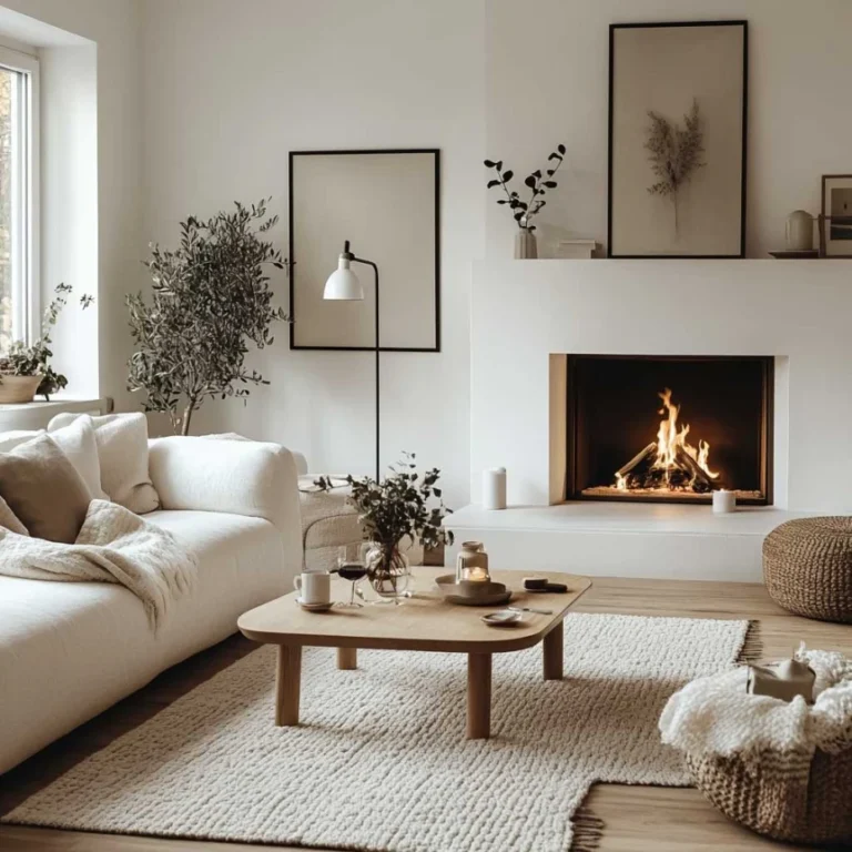
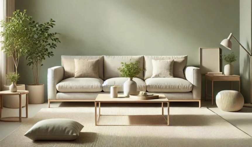
The Classic White and Wood Palette
Core Colors
Warm white, cream, light wood, and a single darker accent. This is the most recognizable Scandinavian palette. It’s bright, clean, and forgiving, working in nearly any room and with almost any style of furniture. It’s also the palette I recommended most often to customers who weren’t sure where to start, because it’s nearly impossible to get wrong as long as the undertones stay warm.
How to Apply It
Paint walls in a warm white rather than a stark cool white. Choose light wood floors (oak, ash, or birch) or a light toned rug if your floors are darker. Furniture in cream, white, or natural wood builds on the foundation. Add a single darker element, like a charcoal throw, a black framed mirror, or a dark wood accent piece, to prevent the room from feeling washed out.
Where It Works
This palette suits any room but is particularly effective in living rooms, bedrooms, and kitchens. It’s also forgiving in spaces with mixed lighting conditions. If your home has rooms that get very different amounts of natural light throughout the day, this palette holds up across all of them better than any other Scandinavian variation. For specific room applications, see our guides to Scandinavian living room ideas and Scandinavian bedroom ideas.
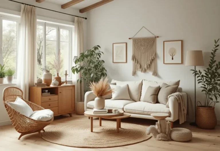
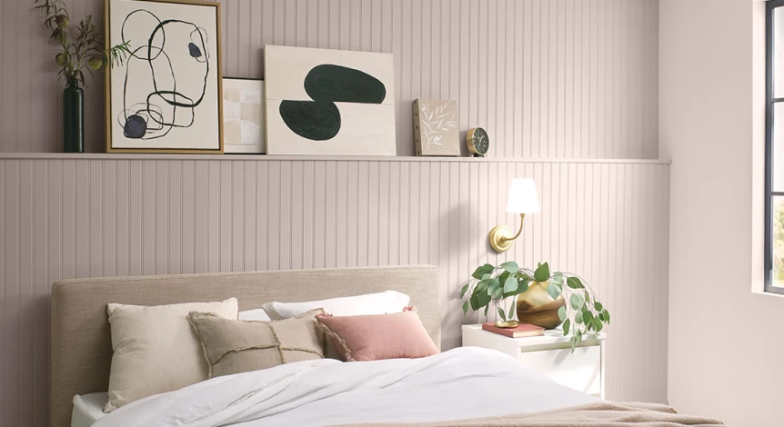
The Dusty Pink Palette
Core Colors
Warm white, light wood, dusty pink, soft gray, and brass accents. This palette adds a feminine warmth to the classic Scandinavian base. The pink is muted and sophisticated rather than sweet or childlike. Combined with brass, it creates a soft, inviting atmosphere. The trick with this palette is keeping the pink restrained. A few customers I worked with got excited about pink and went too far, ending up with rooms that felt more cottage than Scandinavian. The pink should whisper, not announce itself.
How to Apply It
Keep walls warm white and floors light. Introduce dusty pink through cushions, a throw, a rug, or an upholstered chair. Brass appears in hardware, lamps, or small decor items. Soft gray balances the warmth and adds subtle depth. One or two darker elements keep the room grounded. The 80/15/5 ratio works well here: 80 percent warm neutrals, 15 percent dusty pink and gray, 5 percent dark accent. Push the pink past 15 percent and the room starts shifting toward cottage or shabby chic territory.
Best Rooms for This Palette
Dusty pink works beautifully in bedrooms, living rooms, and reading nooks. It’s particularly effective in smaller spaces where you want warmth without overwhelming the room with color. It also works surprisingly well in home offices, where the soft warmth of the pink helps make the room feel less corporate.
The Muted Sage Palette
Core Colors
Warm white, light wood, muted sage green, soft cream, and natural linen. This palette pulls Scandinavian design toward nature with a gentle green tone that adds calm depth without feeling dramatic. Sage is one of the most versatile accent colors in Scandinavian design because it works with both warmer and cooler neutrals. It’s also the most forgiving green for people who say they “don’t do green” because it’s so muted that it reads almost as a neutral.
How to Apply It
Use warm white on walls. Introduce sage through cushions, a throw, a painted accent piece (like an island or a single cabinet), or a piece of art. Pair with light wood furniture and plenty of natural textiles. The goal is to let the sage add personality without dominating the room. If you want to go bolder, a single sage painted accent (a kitchen island, a built in shelf, an entry door) can work as a focal point as long as the rest of the room stays in neutral territory.
Where It Works
Muted sage works well in any room but particularly in kitchens, bedrooms, and home offices. It pairs beautifully with natural wood and creates a sense of calm that suits both active and restful spaces. Sage is also one of the few Scandinavian accent colors that works in bathrooms without feeling dated.
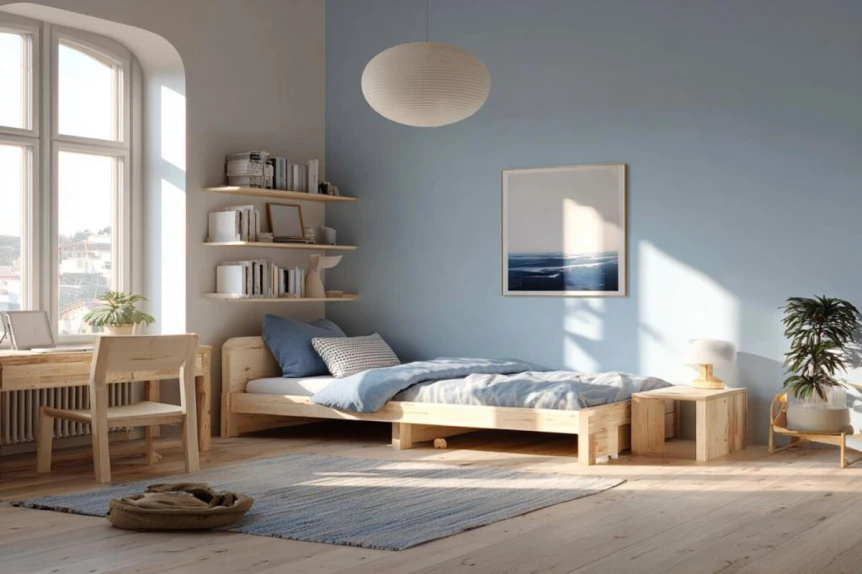
The Soft Blue Palette
Core Colors
Warm white, light wood, pale dusty blue, soft cream, and gentle gray. Blue has deep Nordic roots, evoking both sea and sky. A muted, chalky dusty blue adds serene color to a Scandinavian room without feeling cold or too traditional. The challenge with blue is choosing the right one. Many “Scandinavian blues” sold by paint companies trend too saturated or too gray. Look for chalky, slightly dusty blues with warm undertones. If a blue looks crisp and modern on the chip, it’s probably too saturated for this palette.
How to Apply It
Introduce the blue through textiles, a piece of furniture, or even a painted wall. The key is keeping the blue dusty and muted rather than bright or saturated. Pair with plenty of warm white and light wood to maintain the bright, welcoming atmosphere. A single blue painted wall behind a bed or in a reading nook works particularly well, as long as the surrounding walls stay warm white.
Best Applications
Soft blue palettes work beautifully in bathrooms, bedrooms, and kitchens. They bring a gentle, spa like quality to rooms where calm is especially important. Be cautious with blue in living rooms, though. The cooler tones can fight the warm gathering atmosphere a living room needs. If you do use blue in a living room, balance it heavily with warm wood and natural textiles.
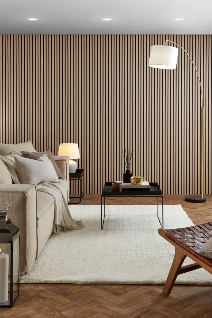
The Monochrome Palette
Core Colors
Warm white, soft gray, charcoal, black, and light wood. This is Scandinavian design in its most graphic form, with stronger contrast between light and dark elements. It leans toward minimalism but retains the warmth and comfort of Scandinavian style. This was the palette I had to talk customers out of most often. People assume more contrast means more sophisticated, but in Scandinavian design, the high contrast version is harder to make warm. It requires more attention to texture and lighting than any other palette to keep the room from feeling severe.
How to Apply It
Keep walls warm white for maximum light. Use soft gray on larger upholstered pieces. Add charcoal or black through a throw, a picture frame, or a piece of art. The key is ensuring warmth comes through despite the cooler tones, which means plenty of wood, tactile textiles, and warm lighting. The quickest way to ruin a monochrome Scandinavian room is to skimp on textiles. Without enough sheepskin, wool, and linen to add tactile warmth, the contrast between black and white starts reading as cold and modern rather than calm and Scandinavian.

When to Use This Palette
Monochrome suits modern apartments, lofts, and contemporary homes with strong architectural features. It’s less common in traditional Scandinavian homes but increasingly popular in urban settings. If you’re drawn to this palette, ask yourself honestly whether you’ll commit to the textile layering it requires. If not, choose one of the warmer palettes instead.
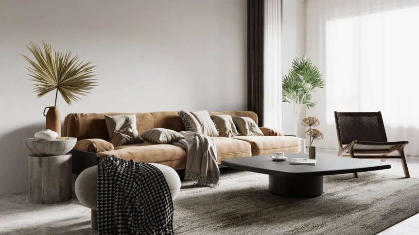
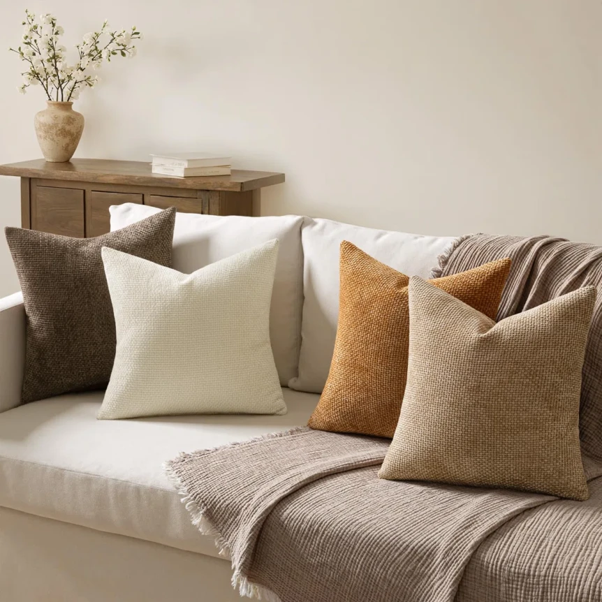
The Warm Earthy Palette
This palette pushes Scandinavian design toward warmer territory, adding earthy tones that feel grounding and cozy. It’s a newer variation that overlaps with warm minimalism and Japandi, and it’s been the fastest growing palette I saw customers gravitate toward in recent years. People who would have chosen the classic white and wood palette five years ago are increasingly choosing this warmer version instead.
Core Colors
Warm cream, soft beige, medium wood tones, terracotta, and muted mustard. The wood here can be slightly darker than in the classic palette, which adds to the cozier feeling.
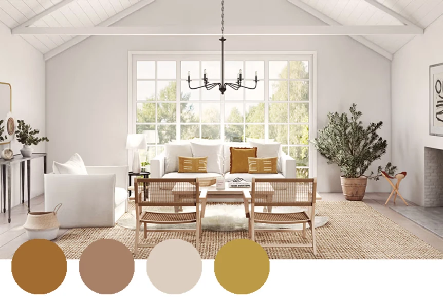
How to Apply It
Walls in warm cream or soft beige. Floors in medium wood tones. Furniture in cream or beige upholstery with terracotta or mustard accents through pillows and throws. Natural wood provides the backbone, and simple ceramics in earthy glazes add character. The earth tones work better as small accents than as large fields of color. A terracotta throw is beautiful. A terracotta sofa is a commitment most people regret within a few years.
Best Rooms for This Palette
Warm earthy palettes work beautifully in living rooms, dining rooms, and bedrooms where you want a cozy, nurturing atmosphere. They’re particularly effective in homes with limited natural light or in regions with long winters. They also age well, which matters in a palette you’ll live with for years.
How to Choose the Right Palette
This is the question I got most often, and the answer was almost always more practical than people expected. Here’s the framework I walked customers through.
Consider Your Light
Rooms with abundant natural light can handle slightly cooler palettes (though still with warm undertones). Rooms with limited natural light benefit from warmer palettes that compensate for the lack of sunlight. Face this honestly before choosing your colors. The biggest paint mistake I saw repeatedly was customers choosing a palette they liked in someone else’s bright, sunny home and applying it to their own darker apartment. The palette behaved completely differently in their light, and the result felt cold or muddy instead of bright and calm.
Think About Mood
Bedrooms generally call for softer, calmer palettes. Living rooms can handle more variety. Kitchens often work best with bright, cheerful palettes that make cooking feel welcoming. Match the palette to how you want the room to feel rather than to a Pinterest board you saw last week. The right palette for your home is the one that supports the mood you actually want, not the one that photographs best.
Start With One Element
If you already have a rug, a piece of furniture, or an art piece you love, pull your palette from that existing element. This ensures cohesion and prevents the room from feeling like it was assembled piece by piece without a plan. This was probably my single most common piece of advice. Customers came in wanting a “Scandinavian” room but already owned a sofa, a rug, or a painting they weren’t willing to give up. The smart move is always to build the palette around what you already love rather than fighting against it.
Test Before You Commit
Paint colors look different in your home than they do on the chip or in the showroom. Before painting an entire room, paint a large swatch (at least two feet by two feet) on the wall and live with it for a few days. See how it looks at morning, afternoon, and evening light. The right paint color for your room is the one that still looks right at all three times of day, not just one.
Adding Color Responsibly
Scandinavian design welcomes color more than minimalism or Japandi, but color is still used in a controlled way. Stick to one or two accent colors per room. Use them through textiles, art, or a single piece of furniture rather than everywhere at once. Keep colors muted rather than bright. The goal is to add personality without disrupting the calm atmosphere. The biggest color mistake I saw was using too many small accents in different colors. A green throw, a pink cushion, a yellow piece of art, and a blue vase don’t add up to “more personality.” They add up to visual chaos. One or two accent colors, repeated through multiple pieces, looks intentional. Five different accent colors looks like indecision. For more on furniture that complements these palettes, see our Scandinavian furniture guide.
Common Color Mistakes
Cool Whites
Pure cool white walls work against everything Scandinavian design is trying to create. Always choose warm whites with slight yellow, beige, or pink undertones. Test paint samples in your actual light before committing. This is the single most consequential color decision in any Scandinavian room. Get it right and everything else falls into place. Get it wrong and even the best furniture and styling can’t fix it.
Too Much Color
Even in Scandinavian design, which allows more color than minimalism, too much color creates visual noise. Stick to one or two accent colors per room. More than that starts to feel busy and dilutes the calm the style depends on.
Forgetting the Dark Element
A room that’s entirely light, with no darker grounding elements, can feel washed out. Include at least one dark accent, whether that’s a black picture frame, a dark wood piece, or a charcoal textile. The contrast is subtle but essential. Without it, the room feels like it’s floating, and the lighter elements lose their impact because nothing anchors them.
Bright or Saturated Colors
Bright red, bold turquoise, and saturated yellow don’t suit Scandinavian design. Keep colors muted and chalky. If you love brighter tones, consider a different style or use them very sparingly through a single small piece. The simplest test: if a color reads as “fun and energetic” on the swatch, it’s too saturated for Scandinavian. The right colors read as “calm and lived in.” For more on creating the right atmosphere, see our guide on what is hygge and how to bring it home.
Conclusion
Scandinavian color palettes are disciplined but not boring. They prioritize brightness, warmth, and subtle personality, balancing light and dark, color and neutral, in ways that create rooms you actually want to live in. Choose a palette that fits your light and mood, keep it consistent throughout connected spaces, and let natural materials and textures provide the visual interest that tight palettes sometimes miss. The customers who built the most successful Scandinavian homes were the ones who picked one palette and stuck with it across multiple rooms, rather than treating each room as an independent project. Cohesion across a home reads as more sophisticated than individual rooms styled in isolation, even if each individual room is beautiful on its own.
For the complete framework of Scandinavian design, visit our complete guide to Scandinavian interior design.
Frequently Asked Questions
What colors are used in Scandinavian design?
Warm whites, creams, and light wood tones form the base. Soft pastels like dusty pink, pale blue, muted sage, and light mustard appear as accents. A darker grounding element like charcoal or black adds depth. All colors tend to be muted and gentle rather than bright or saturated.
Can Scandinavian design be colorful?
Yes, more so than minimalism or Japandi. Scandinavian design welcomes soft, muted colors applied through textiles, art, and accent pieces. However, colors should be gentle and limited to one or two per room. Bright or saturated colors generally don’t fit the style.
What white paint is best for a Scandinavian home?
Choose a warm white rather than a cool or pure white. Look for whites with slight yellow, beige, or pink undertones that support the cozy atmosphere the style is built on. Test paint samples in your actual light before committing. Pure cool whites work against the warmth Scandinavian design aims to create.
How do I keep a Scandinavian palette from feeling boring?
Use texture and material variation to add interest. Include a single accent color through textiles or art. Add at least one darker grounding element for depth. Incorporate natural wood in varying tones. Add plants and candles for life and warmth. The richness in Scandinavian design comes from material and textural layers, not from bold color.