Best Scandinavian Paint Colors: 12 Worth Buying

By Tereza Hower | Published September 7, 2026 | Updated October 12, 2026
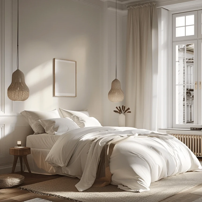
Most people shopping for Scandinavian paint colors walk out of the store with the wrong white. Not a bad white, just a cool one, chosen because it looked cleanest on the chip under fluorescent light. On the wall of a north facing living room it turns the color of skim milk, and the oak floor and the linen sofa that were supposed to look Nordic start looking like a waiting room.
This is the buying list. The Scandinavian color palettes guide explains the six palettes and how they behave in a room; this guide names the twelve cans worth paying for, by brand and code, and what each should cost.
At a Glance
- Three warm whites do most of the work in a Scandinavian home, and White Dove is the one to reach for when you need a single answer.
- A warm greige beats a white in any room that faces north or has only one window.
- Accent colors should be chalky and muted, never crisp, and one per room is enough.
- Every room needs one dark anchor, which is where a near black paint on a door or a piece of trim earns its keep.
- Spend on sample pots first and on the designer line only where the finish is the point.
The Twelve Scandinavian Paint Colors Compared
The twelve colors below run from lightest to darkest. LRV is the manufacturer’s published light reflectance value, rounded; the higher it is, the more light the wall bounces back into the room.
| Color | Brand and code | Undertone | LRV | Best light | Price tier |
|---|---|---|---|---|---|
| White Dove | Benjamin Moore OC-17 | Soft warm, faint gray | 85 | Any orientation | Mid |
| Alabaster | Sherwin Williams SW 7008 | Warm, slightly creamy | 82 | Any orientation | Mid |
| Pointing | Farrow & Ball No. 2003 | Warm, red based | 82 | North facing | Designer |
| Borrowed Light | Farrow & Ball No. 235 | Pale chalky blue | 73 | South facing | Designer |
| Pale Oak | Benjamin Moore OC-20 | Warm greige, oat | 69 | North facing | Mid |
| Edgecomb Gray | Benjamin Moore HC-173 | Warm greige, beige | 63 | Any orientation | Mid |
| Setting Plaster | Farrow & Ball No. 231 | Dusty plaster pink | 63 | North facing | Designer |
| Skimming Stone | Farrow & Ball No. 241 | Warm stone gray | 62 | Any orientation | Designer |
| Accessible Beige | Sherwin Williams SW 7036 | Warm beige, gray | 58 | Low light rooms | Mid |
| Evergreen Fog | Sherwin Williams SW 9130 | Muted gray green | 30 | East and south facing | Mid |
| Chelsea Gray | Benjamin Moore HC-168 | Warm charcoal | 22 | Bright rooms only | Mid |
| Railings | Farrow & Ball No. 31 | Soft blue black | 4 | Trim, doors, one wall | Designer |
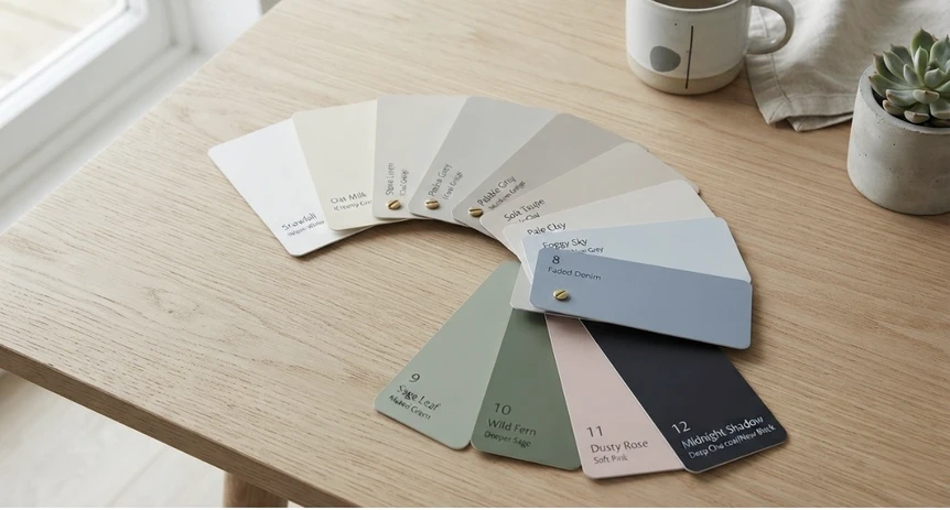
Which Scandinavian Paint Colors Should You Start With?
Start with a warm white, because that is the wall color in four of the six Scandinavian palettes and the backdrop every other color here is judged against. A warm white has a little yellow, red, or gray in the base, which is what keeps it from going blue in northern light.
White Dove by Benjamin Moore (OC-17)
If you need a single white, White Dove is the safest default. It carries a soft gray warmth that reads as white next to pale oak and as slightly creamy next to a pure white ceiling, which is exactly the range a Scandinavian room wants. It holds steady from morning to evening and looks correct with both black metal and brass.
Alabaster by Sherwin Williams (SW 7008)
Alabaster is the closest match to White Dove in the Sherwin Williams range, a touch creamier and a touch softer. Choose it when the room already has a lot of warm wood, since the extra cream keeps oak floors and birch furniture from looking orange.
Pointing by Farrow & Ball (No. 2003)
Pointing is the warmest of the three, with a red based undertone that turns north light from gray to gentle. It is the white to buy for a north facing bedroom or a living room with a single window; in a bright south facing room it can drift toward cream. Whether Pointing suits a living room depends on its light, which is how the best living room colors are sorted, along with price.
The Scandinavian living room guide shows how these whites behave once furniture and textiles go in.
The Warm Greiges That Beat White in Dark Rooms
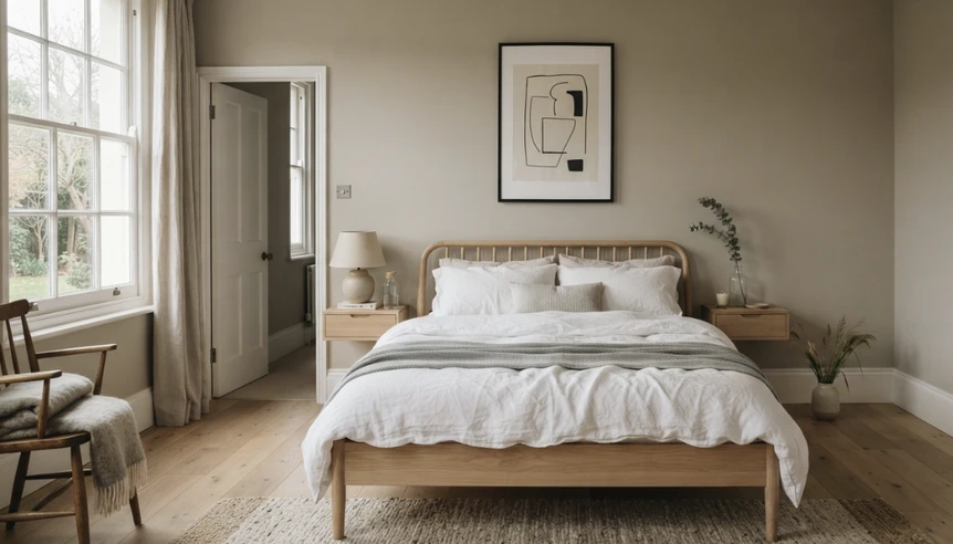
A warm greige is a gray with enough beige or oat in it to read warm on the wall. In a room that faces north, or has only one window, a greige does the job a white was supposed to do: it looks light without looking cold.
Pale Oak by Benjamin Moore (OC-20)
Pale Oak is the wall color behind the warm earthy palette and the greige to buy first if you only try one. It reads gray against warm wood, beige against cool wood, and faintly pink late in the day. Pair it with terracotta textiles and walnut furniture and the room lands in Scandinavian territory without a single white surface.
Edgecomb Gray by Benjamin Moore (HC-173)
Edgecomb Gray sits a shade deeper than Pale Oak with a little more beige, which makes it the safer choice in a room with strong afternoon sun. It works in hallways and stairwells that connect rooms painted in White Dove, because the two share an undertone and read as one family from a doorway.
Skimming Stone by Farrow & Ball (No. 241)
Skimming Stone is a stone gray with a warm base, the greige to choose when the room leans toward the monochrome palette but needs to stay soft. It pairs naturally with Railings on a door or window frame and with pale ash furniture.
Accessible Beige by Sherwin Williams (SW 7036)
Accessible Beige is the warmest and deepest of the four, and it belongs in an entry hall or a windowless corridor where a paler greige would go muddy. Keep it to rooms with little natural light; in a bright room it looks heavier than a Scandinavian scheme wants.
Which Accent Colors Belong in a Scandinavian Home?
Accent colors in this style are chalky, dusty, and quiet; if a chip reads as fun or energetic, it is too saturated. The three below each anchor one of the palettes in the companion guide, and each is meant for a single wall, a run of joinery, or one room rather than the whole floor.
Setting Plaster by Farrow & Ball (No. 231)
Setting Plaster is the dusty pink the whole palette is named for, a plaster tone with more brown than pink in it. It is warm enough to hold a north facing bedroom on its own and grown up enough for a home office. Pair it with brass and light oak, and keep the textiles in cream and soft gray so the pink stays a whisper.
Evergreen Fog by Sherwin Williams (SW 9130)
Evergreen Fog is a gray green that reads as sage in daylight and as a soft neutral in the evening, which makes it the most forgiving green in the range. It is the right pick for a kitchen island, a run of cabinets, or a bathroom wall. The Scandinavian kitchen guide shows how a painted island sits against white walls and pale wood.
Borrowed Light by Farrow & Ball (No. 235)
Borrowed Light is a pale blue with enough chalk in it to stay Nordic rather than coastal. Use it behind a bed or in a bathroom that faces south, where the sun keeps it from going cold. In a north facing living room the blue and the gray light compound each other.
The Scandinavian bedroom guide shows all three accents in the room where a soft color earns the most.
The Dark Anchors Every Room Needs
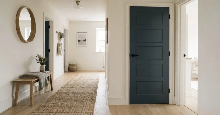
A Scandinavian room that is all light surfaces floats. The fix is a single dark element, and paint is the cheapest way to add one: a front door, the inside of a bookcase, a window frame, or one short wall.
Chelsea Gray by Benjamin Moore (HC-168)
Chelsea Gray is the warm charcoal at the center of the monochrome palette, deep enough to anchor a room and warm enough to avoid the flat, cold gray that dated so many homes. It is a whole wall color only in bright rooms; elsewhere it belongs on a door, a fireplace surround, or a single built in.
Railings by Farrow & Ball (No. 31)
Railings is the near black, a soft blue black that reads as charcoal in daylight and as black at night. It is the right choice for window frames, a staircase, or interior doors against White Dove walls, and it is gentler than a true black next to pale wood. Buy it in the trim finish rather than the flat wall finish, since doors take fingerprints.
How Much Should You Pay for a Gallon?
Interior paint sells in three tiers, and the gap between them is wider than most people expect. Treat the bands below as context rather than a quote.
- Budget lines, roughly $25 to $45 a gallon. Store brand and contractor grade paint. Fine for a ceiling or a rental you will repaint, but the colors above are not available in these lines, and the color match a store mixes from a chip is rarely close enough.
- Mid tier, roughly $55 to $95 a gallon. The standard premium interior lines from Benjamin Moore and Sherwin Williams. This is where eight of the twelve colors in this guide live, and it is the tier to buy for walls in most rooms.
- Designer lines, roughly $110 to $150 a gallon. Farrow & Ball and a handful of similar makers. The pigment load is higher and the finish is chalkier and more matte, which is a large part of why those colors look the way they do in photographs.
The designer line is worth it in two situations. The first is when the color itself is the point, as with Setting Plaster or Railings, because a mid tier match mixed from the chip loses the depth that made you choose it. The second is a small, high impact surface such as a front door or one accent wall, where the extra cost is a gallon, not five. For a full living room in White Dove or Pale Oak, the mid tier is the right call.
How to Tell Quality Paint from Cheap Paint
The can looks the same at every price, so the differences show up on the wall over the following year. Four things separate a paint worth buying from a bargain.
Coverage. Quality paint covers a similar shade in two coats and a strong color change in three. Cheap paint carries less pigment and more filler, so it takes an extra coat, and the labor for that coat costs more than the money saved on the can.
Sheen options. A good line offers a true matte, a washable eggshell, and a satin or trim finish. Scandinavian rooms want the flattest finish the wall can tolerate, since a matte white reads as plaster and a shiny one reads as plastic. Budget lines often skip the matte or offer one that scuffs the first time a chair back touches it.
Touch up behavior. This is the difference nobody notices until year two. Quality matte paint accepts a touch up that disappears; cheap paint flashes, leaving a patch in a slightly different sheen from the wall around it.
Low VOC. Low or zero VOC formulas smell less and cure cleaner, and they are standard in the mid and designer tiers. A strong solvent smell from the can means old stock or a cheap line, and neither belongs in a bedroom.
What Most People Get Wrong
The most common mistake is choosing a white in the store. Chips are viewed under cool fluorescent light against other chips, and the coolest, cleanest white always wins that contest. On a wall facing away from the sun, that same white is the reason a room feels cold and nobody can work out why.
The second is buying the accent color first. A dusty pink or a sage chosen before the white is settled will fight it, because the undertones were never matched. Choose the white, then the greige, then the accent, and check each against the same white in the same light.
The third is skipping the dark anchor. People chase brightness, leave the room with nothing to ground it, and then buy a black floor lamp to compensate. A single door in Railings does the same job more quietly and costs less than the lamp.
The fourth is treating trim as an afterthought. In a Scandinavian room the trim is the same white as the wall or the near black, never a bright factory white. A brilliant white baseboard against a warm white wall makes the wall look dirty.
What Order Should You Buy In?
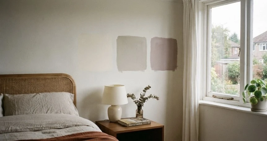
Sample pots first, always. One of the questions I always asked customers was “where will this live, and what will it do?” and it applies to paint as much as to furniture: a color that cannot answer that for a specific wall in a specific light does not belong on it yet. Paint a square at least two feet across on every wall that will carry the color, and look at it in the morning, at midday, and by lamplight.
Then buy in this order: the wall white for the main rooms first, because everything else is judged against it. The greige for the north facing or single window rooms comes second, the accent color for one room third. The dark anchor comes last, and only after you know which door or frame will carry it.
Buy the mid tier for the large surfaces and the designer line for the small, high impact ones. Keep the leftover of each can labeled with the room name for the touch up in year two.
Where to Go Next
Twelve colors is a short list on purpose, with a combination in it for every room and orientation in a Scandinavian home. Pick the white, sample it honestly, and let the rest follow.
For how these colors sit alongside pale wood and natural textiles, the Scandinavian furniture guide picks up where the paint leaves off. For the principles behind all of it, start with the complete guide to Scandinavian interior design, and if it is the feeling of the room you are chasing rather than the color, read what hygge is and how to bring it home.
Frequently Asked Questions
What is the best white paint for a Scandinavian home?
White Dove by Benjamin Moore (OC-17) is the safest single answer. It is a warm white with a soft gray undertone that stays white next to pale oak, holds steady in mixed light, and works with black metal or brass. Alabaster by Sherwin Williams is the closest equivalent, and Pointing by Farrow and Ball is the warmer choice for a north facing room.
Should Scandinavian walls be white or greige?
White in rooms with good daylight, greige in rooms that face north or have a single window. A warm greige such as Pale Oak or Edgecomb Gray reads as light without going cold, which is the job a white fails at in low light. Keep the two in the same undertone family so connected rooms read as one house.
Is Farrow and Ball worth the price for Scandinavian paint colors?
For the accents and the dark anchor, usually yes, because the pigment depth and chalky matte finish are the reason those colors look the way they do. For a whole room of warm white or greige, the mid tier lines from Benjamin Moore or Sherwin Williams cover better per dollar and the color is native to the brand rather than a store match.
Which paint finish suits Scandinavian interiors best?
The flattest finish the surface can tolerate. Matte or flat on walls reads as plaster and suits the style; eggshell in kitchens, bathrooms, and hallways where walls get wiped; satin or the manufacturer’s trim finish on doors and window frames. Avoid high gloss anywhere except a deliberately lacquered piece.
How many sample pots should I buy before painting?
One pot for each color you are seriously considering, applied as a square at least two feet across on every wall that will carry it. Check each square in the morning, at midday, and under lamplight before deciding. The cost of four sample pots is a fraction of repainting a room in a white that turned cold.