Color Palette for Interior Design: 7 Paints That Work

By Tereza Hower | Published November 13, 2026
Most palettes fall apart at the paint counter, not on the mood board. Someone arrives with five lovely chips, buys them one room at a time, and ends up with a house where the hallway argues with the kitchen. A color palette for interior design is not a collection of favorite colors. It is a short list of paints that were chosen to sit next to each other, each with a job.
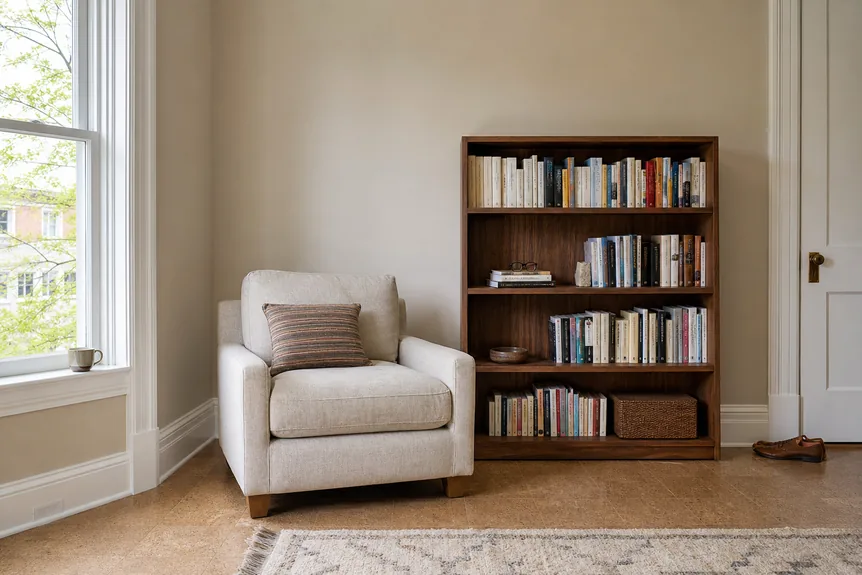
This guide builds one complete palette from seven real paints, all from a single fan deck so every sample can be collected in one trip. Each paint is listed with its light reflectance value as the maker publishes it, its undertone, and the surface it belongs on. The method works with any seven paints. The list simply shows what a finished answer looks like.
Key Takeaways
- A whole house needs five to seven paints: one trim white, one wall white, two neutrals, one color, and one or two darks.
- Undertone, not hue, decides whether two paints agree, so every paint in a palette should lean the same way.
- Light reflectance value tells you how a paint behaves in a dim room before a single sample goes on the wall.
- The 60-30-10 split assigns each paint a share of the room and stops the accent from taking over.
- Sample boards moved around the house for two days catch the mistakes a chip under store lighting hides.
What Is a Color Palette for Interior Design?
A color palette for interior design is a fixed set of five to seven paint colors used across a whole home, each assigned to a surface: walls, trim, ceilings, cabinetry, doors, and one or two accents. The colors share an undertone and step evenly from light to dark, which is why rooms painted from the same palette look related even when they are different colors.
Two terms carry most of the weight. Light reflectance value, or LRV, is the percentage of light a painted surface reflects, on a scale where 0 is absolute black and 100 is pure white. Undertone is the quieter color sitting underneath the obvious one: the yellow in a warm white, the green in a gray, the red in a brown.
A palette is also a restriction, and that is its value. With seven paints decided in advance, the question in every room stops being “what color?” and becomes “which of the seven?”. That question has an answer.
The Seven Paint Palette
These seven come from one maker’s range and lean gently warm, which suits the oak floors, linen, and walnut found in most modern homes. The LRV figures are the ones the manufacturer lists for each color. The hex values are screen approximations for reference only, since no monitor shows paint accurately.
| Color | Maker | LRV | Undertone | Hex (approximate) | Use it for |
|---|---|---|---|---|---|
| Simply White OC-117 | Benjamin Moore | 89.52 | Clean, faint warmth | #F6F5EC | Trim, ceilings, doors |
| White Dove OC-17 | Benjamin Moore | 83.16 | Soft warm | #EFEEE5 | Main walls in bright rooms |
| Pale Oak OC-20 | Benjamin Moore | 68.64 | Warm gray | #DDD6CA | Main walls in dim rooms, bedrooms |
| Revere Pewter HC-172 | Benjamin Moore | 55.05 | Between warm and cool | #CBC6B8 | Halls, open plan living areas |
| October Mist 1495 | Benjamin Moore | 46.54 | Sage, gray green | #B7B9A5 | The one color: a study, a bedroom, cabinets |
| Hale Navy HC-154 | Benjamin Moore | 8.36 | Deep blue, slightly gray | #434C56 | Island, built ins, a powder room |
| Wrought Iron 2124-10 | Benjamin Moore | 8.17 | Soft black | #4A4B4D | Interior doors, window frames, railings |
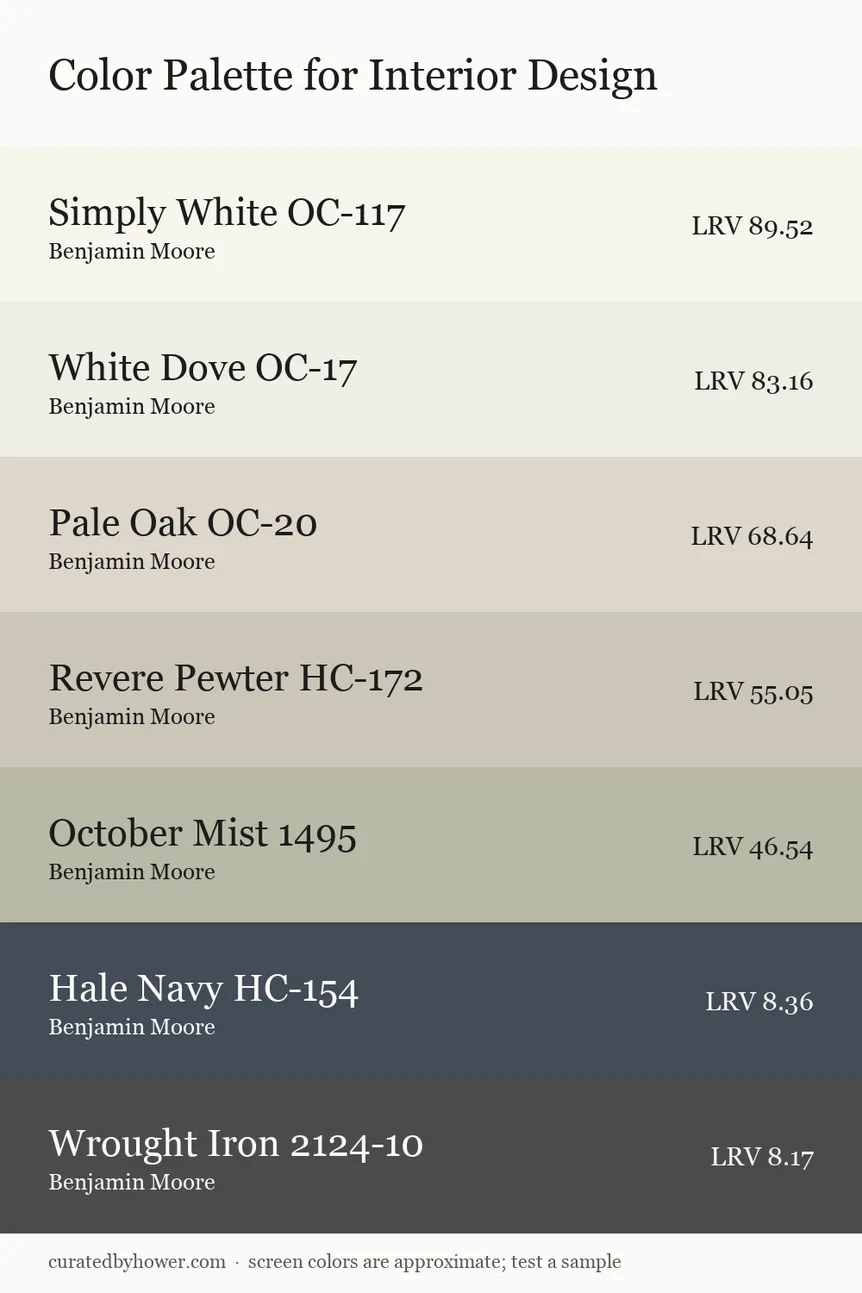
Read the LRV column from top to bottom and the logic shows. The steps run from about 90 down to 8 with no two wall colors closer than twelve points, so every paint is visibly different from its neighbor. The two darks sit almost level on purpose: one is blue and one is neutral, and they are never used on the same piece.
The maker describes Revere Pewter as a bridge between warm and cool tones, and that is its role here. It is the paint that lets a warm white room open onto a navy island without a jolt. Swap any paint for one you prefer, but keep its LRV within five points of the one it replaces and keep the undertone leaning the same way.
How Do Seven Paints Divide Across a House?
The 60-30-10 rule is the oldest proportion in decorating and still the most useful. Sixty percent of what the eye sees in a room is the dominant color, thirty percent is a secondary, and ten percent is the accent. In paint terms the walls are the sixty, the trim, ceiling, and large furniture are the thirty, and one door, island, or alcove is the ten.
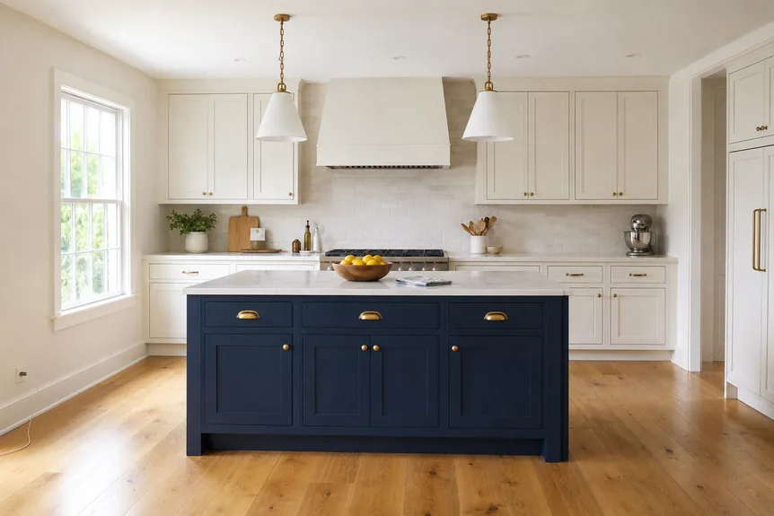
Applied to the seven, the split looks like this in practice:
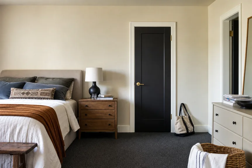
- Every room: Simply White on trim and ceilings. One trim color through the whole house is the single strongest thread a palette has.
- Bright main rooms: White Dove on the walls, with Wrought Iron on the interior doors as the ten.
- Dim rooms and bedrooms: Pale Oak on the walls. It holds its warmth where a white would turn flat.
- Halls and connecting spaces: Revere Pewter, because it has to agree with every room that opens off it.
- One room with a door that closes: October Mist on all four walls. A study or a guest bedroom is the right size for the one color.
- One fixed piece: Hale Navy on the island or the built ins, and nowhere else on that floor.
Open plan homes need more care, because three rooms share one sightline and the sixty has to stay constant through all of them. Our guide to paint color combinations for open concept homes covers where one color can stop and the next can start when there is no doorway to hide the join.
Why Does Undertone Decide Whether a Palette Works?
Two paints can be the same depth and still fight, and undertone is almost always the reason. A gray with a green undertone beside a gray with a violet one makes both look dirty. Neither is a bad color. They simply lean in opposite directions, and the eye reads the disagreement before it reads either paint.
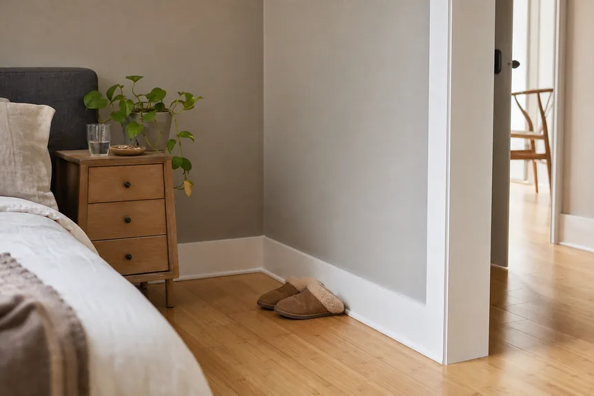
The quickest test costs nothing. Hold the chip against a sheet of plain printer paper, which is a cool, bright white, and the undertone steps forward: the chip will suddenly look yellow, pink, green, or blue by comparison. Do the same with every candidate and keep only the ones that lean the same way.
Fixed finishes set the direction before any paint is chosen. Red oak floors, honey toned cabinets, and beige stone all push warm, and a cool gray on the wall above them will look like a mistake. Cool finishes such as white marble, chrome, and blue gray tile ask for the opposite. The palette above leans warm because most houses do, and the warm earthy paint colors guide goes further in that direction for anyone who wants clay and ochre in place of sage.
What LRV Should Walls, Trim, and Accents Have?
LRV is the most practical number on a paint chip and the one most buyers skip. It predicts how much of a room’s light a wall will hand back, which matters far more in a north facing bedroom than in a sunroom. These bands are a working guide, not a law:
- 82 and above: reads as white. Use for trim, ceilings, and walls in rooms with strong daylight.
- 60 to 75: light neutrals that still look like a color. The safest band for dim rooms.
- 40 to 60: mid tones. They need either good daylight or a deliberate decision to make the room feel enclosed.
- Below 15: darks. Best on things, not rooms: a door, an island, a bookcase.
The gap matters as much as the number. Trim and wall need at least ten points between them or the trim disappears, which is why Simply White at 89.52 sits cleanly against Pale Oak at 68.64 and only just separates from White Dove at 83.16. That close pairing is deliberate. White walls with slightly whiter trim give a room a soft edge instead of an outline.
Sheen changes the reading too. The same paint looks lighter and cooler in semi gloss than in matte, so trim in a higher sheen will separate from the wall even when both are the same color. Choosing by room matters here as well, and the best living room colors guide works through the picks for the room most people paint first.
Adapting the Palette to a Style
The seven are a neutral starting point. A named style mostly changes two slots: the one color and the darks. The whites and the two neutrals carry over with little adjustment.
- Scandinavian: drop the navy, keep the whites high, and let pale wood be the secondary. The Scandinavian color palettes guide has six worked versions.
- Japandi: pull every neutral a step darker and earthier, and trade sage for a muted clay. See the Japandi color palettes that set that tone.
- Minimalist: cut the list to four paints and let texture do the work of the missing colors, as the minimalist color palettes guide lays out room by room.
- Bohemian: keep the warm whites and spend the accent budget on terracotta, mustard, or deep teal. The boho color palettes guide shows how much is enough.
- Industrial: lead with the darks and let brick, steel, and concrete count as colors in the split. The industrial color palette guide pairs each paint with a material.
What should not change is the structure. Whatever the style, the list still needs a trim white, a wall color for bright rooms, one for dim rooms, a connector, and a dark. A palette missing one of those roles sends its owner back to the paint counter mid project, which is where mismatched houses begin.
Common Mistakes That Break a Palette
Most failed palettes fail in one of five ways, and all five are cheaper to avoid than to repaint.
- Choosing room by room. Each choice looks fine alone. Together they share no undertone and no trim color, and the house reads as several apartments.
- Mixing warm and cool whites. A cool white ceiling over warm white walls makes the walls look yellowed. Pick one direction for every white in the house.
- Too many mid tones. Three paints between LRV 45 and 60 blur into one muddy impression. Spread the list out so each step is visible.
- A dark with no partner. A single navy wall with nothing else dark in the room looks like a hole. Repeat the depth in a lamp, a frame, or a door.
- Trusting the chip. A two inch card under store lighting says very little about fourteen feet of wall at dusk. The chip narrows the field. The sample decides.
A sixth mistake is quieter: ignoring what is already in the room. Sofas, rugs, and wood tones are part of the palette whether or not anyone chose them, and paint is the cheapest thing to change. Start from the piece that is staying and pick the paint that flatters it, never the other way round.
How Do You Test a Palette Before Buying Gallons?
Buy sample pots of every paint on the list, not just the main wall color. The point of a palette is how the paints behave together, and that cannot be judged one at a time.
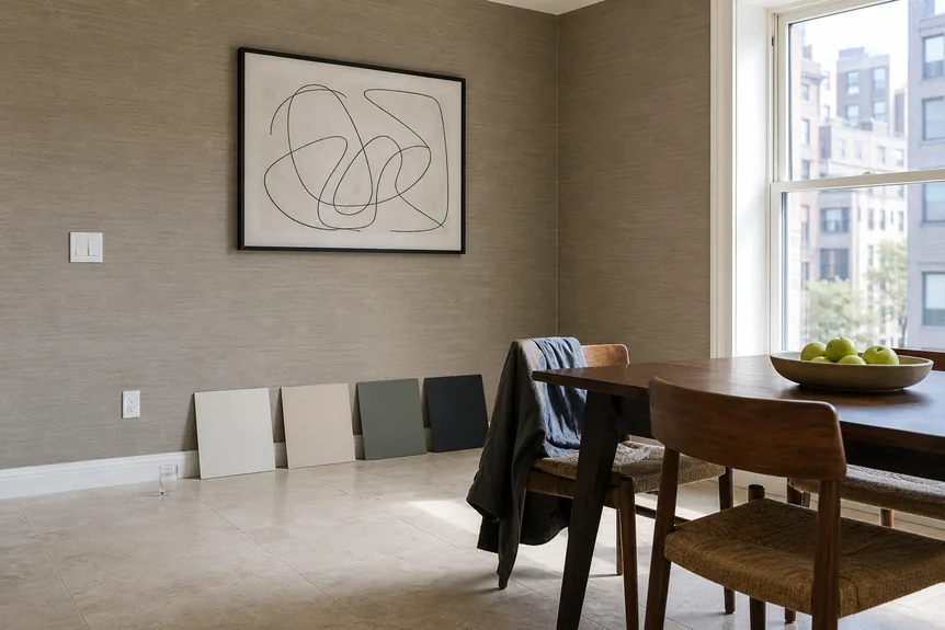
- Paint boards, not walls. Two coats on a sheet of white poster board, at least a foot square, leaving a white border. Patches painted straight on the wall are judged against the old color and mislead.
- Stand them up. Paint on a wall is vertical and catches light differently from a board lying on a table.
- Move them through the day. Look in the morning, at midday, and under lamps at night, in the room each paint is meant for.
- Pair them. Hold the wall board against the trim board, then against the floor and the largest piece of furniture. This is where a wrong undertone shows.
- Give it two days. A color that still looks right on the second evening is the one to buy.
Seven sample pots cost far less than one wrong gallon plus the weekend spent covering it. The boards are also worth keeping. They go to the store when choosing a rug or a sofa fabric, which is the moment a palette starts paying for itself.
Where to Go Next
A finished palette is seven decisions made once instead of forty made under pressure. Fix the trim white first, choose the two wall colors by how much light each room gets, add the connector, then spend the remaining slots on one color and one or two darks. Check the undertones against plain paper and the LRV steps against the bands above.
For the finish, sheen, and room by room choices that come after the palette is set, continue with the complete guide to modern paint colors.
Frequently Asked Questions
How many colors should an interior color palette have?
Five to seven paints cover a whole house: one trim white, one or two wall colors, a connecting neutral for halls, one real color, and one or two darks. Fewer than five usually leaves a role unfilled. More than seven and the rooms stop looking related.
Should every room in the house be the same color?
No. Every room should come from the same palette, which is different. Keep the trim and ceiling color constant, choose each room’s wall color from the list by how much daylight it gets, and the house will look consistent without being one color throughout.
What is a good LRV for interior walls?
For most rooms, a wall color between 60 and 85 keeps the space bright without glare. Dim or north facing rooms do better in the 60 to 75 band, where a color keeps some warmth. Below 40, treat the paint as a deliberate choice for an enclosed, moody room.
Can warm and cool colors be used in the same palette?
Yes, as long as the whites and neutrals all lean one way and the contrast is deliberate. A warm palette with one cool accent, such as navy on an island, works well. Problems start when two whites or two grays of opposite undertone sit side by side.
Do paint colors look the same in every room?
No. North light is cooler and makes colors look grayer, south light is warmer and brings out yellow, and lamps at night shift everything again. Test each paint on a board in the room it is meant for before buying a gallon.