Best White Paint Colors for Modern Interiors
By Tereza Hower | Published May 30, 2026 | Updated May 29, 2026
The first white I painted in my own home was Decorator’s White by Benjamin Moore (OC-149). On the chip, in the paint store, under fluorescent panels, it looked like the clean, bright white I wanted for a small kitchen with warm oak cabinets. On the wall, two coats dry, around 4 pm with the light filtering through the west facing window, it read as distinctly ice blue against the cabinetry. The contrast was not the airy clean I had pictured. It was a temperature collision.
I lived with it for six weeks before repainting with White Dove (OC-17), a slightly warmer white that holds its softness in cool light and does not yellow in warm light. The kitchen finally read as integrated. That repaint was the first lesson in what has become a working principle: there is no single best white paint, only the right white for a specific room.
This guide covers the white paint colors that consistently work in modern interiors, the rooms each one suits, and the specific lights to test under before committing. The category is the most photographed and the most regretted in residential paint, partly because design photography hides the temperature shifts that show up only after a few weeks of real living.
Key Takeaways
- White paint is the most light sensitive category and the most commonly repainted because of mismatched undertones.
- Modern white paint colors lean warm, with the strongest options carrying a soft yellow, pink, or putty undertone rather than a cool blue or violet one.
- Benjamin Moore White Dove, Sherwin Williams Alabaster, Benjamin Moore Swiss Coffee, and Farrow and Ball Pointing are the most consistently specified modern whites.
- Pure bright whites (Chantilly Lace, Decorator’s White) work in rooms with abundant warm natural light and rarely elsewhere.
- Test whites at two foot square scale on every wall, at multiple times of day, before committing to gallons.
What Makes a White Paint Read as Modern?
Modern white paint reads as soft and warm rather than crisp and bright. The previous decade favored cooler, brighter whites that read architecturally on camera. The current direction is whites that read as natural light rather than as clinical surface, which means whites with visible warm undertones.
The distinction is most visible at the wall to trim transition. A modern white wall against a paler modern white trim should read as a quiet temperature continuum, not as a contrast. The whites that work are the ones that integrate, not the ones that announce.
The Best White Paint Colors for Modern Interiors
The whites below appear most consistently in design publications, architectural specifications, and editorial home tours. Each one has a defined light context where it performs best.
White Dove by Benjamin Moore (OC-17)
The most reliable modern white. A soft warm white with a barely visible yellow gray undertone that keeps it from reading either cold or creamy. Works in nearly every orientation and most light conditions. The default white I recommend when someone needs a single answer.
Best for living rooms, kitchens, bedrooms, and as a trim color paired with greige or warm earthy walls. Reads slightly cooler in north facing rooms (still acceptable) and slightly warmer in south facing rooms (still acceptable). The flexibility is the point.
Swiss Coffee by Benjamin Moore (OC-45)
Warmer than White Dove, with a clearer cream undertone that reads as soft and inviting in lower light. Best in rooms with limited natural light, north facing bedrooms, and interiors where the goal is a quieter, more layered envelope.
The risk with Swiss Coffee is in south or west facing rooms, where its warmth can intensify into a clearly yellow read by afternoon. Best in interior rooms or those with cool light exposure.
Alabaster by Sherwin Williams (SW 7008)
The Sherwin Williams equivalent to White Dove, with a slightly softer warm white reading. A reliable cabinet and trim color and a versatile wall color. Pairs particularly well with cool gray vein marble and brushed nickel hardware because its warmth balances the cooler materials.
Simply White by Benjamin Moore (OC-117)
Brighter than White Dove with a clear yellow undertone. Reads as a true clean white in north facing rooms and as a clearly warm white in south facing rooms. Best when used in low light spaces or interior rooms where its warmth is needed. Avoid in south facing kitchens with white quartz, where the yellow undertone reads as a temperature mismatch.
Pointing by Farrow & Ball (No. 2003)
An English warm white with a barely visible pink putty undertone. Reads as a gallery white in well lit rooms and as soft plaster in lower light. The most editorial of the warm whites, with a slightly more sophisticated read than the American equivalents.
Best in living rooms, dining rooms, and bedrooms paired with warm earthy materials and natural wood. The pricing reflects the brand, which limits it to feature rooms in most renovations.
Cloud White by Benjamin Moore (OC-130)
Between White Dove and Decorator’s White in temperature. Cleaner than White Dove but softer than Decorator’s White. A solid choice for trim and ceilings, particularly in rooms with cool gray or muted green walls where you want the trim to read as integrated rather than starkly bright.
Chantilly Lace by Benjamin Moore (OC-65)
A pure bright white with a minimal cool undertone. Reads as crisp and modern in rooms with abundant warm natural light and reads as cold or distinctly blue in rooms with limited light. Best in renovated lofts, sunny modern kitchens, and as a trim color in rooms with deep saturated wall paint where contrast is the intention.
The most over specified white in current renovation work. Looks correct in marketing photographs, often fails in real lived in spaces with mixed light conditions.
How Do You Choose Between Warm White Options?
The choice usually comes down to three variables: the orientation of the room, the warmth of the existing materials, and the goal for the wall (background versus surface).
North facing rooms need warmer whites to compensate for cool indirect light. Default to White Dove or Swiss Coffee. South facing rooms can take a slightly cooler white because the warm light will already provide temperature. Default to White Dove, Cloud White, or Alabaster. East and west facing rooms experience temperature shifts during the day. The safest choice is a white that holds steady across light conditions, which means White Dove or Alabaster again.
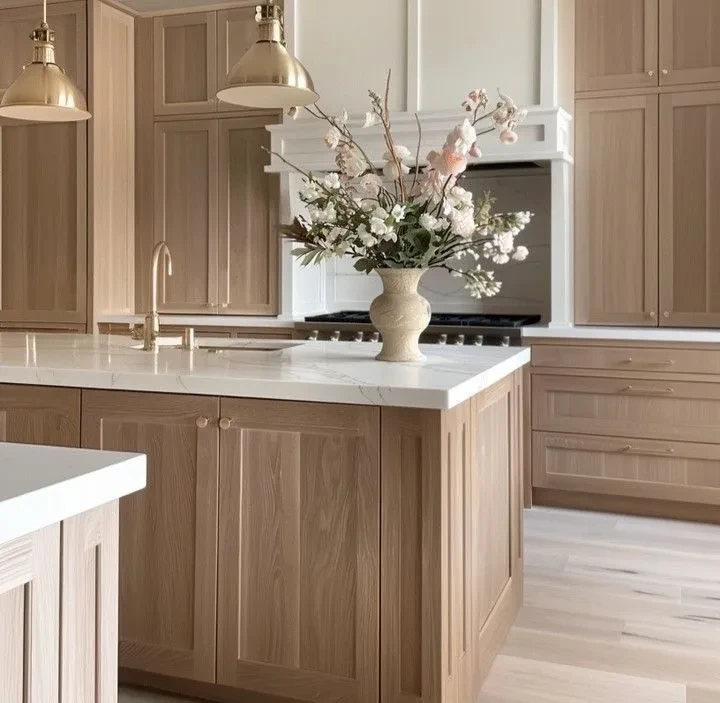
If the room already has warm materials (oak floors, walnut furniture, brass fixtures, linen upholstery), a warmer white reads as integrated. If the room has cooler materials (white oak floors with cool undertones, white marble with blue veining, brushed nickel or chrome fixtures), a slightly cooler white prevents the wall from reading too yellow against those finishes.
What White Paint Works Best for Trim and Cabinets?
Trim and cabinet whites are a slightly different decision than wall whites. They need to coordinate with the wall color and stand up to direct comparison with adjacent surfaces.
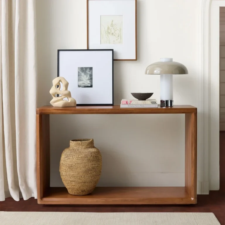
For trim against a warm earthy or greige wall, use a white that matches the wall’s family. White Dove against Pale Oak. Pointing against Skimming Stone. Swiss Coffee against Accessible Beige. The trim should read slightly lighter than the wall, not noticeably different in temperature.
For cabinets, the choice depends on what the cabinets are paired with. Against warm oak floors and brass hardware, choose Alabaster or White Dove. Against cool gray floors and chrome hardware, choose Cloud White or even Chantilly Lace if the kitchen has enough warm light. Avoid Swiss Coffee for cabinet fronts: its warmth often reads as discolored or aged on a flat cabinet surface.
White Paint Comparison Table
| White | Undertone | Best Light | Best Use | Avoid In |
|---|---|---|---|---|
| White Dove (BM OC-17) | Soft yellow gray | Any orientation | Walls, trim, cabinets | None of significance |
| Swiss Coffee (BM OC-45) | Cream | North, low light interior | Walls in low light rooms | South facing rooms, cabinet fronts |
| Alabaster (SW 7008) | Warm white | Any orientation | Walls, trim, cabinets | None of significance |
| Simply White (BM OC-117) | Clear yellow | North, interior | Walls in low light | South facing, white quartz kitchens |
| Pointing (F&B 2003) | Pink putty | Any orientation | Feature walls, living rooms | None of significance |
| Cloud White (BM OC-130) | Subtle warm | Any orientation | Trim, ceilings | Walls in warm light rooms |
| Chantilly Lace (BM OC-65) | Cool clean | South, abundant light | Modern kitchens, trim with deep walls | North facing rooms, low light |
What Are the Common White Paint Mistakes?
White paint accounts for more repaint jobs than any other category. Three mistakes show up most often.
Choosing white based on the chip
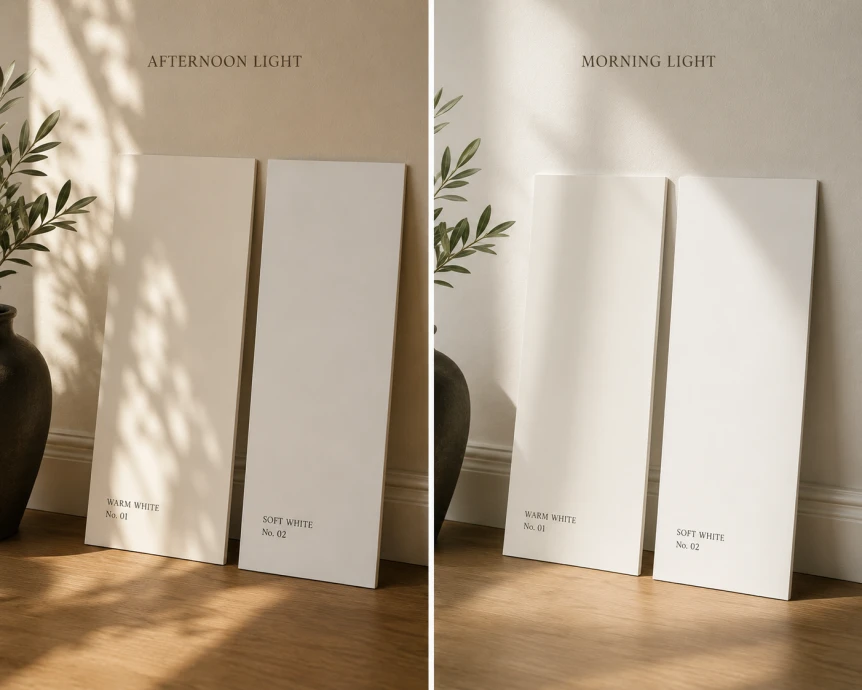
White paint chips are almost impossible to read accurately. They are small, they all look the same under store lighting, and the undertones do not appear at chip scale. The only reliable approach is a two foot square sample applied to actual wall surface, viewed at multiple times of day, against the adjacent materials that will share the room.
Painting trim and walls in different white families
A common error is using a warm white on the wall (White Dove, Swiss Coffee) and a cool white on the trim (pure white, Decorator’s White) or vice versa. The temperature mismatch shows up as a visible line at every transition. Trim should be from the same warm or cool family as the wall, just lighter.
Specifying Chantilly Lace by default
Chantilly Lace has become the most over specified bright white in renovation work because of its prominence in marketing photography. In rooms without abundant warm natural light, it reads as distinctly cool or even blue. It is a beautiful white in the right context and an expensive repaint in the wrong one. Always test before committing.
Should the Ceiling Be the Same White as the Walls?
In most modern interiors, the ceiling is the same warm white as the trim, in a flat finish. This is a quieter look than the older convention of pure bright white ceilings, which now read as the brightest surface in the room and pulls the eye upward instead of letting the room sit at horizontal level.
For rooms with warm earthy or greige walls, a White Dove or Pointing ceiling reads as a gentle extension of the wall family. For rooms with deep saturated walls, painting the ceiling the same color as the wall (color drenching) creates an enveloping effect that flatters the room. For more on that decision, see our guide to color drenching.
For the broader paint conversation, the complete guide to modern paint colors covers how whites fit alongside the warm earthy, muted green, and deep neutral families. The light orientation framework is the most useful next step if you have a candidate white but are not sure how to evaluate it in your specific room. For minimalist contexts in particular, the minimalist color palettes guide covers white paint within style settings.
Frequently Asked Questions
What is the best white paint for modern interiors?
Benjamin Moore White Dove (OC-17) is the most consistently recommended white for modern interiors. Its soft yellow gray undertone keeps it from reading either cold or creamy, and it works in nearly every light orientation. Sherwin Williams Alabaster (SW 7008) is the equivalent in the Sherwin Williams catalog and performs similarly.
Is Chantilly Lace too cool for most rooms?
Chantilly Lace by Benjamin Moore (OC-65) is a pure bright white that reads correctly only in rooms with abundant warm natural light. In north facing rooms, low light interiors, or rooms with cool LED bulbs, it reads as distinctly cool or blue. It is widely over specified in renovation work and one of the most commonly repainted whites.
Should trim be a different white than walls?
Trim should be in the same warm or cool family as the wall, just paler. A warm white wall paired with a cool white trim creates a visible temperature mismatch at every transition. For walls in White Dove, use the same color in a different sheen for trim, or a slightly cleaner warm white like Cloud White.
What white paint works best in a north facing room?
North facing rooms need warmer whites to compensate for cool indirect light. Benjamin Moore Swiss Coffee, Benjamin Moore White Dove, and Sherwin Williams Alabaster are the strongest options. Avoid cool whites like Chantilly Lace or Decorator’s White, which read distinctly cold in north facing light.
How do I test a white paint before painting a whole room?
Buy sample pots of three candidate whites. Paint each onto a two foot square of poster board, two coats, edge to edge. Lean the boards against different walls in the actual room. View at 7 am, noon, 4 pm, and after dark with the room’s evening lighting on. The white that holds steady across all four time periods, photographed against your phone camera, is the white most likely to read correctly on the wall.
White paint looks like an easy decision and is one of the trickiest in the modern palette. If you take only one step before buying gallons, make it the poster board test on every wall, at every time of day. The white that reads correctly across all of those conditions is the white worth committing to. Continue with the light orientation framework or return to the complete guide to modern paint colors for the broader picture.