Best Living Room Colors: 8 Paint Picks, Costs and What to Skip

By Tereza Hower | Published September 28, 2026
A paint chip is two inches square and lit by a store’s ceiling tubes. A living room wall is closer to 120 square feet, lit by one window by day and three lamps at night. The best living room colors are chosen for that second light, which is why so many rooms end up repainted within a year of the first coat.
This guide names eight paint colors with their codes and light reflectance values, says which direction of light each one suits, and prices the job at three quality levels. It sits alongside the modern color schemes for living rooms, which covers accent colors and proportions; this page is about the wall color itself and the can it comes in.
Key Takeaways
- The safest living room colors are warm whites and greiges with a light reflectance value between 55 and 85.
- North facing rooms need warm undertones; south facing rooms can carry cooler grays and greens.
- Deep colors such as navy or bronze work best on one wall of built ins or in a room used mostly at night.
- Premium paint costs about twice as much per gallon but usually covers in two coats instead of three.
- Eggshell is the right finish for most living room walls; flat belongs on the ceiling.
What Are the Best Living Room Colors?
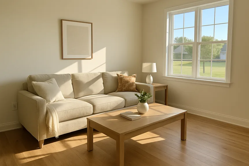
The best living room colors are soft neutrals with a clear undertone: a warm white, a light greige, or a muted green gray. They hold up across daylight and lamplight, sit well with wood floors and most upholstery, and leave room for the rug and art to carry the stronger color.
Light reflectance value, or LRV, measures how much light a color bounces back on a scale of 0 (black) to 100 (pure white). Most manufacturers print it on the back of the chip, and it is the most useful single number for a living room because it predicts how bright the room will feel after dark.
A practical band for main walls is 55 to 85. Below 55 the room reads noticeably darker in the evening; above 85 a bright white can glare in strong sun and look gray in weak light. The picks below stay inside that band except for the two deep colors, which are meant for a single wall or a room used mainly at night.
Best Living Room Colors Compared
LRV figures are rounded from the manufacturers’ published values. Check the current chip before buying, since brands occasionally reformulate a color.
| Color | Code | LRV | Undertone | Best light | Best for |
|---|---|---|---|---|---|
| Benjamin Moore White Dove | OC-17 | about 83 | Soft yellow gray | Any | The one white for walls and trim |
| Benjamin Moore Swiss Coffee | OC-45 | about 84 | Warm yellow beige | North, east | A cool, dim room that needs warmth |
| Benjamin Moore Pale Oak | OC-20 | about 69 | Faint pink violet | North, west | A light greige with cool furniture |
| Sherwin Williams Agreeable Gray | SW 7029 | 60 | Warm, slight green | Any | Open plans that run into a kitchen |
| Benjamin Moore Revere Pewter | HC-172 | about 55 | Green gray | South, west | A bright room that needs depth |
| Sherwin Williams Evergreen Fog | SW 9130 | 30 | Blue gray green | South | A sunny room with oak and brass |
| Benjamin Moore Hale Navy | HC-154 | about 8 | Gray | Any, used sparingly | Built ins and a single feature wall |
| Sherwin Williams Urbane Bronze | SW 7048 | 8 | Brown green | Any, lamp lit | A media wall or an evening den |
The Best Living Room Paint Colors, Pick by Pick
Each pick below earns its place for a specific room condition. None of them is a universal answer, and the notes say where each one goes wrong.
Best all round white: Benjamin Moore White Dove OC-17
White Dove carries a trace of gray and yellow, so it never goes stark in south light or creamy in north light. It also works as the trim color for every other pick on this list, which saves buying a second white. Skip it only in a room with bright white kitchen cabinets in view, where it will read slightly dingy next to them.
Best warm white for a dim room: Benjamin Moore Swiss Coffee OC-45
Swiss Coffee is noticeably creamier than White Dove, and that yellow beige base is what a north facing living room needs to stop looking chilly by mid afternoon. In a room with strong west light it can turn buttery, so test it at 5 p.m. before committing.
Best light greige: Benjamin Moore Pale Oak OC-20
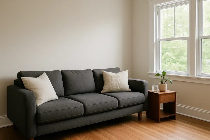
Pale Oak sits between white and beige and gives a room a quiet depth without darkening it. Its faint pink violet undertone flatters gray and charcoal upholstery. That same undertone can read blush in hard south sun, so it belongs in north or west rooms.
Best greige for an open plan: Sherwin Williams Agreeable Gray SW 7029
Agreeable Gray is the color most likely to work in every room it touches, which is exactly what an open plan needs. It stays warm without turning beige and rarely flashes purple the way cooler grays do. For more on carrying one wall color through connected rooms, see the paint color combinations for open concept homes.
Best mid tone neutral: Benjamin Moore Revere Pewter HC-172
Revere Pewter is a heavier greige with a green gray cast that suits bright rooms and old oak floors. At an LRV of about 55 it is the darkest neutral here that still works on all four walls. In a small north facing room it goes muddy, so it needs real daylight.
Best green: Sherwin Williams Evergreen Fog SW 9130
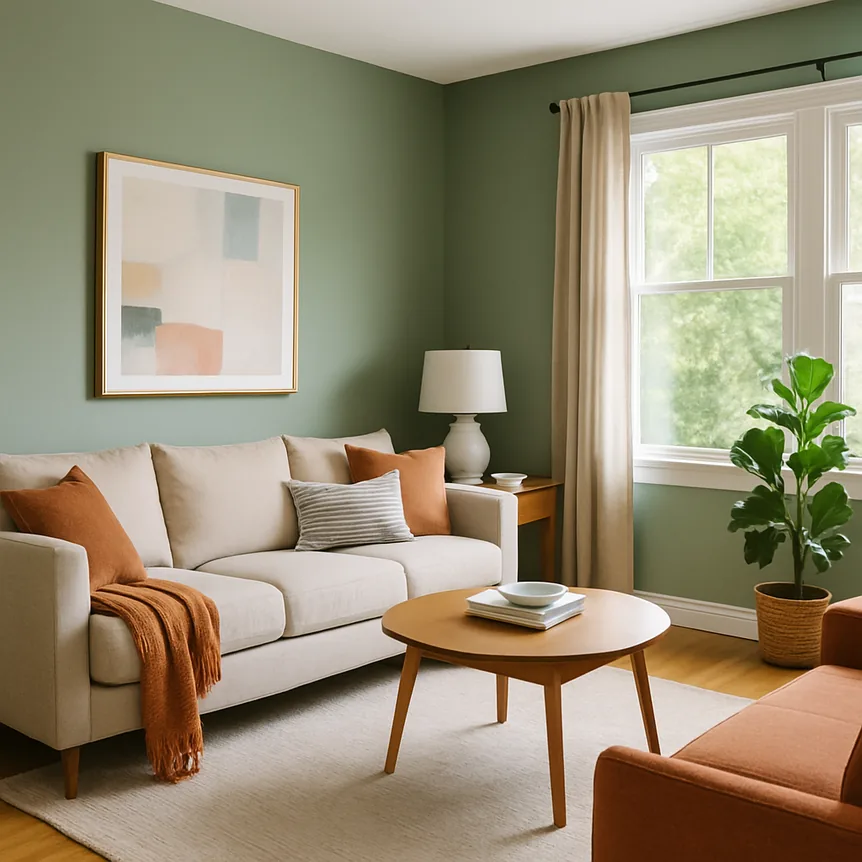
Evergreen Fog is the green that behaves like a neutral: gray enough to sit behind patterned rugs, green enough to feel like a decision. It looks best with oak, cane, and unlacquered brass. At an LRV of 30 it wants a south or west window, and a softer green such as those in the warm earthy paint colors guide is the better choice for a dim room.
Best deep blue: Benjamin Moore Hale Navy HC-154
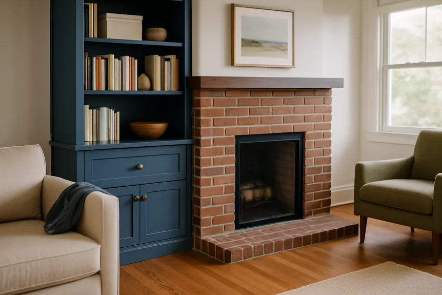
Hale Navy is a gray navy that never tips into purple or royal blue. It belongs on a bookcase wall, a run of built ins, or the wall behind the sofa in a room over about 200 square feet. On all four walls of a small room it closes the space in and makes art hard to see after dark.
Best dark neutral: Sherwin Williams Urbane Bronze SW 7048
Urbane Bronze is a brown gray with a green edge that reads as a rich, soft dark rather than black. It suits a television wall, where it swallows the black screen, or a den used mostly by lamplight. Pair it with warm whites on the trim, not bright ones, or the contrast looks harsh.
Which Direction Does Your Living Room Face?
The direction of the main window decides more about a living room color than any trend. In the Northern Hemisphere, each orientation gives a different quality of light, and a color that works in one can look wrong in the next room over.
- North facing: cool, even, slightly blue light all day. Use warm undertones: Swiss Coffee, White Dove, Pale Oak. Avoid blue grays, which go cold.
- South facing: strong, warm light for most of the day. Cooler grays and greens such as Revere Pewter and Evergreen Fog stay balanced here, and creamy whites can look yellow.
- East facing: bright warm mornings, flat blue afternoons. Choose for the time the room is used; most living rooms are used after work, so lean warm.
- West facing: dull mornings and orange evening sun. Mid greiges handle the swing best; very warm whites turn orange at sunset.
Artificial light matters as much after dark. Bulbs rated 2700K keep warm colors warm, while 4000K and higher bulbs push every greige toward gray. The modern lighting guide for living rooms covers bulb temperature and where to put each lamp.
How Much Does It Cost to Paint a Living Room?
A 12 by 15 foot living room with 8 foot ceilings has roughly 370 square feet of wall once doors and windows are subtracted. Two coats come to about 740 square feet, which is two gallons of most paints at 350 to 400 square feet per gallon. The price bands below are typical US list prices per gallon; brand stores run sales of 30 to 40 percent several times a year.
| Grade | Price per gallon | Coats to cover a color change | Walls of a 12 by 15 room | Worth it for |
|---|---|---|---|---|
| Contractor or budget | $25 to $40 | Often three, plus primer | $75 to $160 | Rentals, ceilings, same color repaints |
| Mid line (Benjamin Moore Regal Select, Sherwin Williams SuperPaint) | $55 to $75 | Two, sometimes with primer | $110 to $150 | Most living rooms |
| Premium (Benjamin Moore Aura, Sherwin Williams Emerald) | $80 to $115 | Two, usually no primer | $160 to $230 | Deep colors and rooms with children or pets |
| Specialty and heritage brands | $120 to $150 | Two plus the brand’s primer | $250 to $330 | Chalky flat finishes in low traffic rooms |
Add $40 to $60 for a quart of trim paint, a gallon of ceiling white, rollers, tape, and a drop cloth. A professional painter in most US cities charges $400 to $1,000 for the walls of a room this size, and more if the ceiling and trim are included.
How to Tell Good Paint From Cheap Paint
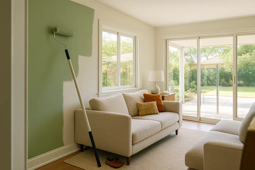
The difference between a $30 gallon and a $90 gallon is mostly what is left on the wall once the water evaporates. Cheaper paint carries more water and filler, so each coat is thinner, which is why it takes an extra coat to hide the old color. Once that extra coat is counted in labor and time, the gap in cost narrows fast.
Four things separate a good can from a cheap one, and all of them can be checked on the product data sheet or in the first hour of painting:
- Volume solids: premium lines typically sit around 40 percent or higher, budget lines closer to 25 to 30 percent. More solids means a thicker film per coat.
- Hide: a good paint covers a light gray primer in two coats without the roller marks showing through.
- Touch up: dab a spot a week later. Better paint blends in; cheap paint leaves a shiny patch, known as flashing.
- Scrubbability: look for a scrub rating tested to ASTM D2486 on the data sheet. It matters behind the sofa and along the path to the kitchen.
Deep colors show these differences most. Navy and bronze need extra tint base, and budget formulas often streak or burnish when a hand or a cushion rubs against them. For any color with an LRV under 20, buy the premium line.
Which Paint Finish Is Best for a Living Room?
Eggshell is the best finish for most living room walls. It has a low sheen that wipes clean without highlighting dents and patched drywall, which a satin finish shows in raking light from a window.
Matte is worth choosing for deep colors and for walls with a lot of repairs, since it hides the most and makes dark colors look velvety. Use satin or semi gloss on trim and doors, where hands and vacuums hit, and flat white on the ceiling. A ceiling tinted to 25 percent of the wall color is a small upgrade that makes the room feel finished rather than boxed.
What Most People Get Wrong About Living Room Colors
The most common mistake is choosing the color before the sofa and rug. Paint is the cheapest thing in the room to change and comes in thousands of shades; a sofa comes in a dozen. Pick the wall color last, holding the chip against the upholstery and the floor.
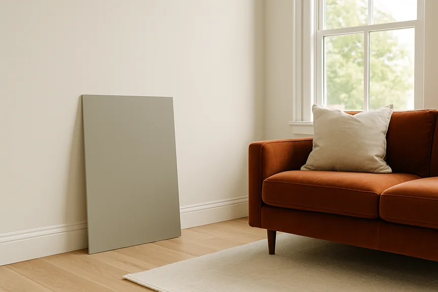
The second is testing with a small chip or a patch on the old wall. The old color changes how the new one reads, and a chip looks about a shade lighter than a full wall. Paint a 2 by 2 foot board with two coats, or use a large peel and stick sample, and move it around the room over a full day and evening.
The third is the accent wall picked at random. A single dark wall works when it has a reason: a fireplace, built ins, or the wall the seating faces. Painted behind a door or on the window wall, it just looks like a different room began there.
The last is ignoring what is visible from the living room. In an open plan, the kitchen cabinets, the hallway, and the dining wall are part of the palette, which is why a flexible greige usually beats a stronger color that only works in one of those spaces.
Where to Go Next
Once the wall color is settled, the rest of the room follows from it. The living room ideas guide works through rugs, lighting, and furniture piece by piece, and the complete guide to modern paint colors covers every room beyond this one.
For the layout, the furniture, and the principles behind all of it, the complete guide to modern living room design is the place to start. Choose the sofa and the rug first, then come back to these eight colors with samples in hand.
Frequently Asked Questions
What color makes a living room look bigger?
A light neutral with an LRV between 70 and 85, such as Benjamin Moore White Dove or Pale Oak, painted on the walls and trim alike. Using one color on walls and trim removes the lines that break a wall into smaller pieces. Very bright whites can make a room feel smaller in dim light because they turn gray.
What wall color goes with a gray sofa?
A warm white or a light greige keeps a gray sofa from looking cold. Benjamin Moore Pale Oak and Sherwin Williams Agreeable Gray both work, and Swiss Coffee suits a north facing room. Avoid a blue gray on the walls, which makes the whole room read cool and flat.
Is dark paint a good idea in a small living room?
It can be, if the room is used mostly in the evening and the color covers every wall, so the corners blur and the room feels enveloping rather than cramped. A single dark wall in a small room usually looks like a mistake. Use a premium matte paint so the dark color covers evenly.
Should the ceiling be the same color as the walls?
Not usually. A flat white ceiling, or a white tinted to about a quarter of the wall color, keeps the room bright. Painting the ceiling the full wall color works with deep colors in rooms with ceilings of 9 feet or more.
Is living room one word?
No. Living room is two words in standard American and British dictionaries, used as a noun. As a compound adjective before another noun it is sometimes hyphenated, as in living-room furniture, though most style guides now leave it open.