Paint & Color
By Tereza Hower | Published May 29, 2026
Warm earthy paint colors are not a trend in the disposable sense. They are a course correction. After a decade of cool grays specified into nearly every newly built or renovated home, the design audience reached collective fatigue with rooms that read as flat, blue tinted, and curiously airless. Warm earthy paint colors solved the problem material first.
The category includes colors named after the things they reference: clay, oat, limestone, putty, plaster, biscuit, stone. The naming matters because it signals the underlying intent. These are colors meant to read as material, not as decoration. They look correct against natural wood, woven jute, raw linen, and ceramic. They look passable against polished chrome and high gloss black, which is not where they belong.
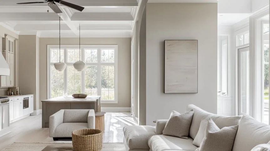
In my own home I use three warm earthy paint colors. Pale Oak (Benjamin Moore OC-20) lives in my home office, where it replaced a cool gray that read as blue in north facing light. Accessible Beige (Sherwin Williams SW 7036) is in the entry hall, where the lack of natural light needed a wall color with built in warmth. Setting Plaster (Farrow & Ball No. 231) was the most committed choice, drenched across the powder room walls and trim. Each one solved a specific room problem rather than chasing a generic warm look.
A warm earthy paint color carries a visible undertone of clay, oat, plaster, or stone. The pigment lineage matters. These colors are mixed with yellow, red, or pink base tones rather than blue or violet. The on wall result is a paint that absorbs warm afternoon light without going yellow and that holds steady in cooler morning light without going cold.
The category does not include warm whites at the pale end (those are their own family) or deep terracottas at the saturated end (those are accent colors). The center of the warm earthy palette sits in the medium light to medium depth range: colors that function as everyday wall paint, not statement paint.
The full warm earthy palette includes roughly twenty consistently specified colors across Benjamin Moore, Sherwin Williams, and Farrow & Ball. The eight below are the ones design publications and editors return to most often.
A soft warm greige with a faint pink oat undertone. Reads gray against warm wood, beige against cool wood, slightly pink in late afternoon. The most versatile color in the category and the one I default to when a room needs warmth without commitment to a specific tone. Works in any orientation, especially north facing.
A muted beige greige with a slightly olive undertone that keeps it from reading too pink or too yellow. Stronger and warmer than Pale Oak. Best in transitional spaces (entries, hallways, stairwells) where you want clear warmth without darkness.
Warmer than Pale Oak, sits firmly in greige territory with a yellow oat undertone. Reads beige in most lights and only registers as gray in direct cool morning light. Works best in south or west facing rooms where its undertone is supported by warm natural light.
The most committed pink in the warm earthy family. A dusty, putty toned pink that reads almost as a warm neutral in bright light and shifts to a clearly pink plaster tone in lower light. Best in small enclosed rooms (powder rooms, studies, dressing rooms) where its envelope reading is the point.
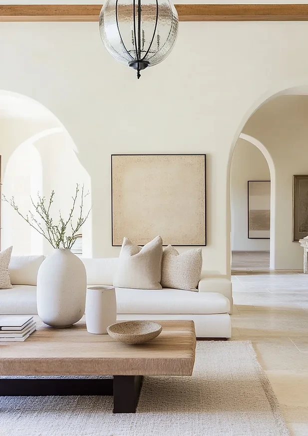
A cool warm middle ground: warmer than a true off white, cooler than a clear greige. Reads as polished plaster or aged limestone. Excellent in living rooms and bedrooms where you want a wall color that recedes but does not read as gray.
A deeper beige with a soft yellow gold undertone. Warmer than most current greiges and starting to lean into the medium tone range. Best in dining rooms and libraries where a warmer envelope is desired and the room has enough natural light to keep it from feeling heavy.
A soft warm gray with strong limestone undertones. Lives between the greige family and the deeper stone family. Best in entries, mudrooms, and stairwells where it can play structural rather than decorative.
For a deeper warm earthy color that still reads as wall paint rather than statement paint, both of these work. They sit in the medium warm range with green gray undertones. Best in bedrooms and studies in north and east facing rooms, where their depth balances the cooler light.
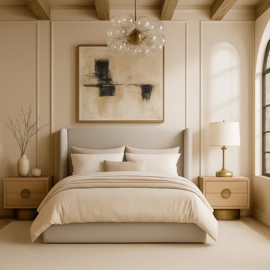
The pairing rule is simple. Warm earthy paint reads correctly against warm materials and reads off against cool ones. Natural wood, woven jute, raw linen, undyed cotton, matte ceramic, brushed brass, terracotta, aged leather. Anything in this list will look correct against a warm earthy wall.
Polished chrome, high gloss black, cool gray upholstery, white marble with strong blue veining, and pure white trim all fight warm earthy walls. The mismatch is most visible at transitions. A warm earthy wall meeting pure white trim reads as a temperature jump. The fix is to choose a trim color one or two shades lighter than the wall (the same color family, just paler) or a soft warm white like White Dove rather than pure white.
For a full breakdown of how warm earthy paint colors fit within style verticals, see the complete guide to modern paint colors and the style specific palette guides for Japandi and minimalist interiors.
| Color | Undertone | Best Light | Best Room | Pair With |
|---|---|---|---|---|
| Pale Oak (BM OC-20) | Pink oat greige | North, any orientation | Office, bedroom, whole home | Oak, linen, brass |
| Accessible Beige (SW 7036) | Olive beige | South, west, low light | Entry, hallway, stairwell | Walnut, jute, ceramic |
| Edgecomb Gray (BM HC-173) | Yellow oat | South, west | Living room, dining room | Light oak, linen, leather |
| Setting Plaster (F&B 231) | Dusty pink | Any (small rooms) | Powder room, study, dressing room | Brass, ceramic, dark wood |
| Skimming Stone (F&B 241) | Cool warm plaster | Any orientation | Living room, bedroom | Oak, linen, matte ceramic |
| Shaker Beige (BM HC-45) | Yellow gold | South, west | Dining room, library | Walnut, leather, brass |
| Limestone (BM 1530) | Stone gray warm | Any orientation | Entry, mudroom, stairwell | Stone, oak, blackened steel |
| Quiet Moments (BM 1563) | Green gray warm | North, east | Bedroom, study | Oak, linen, jute |
The category looks easy on a swatch and is more selective than it appears. Three mistakes account for most of the regret.
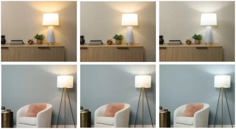
Warm earthy colors intensify in warm light. A pale plaster pink that looks subtle in a north facing showroom will read as distinctly pink in a south facing kitchen by afternoon. South facing rooms can take warm earthy paint, but lean toward the cooler greige end of the family (Pale Oak, Skimming Stone) rather than the pinker or yellower colors.
Three or four warm earthy colors across one home will read as a bag of beige samples rather than a coherent palette. The strongest approach is one warm earthy color carried across most of the home, with one or two specific rooms (a powder room, a study, a bedroom) shifted to a deeper or pinker tone for variety. Continuity reads as intention. Variety reads as indecision.
Pure white trim against a warm earthy wall creates a temperature mismatch that reads as a paint mistake even when both colors are well chosen. The trim should be a soft warm white (White Dove, Swiss Coffee, Pointing) or a paler version of the wall color. The transition should be invisible, not announced.
Warm earthy paint colors will not disappear in three years the way some accent colors did. The category is structural rather than decorative. It exists because the previous cycle of cool gray walls created a visible market gap, and because design publications and paint companies have settled on warm material undertones as the default modern direction.
What will shift is the specific colors at the front of the cycle. Setting Plaster has had a strong recent run. Pale Oak has been steady for nearly a decade. Edgecomb Gray and Accessible Beige will continue to be specified. The category will deepen rather than retreat.
If you are choosing paint and want to avoid both the cool gray hangover and the next trend cycle, the warm earthy family in its quieter shades (greiges, oats, plasters) is the safest landing zone for the foreseeable future. For more on how these colors fit the broader modern paint conversation, see the complete guide to modern paint colors, the related discussion of best white paint colors, and the framework for choosing paint colors that work in your light.
Pale Oak by Benjamin Moore (OC-20) is the most consistently specified warm earthy paint color across design publications and editorial features. Its flexibility across light orientations makes it the closest thing to a default modern wall color. Setting Plaster by Farrow and Ball and Accessible Beige by Sherwin Williams are also widely used.
Yes, warm earthy paint colors are the strongest option for north facing rooms. The cool indirect light in north facing spaces flattens warm colors and exaggerates cool ones, which is why cool grays fail in these rooms. Warm earthy colors compensate for the lack of warm natural light and hold their intended undertone across the day.
Pure white trim creates a temperature mismatch against warm earthy walls. The best trim choices are soft warm whites in the same family as the wall: Benjamin Moore White Dove, Benjamin Moore Swiss Coffee, or Farrow and Ball Pointing. For a quieter transition, use a paler version of the wall color on the trim.
Yes, warm earthy paint works well in kitchens, particularly in north facing or low light kitchens. Pale Oak, Edgecomb Gray, and Skimming Stone are reliable choices. In south or west facing kitchens with abundant warm light, lean toward the cooler greige end of the family to avoid the wall reading too yellow or too pink in afternoon light.
Greige is one subset of the warm earthy paint category. Greige specifically describes neutrals that sit between gray and beige with mixed undertones. The broader warm earthy family also includes plasters (with pink undertones), oats (with yellow undertones), limestones (with stone gray warm undertones), and clay tones (deeper terracotta directions). All greiges are warm earthy, but not all warm earthy colors are greiges.
If you are repainting a room out of cool gray fatigue, the warm earthy family is the first place to look. Start with the swatch testing protocol covered in the complete guide to modern paint colors, then narrow to two or three candidates based on your room’s light orientation. Most of the regretted warm earthy walls I have seen came from skipping the on wall testing step, not from the colors themselves.