Scandinavian Color Palettes for a Bright, Calm Home

By Tereza Hower | Published May 7, 2026 | Updated November 13, 2026
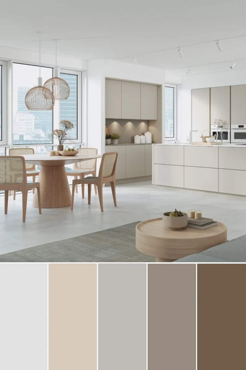
Color in Scandinavian design is all about light. The Nordic winters are long and dark, and every Scandinavian color palette that works is a response to that: bright, reflective walls that stretch the daylight, warm undertones that keep the room from feeling cold, and soft accents that add personality without breaking the calm.
Most people know they want a Scandinavian room but cannot say what that means for the paint chip on the wall or the throw on the sofa. The table below closes that gap: six palettes, each with a specific paint to start from, matched to the light the room actually gets. The sections after it explain how each palette works, where it suits, and the mistakes that undo it.
Key Takeaways
- Every Scandinavian palette starts from a warm white, never a cool one; undertone matters more than the color name.
- Light orientation decides the palette: north facing rooms take the dusty pink or warm earthy palettes, south facing rooms can carry soft blue or monochrome.
- Limit accents to one or two colors per room and repeat them; five small accents read as indecision.
- Every room needs one dark grounding element, or the palette floats.
Scandinavian Paint Colors at a Glance
Every palette below works, but not in every room. Light orientation decides more than taste does, so treat these as starting points and always sample on the wall before committing. For single paint picks rather than full palettes, see best Scandinavian paint colors.
| Palette | Wall color to start from | Accent | Wood tone | Best light |
|---|---|---|---|---|
| Classic white and wood | Benjamin Moore White Dove (OC-17) | Black metal, jute | Pale oak, birch | Any orientation |
| Dusty pink | Farrow & Ball Setting Plaster (No. 231) | Brass, cream | Light oak | North facing |
| Muted sage | Sherwin Williams Evergreen Fog (SW 9130) | Warm white, linen | Ash, pale oak | East and south facing |
| Soft blue | Farrow & Ball Borrowed Light (No. 235) | Off white, pewter | Birch, white oak | South facing |
| Monochrome | Benjamin Moore Chelsea Gray (HC-168) | Near black, e.g. Railings (No. 31) | Walnut for warmth | Bright rooms only |
| Warm earthy | Benjamin Moore Pale Oak (OC-20) | Terracotta, clay | Walnut, teak | North facing |
What Makes a Scandinavian Color Palette Work?
A Scandinavian color palette is a light, warm base of whites and creams, pale wood, one or two muted accent colors, and at least one darker grounding element. Its aim is to make the most of daylight while keeping a room warm and personal. The same mix of light, muted colors and grounding accents is what holds together a color palette for interior design, which shows how seven specific paints divide across a home.
Undertone is the part most people miss. A warm white and a cool white can look identical on a chip and produce completely different rooms: the warm one gives the cozy feeling the style depends on, while the cool one makes the same furniture feel clinical. That difference is what separates a Scandinavian room from a waiting room with similar furniture.
Scandinavian color also sits between two neighbors. It is warmer than minimalism, which can feel stark, and calmer than bohemian, which can feel busy. For the broader principles, see the complete guide to Scandinavian interior design.
The Classic White and Wood Palette
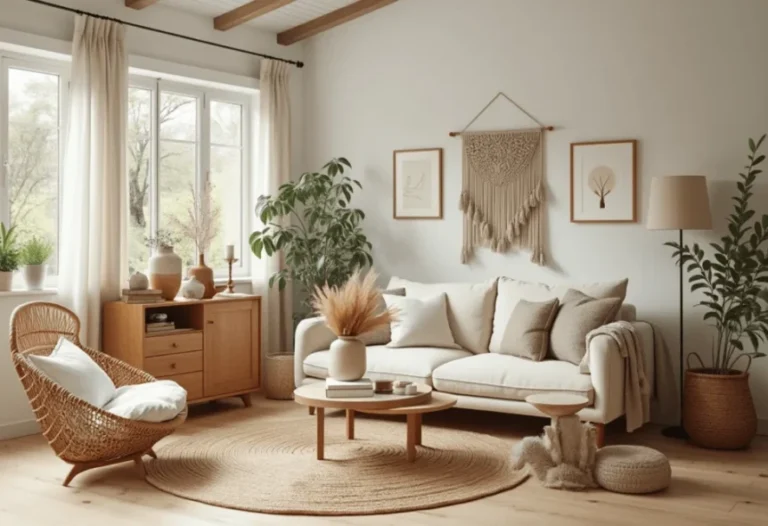
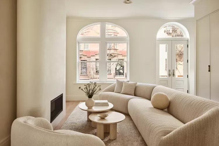
Warm white, cream, light wood, and a single darker accent make up the most recognizable Scandinavian palette. It is bright, clean, and forgiving, and it is the safest starting point because it is very hard to get wrong as long as the undertones stay warm.
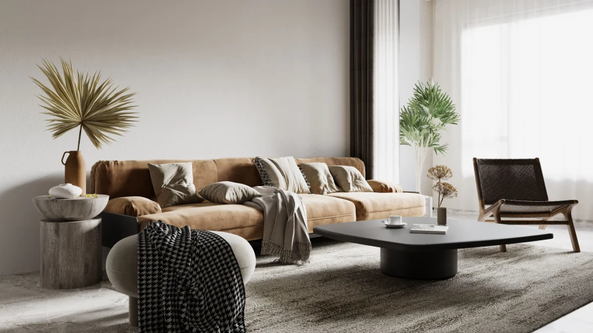
Paint the walls a warm white such as White Dove. Choose light floors in oak, ash, or birch, or a light rug over darker boards. Build on that with furniture in cream, white, or natural wood, and add one darker element, such as a charcoal throw or a black framed mirror, so the room does not wash out.
It suits living rooms, bedrooms, and kitchens, and it holds up better than any other variation in homes where rooms get very different amounts of light. For room by room ideas, see Scandinavian living room ideas and Scandinavian bedroom ideas.
The Dusty Pink Palette
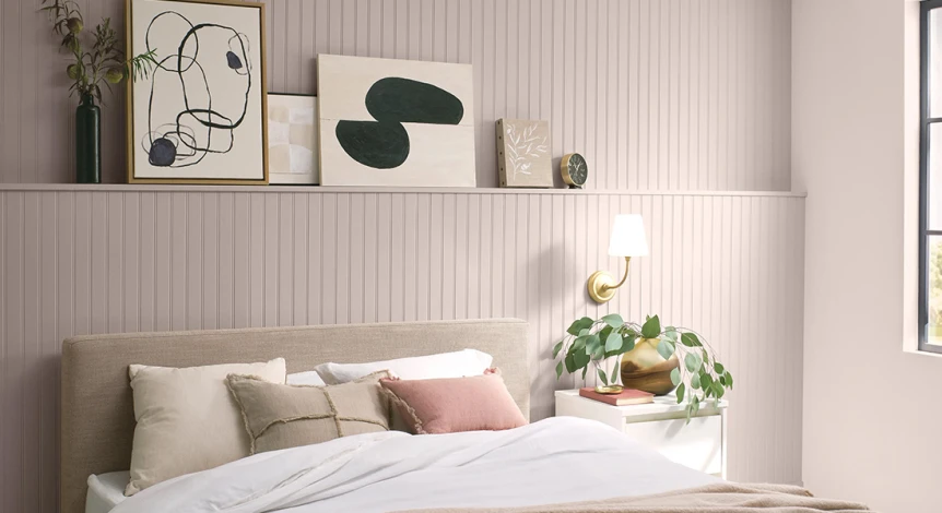
Warm white, light wood, dusty pink, soft gray, and brass add warmth to the classic base. The pink is muted and grown up rather than sweet, and it is the palette that rescues a north facing room, where cool light would otherwise gray out a plain white.
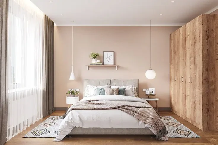
Keep the pink restrained. Use roughly 80 percent warm neutrals, 15 percent pink and gray, and 5 percent dark accent; past 15 percent pink, the room tips toward cottage or shabby chic. Bring the pink in through cushions, a throw, a rug, or one upholstered chair, or paint a whole room in a plaster pink such as Setting Plaster and keep everything else neutral.
Dusty pink works in bedrooms, living rooms, and reading nooks, and particularly in small rooms that need warmth. It also suits home offices, where it makes the room feel less corporate.
The Muted Sage Palette
Warm white, light wood, muted sage, cream, and natural linen pull the style toward nature. Sage is one of the most versatile Scandinavian accents because it sits comfortably with both warmer and cooler neutrals, and it is muted enough to read almost as a neutral.
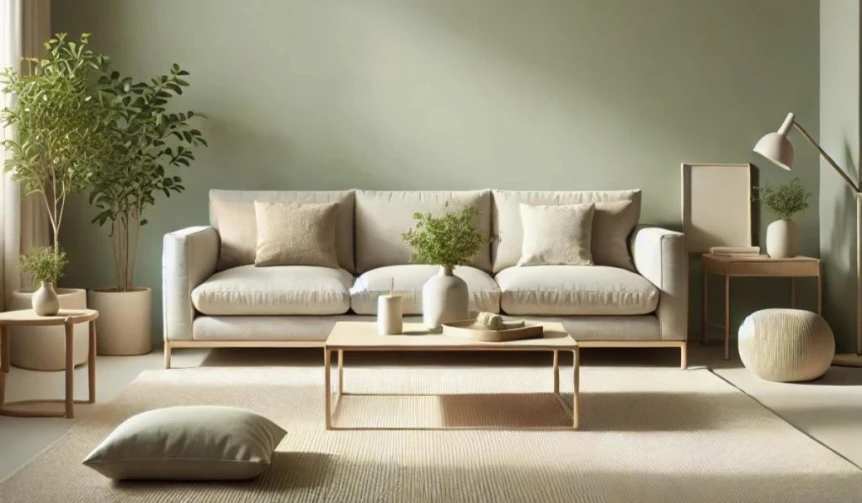
Keep the walls warm white and bring sage in through cushions, art, or one painted piece: a kitchen island, a single cabinet, a built in shelf, or the front door. A gray green such as Evergreen Fog works for that painted accent and, in an east or south facing room, for whole walls.
Sage suits kitchens, bedrooms, and home offices, and it is one of the few accent colors that works in a bathroom without looking dated.
The Soft Blue Palette
Warm white, light wood, pale dusty blue, cream, and soft gray draw on the long Nordic association with sea and sky. The challenge is choosing the right blue: many blues sold as Scandinavian are too saturated or too gray. Look for chalky, slightly dusty blues with a warm undertone; if a blue looks crisp and modern on the chip, it is too strong.
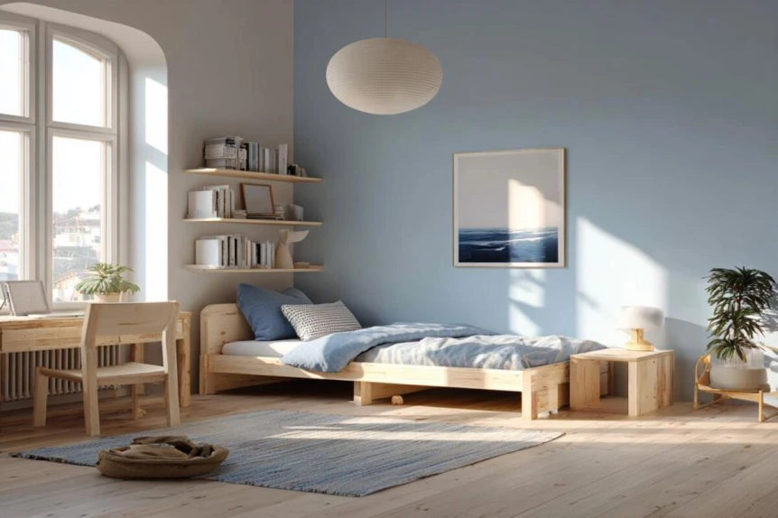
Use blue on textiles, one piece of furniture, or a single wall behind a bed or in a reading nook, with the other walls in warm white. A pale blue such as Borrowed Light works on walls in south facing rooms, where warm light offsets its coolness.
Soft blue suits bathrooms, bedrooms, and kitchens. Be cautious in living rooms, where cool tones can fight the gathering feel the room needs; if blue goes there, balance it with plenty of warm wood and natural textiles.
The Monochrome Palette
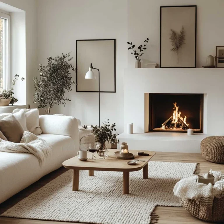
Warm white, soft gray, charcoal, black, and light wood make Scandinavian design at its most graphic. It is the hardest palette to keep warm. More contrast looks sophisticated in a photo, but in a real room it needs more texture and better lighting than any other palette to avoid feeling severe.
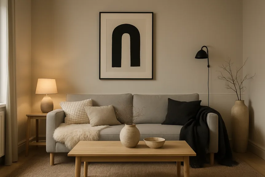
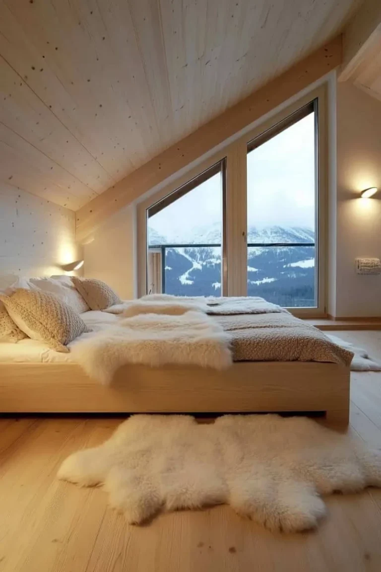
Keep walls warm white for maximum light, use soft gray on large upholstered pieces, and add charcoal or black through a throw, frames, or art. Then layer textiles generously: sheepskin, wool, and linen. Without them, black against white reads as cold and modern rather than calm.
Monochrome suits modern apartments, lofts, and homes with strong architecture, and it needs a bright room. If the textile layering sounds like too much commitment, one of the warmer palettes is the better choice.
The Warm Earthy Palette
Warm cream, soft beige, medium wood tones, terracotta, and muted mustard push the style toward coziness. This newer variation overlaps with warm minimalism and Japandi, and the wood can run darker than in the classic palette.
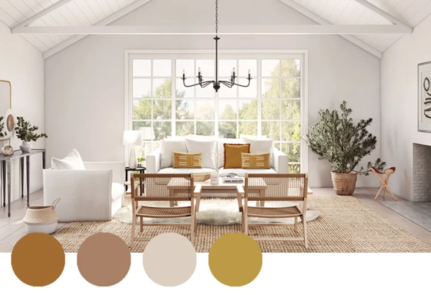
Paint walls a warm cream or soft beige such as Pale Oak, choose medium wood floors, and keep upholstery cream or beige. Terracotta and mustard belong in pillows, throws, and ceramics in earthy glazes. A terracotta throw is easy to live with; a terracotta sofa is a commitment many people regret.
It suits living rooms, dining rooms, and bedrooms, and it is the strongest choice for homes with limited daylight or long winters. For more wall colors in this family, see warm earthy paint colors.
Which Scandinavian Palette Suits Your Light?
Start with the light, not the mood board. Rooms with plenty of daylight can take slightly cooler palettes, though still on a warm white base. Rooms with little daylight need warmer palettes to make up for it. A palette admired in someone else’s sunny home often turns cold or muddy in a darker apartment, because the same paint behaves differently in different light.
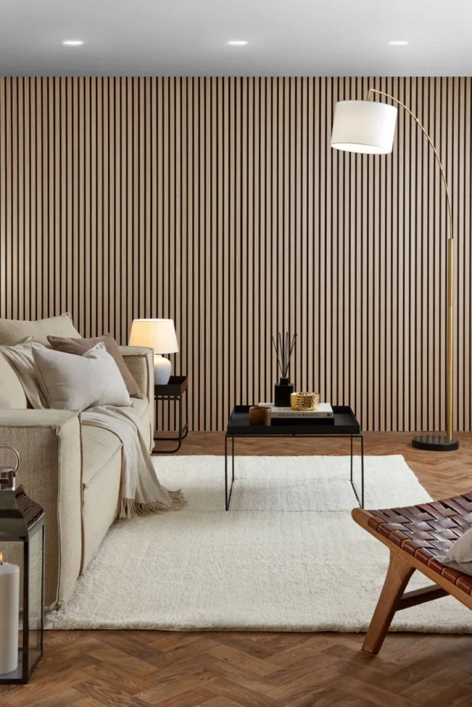
Then consider mood. Bedrooms usually want softer palettes, living rooms can take more variety, and kitchens suit bright, cheerful ones. Choose the palette that supports how the room should feel, not the one that photographs best.
If a sofa, rug, or painting is staying, pull the palette from it. Building around a piece already owned keeps the room cohesive and avoids fighting it.
Finally, test. Paint a swatch at least 2 feet by 2 feet on two walls and look at it in morning, afternoon, and evening light for a few days. The right color is the one that still looks right at all three times.
How Much Color Is Too Much?
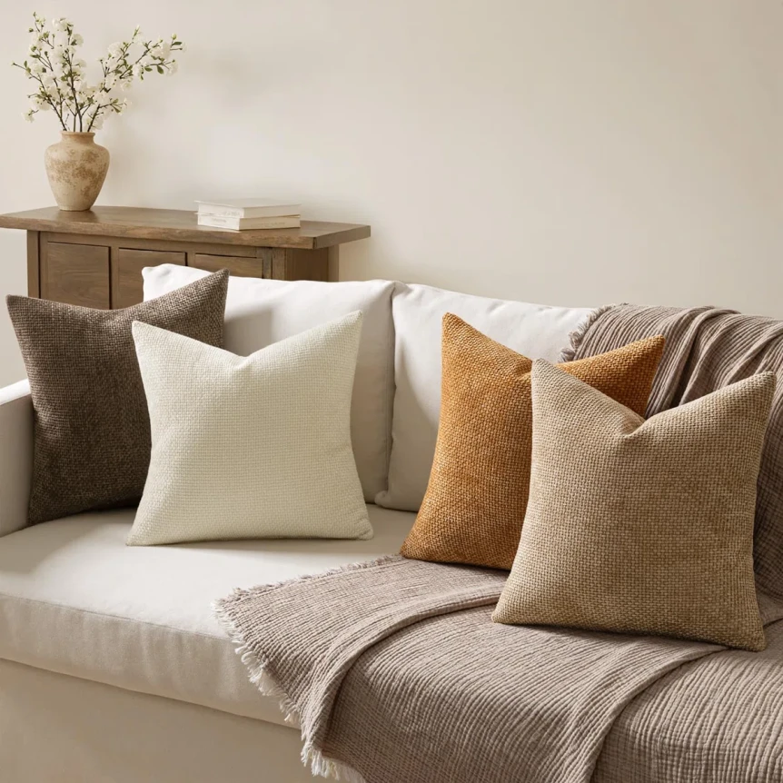
Scandinavian design welcomes more color than minimalism or Japandi, but it still uses color with control. Keep to one or two accent colors per room, keep them muted, and place them in textiles, art, or a single piece of furniture.
The common failure is many small accents in different colors. A green throw, a pink cushion, a yellow print, and a blue vase do not add up to personality; they add up to noise. One or two colors repeated across several pieces look intentional. For furniture that suits these palettes, see the Scandinavian furniture guide.
Common Color Mistakes
Cool whites. Pure cool white works against everything the style is trying to do. Choose whites with a slight yellow, beige, or pink undertone and test them in the room’s own light. This is the most consequential color decision in a Scandinavian room.
Forgetting the dark element. A room with no darker anchor looks washed out, and its light pieces lose impact. Include at least one: a black frame, a dark wood piece, or a charcoal textile.
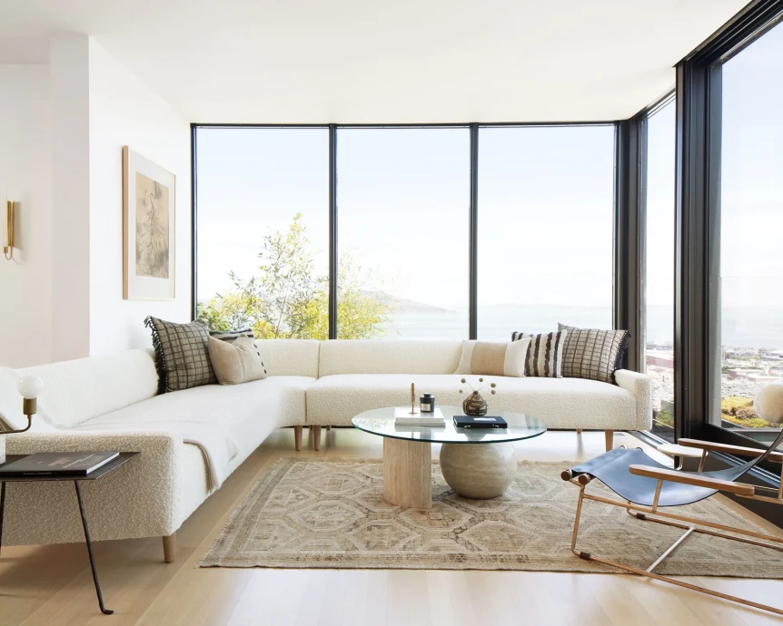
Bright or saturated colors. Bright red, bold turquoise, and saturated yellow do not suit the style. A simple test: if a color reads as fun and energetic on the swatch, it is too strong; the right colors read as calm and lived in. For the atmosphere these palettes support, see what is hygge and how to bring it home.
Treating every room separately. Choosing a different palette for each room makes a home feel disjointed. Pick one palette, or two that share a base white, and carry it through connected spaces.
Which Palette Should You Start With?
Scandinavian palettes are disciplined but not boring. Start with the light the room gets, choose the palette that suits it, and keep the same base white across connected rooms so the home reads as one. Let wood, wool, and linen supply the interest that a tight palette leaves room for.
For the complete framework of Scandinavian design, read the complete guide to Scandinavian interior design.
Frequently Asked Questions
What colors are used in Scandinavian design?
Warm whites, creams, and light wood tones form the base. Muted accents such as dusty pink, pale blue, sage, and soft mustard add color, and one darker element such as charcoal or black adds depth. Colors stay muted rather than bright.
What is a Scandinavian color palette for interiors?
A Scandinavian interior palette is a warm white or cream base, pale wood, one or two muted accents, and a dark grounding element. Six common versions are classic white and wood, dusty pink, muted sage, soft blue, monochrome, and warm earthy.
What white paint is best for a Scandinavian home?
A warm white with a slight yellow, beige, or pink undertone, such as White Dove. Cool, pure whites look clinical. Test samples on two walls and check them morning, afternoon, and evening before committing.
Can Scandinavian design be colorful?
Yes, more than minimalism or Japandi. Keep to one or two soft, muted colors per room, placed in textiles, art, or one piece of furniture. Bright, saturated colors do not suit the style.
How do I keep a Scandinavian palette from feeling boring?
Use texture and material rather than bold color: wood in varying tones, wool, linen, and sheepskin. Add one accent color repeated across a few pieces, one dark element, plants, and warm lamplight.