Modern Color Schemes for Living Rooms: Find Your Perfect Palette

By Tereza Hower | Published March 9, 2026 | Updated September 7, 2026

The living rooms that photograph well and the living rooms that are pleasant to sit in at nine at night are rarely painted the same color. The camera rewards contrast and cool light; the evening rewards warmth and low saturation. Most modern color schemes fail because they were chosen for the first and lived in during the second.
This guide sets out six schemes that survive both, with the paint names, the split between walls, large furniture, and accents, and the accent colors that outlast the trend behind them. It sits inside the complete guide to modern living room design; the color decision is the one that constrains everything bought afterward, so it comes first.
Key Takeaways
- A modern living room scheme is three or four colors at most: one dominant neutral, one secondary neutral, and one or two accents.
- Undertone consistency matters more than the colors themselves; a warm white with a cool gray sofa reads as a mistake even when each is beautiful alone.
- Keep the accent to roughly ten percent of what the eye sees, carried by pillows, art, and one chair rather than a wall.
- Test every wall color as a two foot sample in the actual room across a full day before buying a gallon.
- Warm minimalist is the safest scheme for most homes; black and white is the one most often regretted.
What Makes a Color Scheme Modern?
A modern color scheme is a restrained palette of three or four colors built on a neutral base, with contrast coming from material and texture rather than from many competing hues. It is not a specific set of colors. A warm white room with oak and terracotta and a charcoal room with black steel and white oak are both modern schemes; what they share is discipline.
Contemporary means the same thing here: the room should read as one considered decision rather than a collection of individually chosen colors. The complete guide to modern paint colors covers the underlying palette logic room by room; this guide applies it to the one room where the most people sit for the most hours.
How Does the 60-30-10 Rule Work in a Living Room?
The 60-30-10 rule assigns about sixty percent of the visible room to a dominant color, thirty percent to a secondary color, and ten percent to an accent. In a living room that translates directly to surfaces: walls and the largest upholstered piece carry the sixty, the rug, curtains, and secondary seating carry the thirty, and pillows, art, ceramics, and one small chair carry the ten.
The rule breaks in two predictable ways. The first is treating the sofa as the accent, which pushes a bold color to thirty or forty percent of the room. The second is spreading the ten percent across three accent colors, which reads as clutter rather than a scheme.
Undertone is the half of the rule the percentages leave out. Every neutral leans warm (yellow, red, or brown underneath) or cool (blue, green, or violet underneath), and a scheme holds together only when the neutrals lean the same way. A warm white wall behind a blue gray sofa is the most common reason a carefully chosen room looks slightly off.
Six Modern Color Schemes for Living Rooms
The six schemes below run from warm and soft to graphic and high contrast. The table gives the split at a glance; the sections beneath name paints and say where each scheme works and where it does not.
| Scheme | Walls (60) | Large pieces (30) | Accent (10) | Best for |
|---|---|---|---|---|
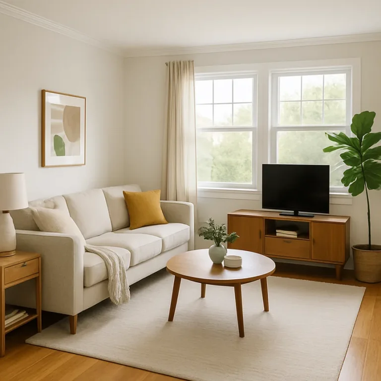
| Warm minimalist | Warm white | Oak or walnut, warm gray textiles | Terracotta or rust | Most homes; south and west light |
| Cool minimalist | Soft blue gray | White or pale gray upholstery, charcoal rug | Navy or forest green | North light; rooms that run hot |
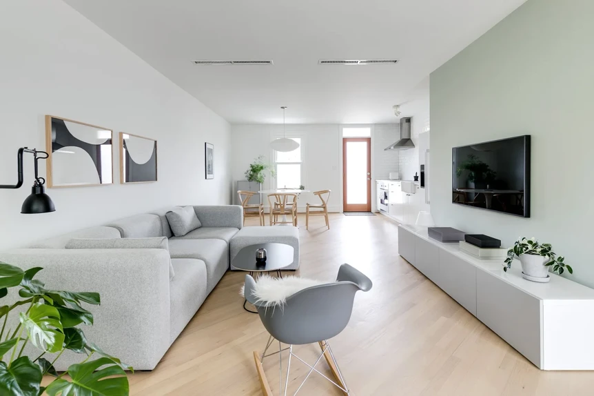
| Monochrome neutral | Greige | Deeper greige and taupe textiles | Black hardware and frames | Open plans that need to stay quiet |
| Black and white | Bright white | Black steel, black rug, pale oak | Natural wood as the relief | Strong architecture; owners with restraint |
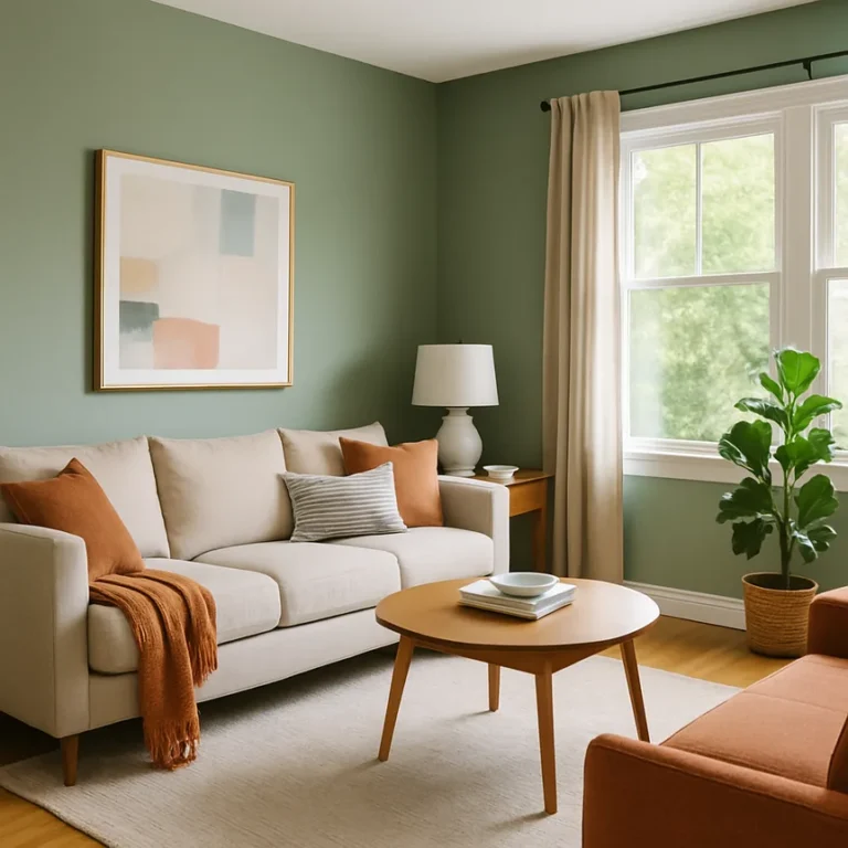
| Warm with one accent | Warm white | Oak and warm gray | Navy, forest green, or terracotta | Homes that want warmth and personality |
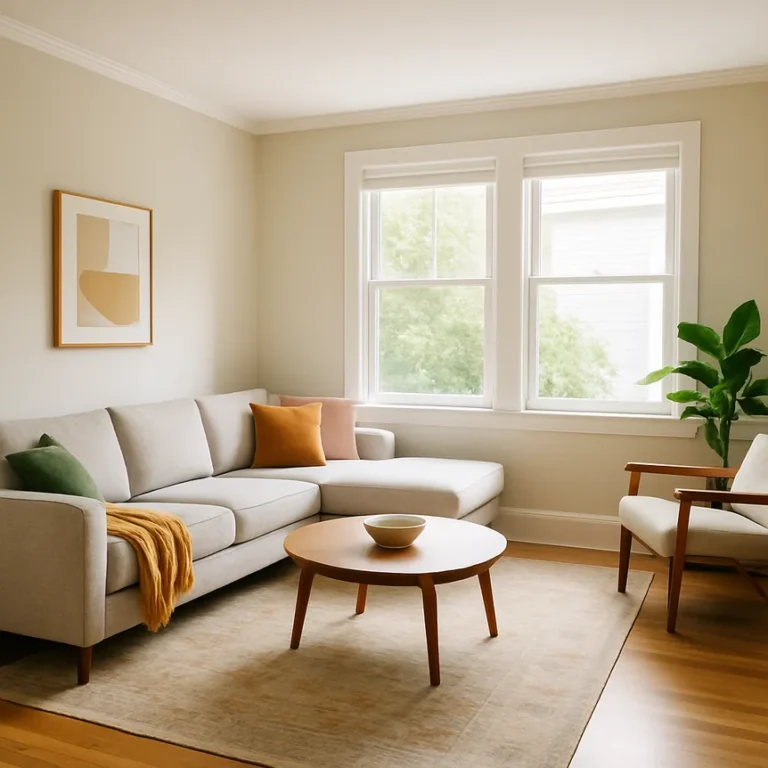
| Cool with one accent | Soft gray | White upholstery, charcoal textiles | Blush, sage, or mustard | Calm rooms with a single point of interest |
Warm minimalist
Warm white walls, natural wood furniture, warm gray textiles, and a rust or terracotta accent. This is the scheme most homes can absorb without a rupture, and the one to default to when the rest of the house is undecided. For the wall, White Dove by Benjamin Moore is the default white I recommend when someone needs a single answer; Swiss Coffee runs slightly creamier for rooms with less light.
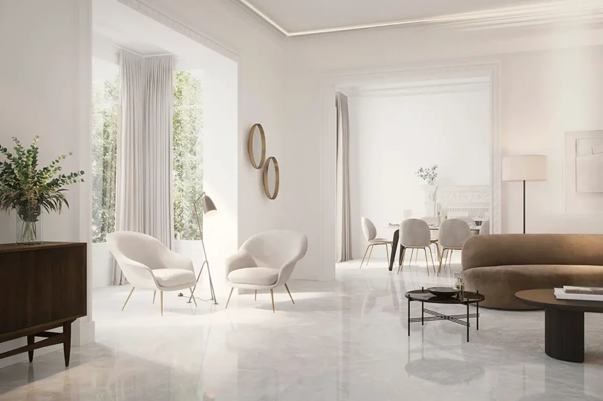
The wood does most of the work. White oak keeps the scheme light and Scandinavian; walnut pulls it toward mid century and needs a warmer white to avoid looking orange. Keep the terracotta to a pair of pillows, a ceramic lamp base, or one large print, and let the warm gray rug carry the thirty percent.
Cool minimalist
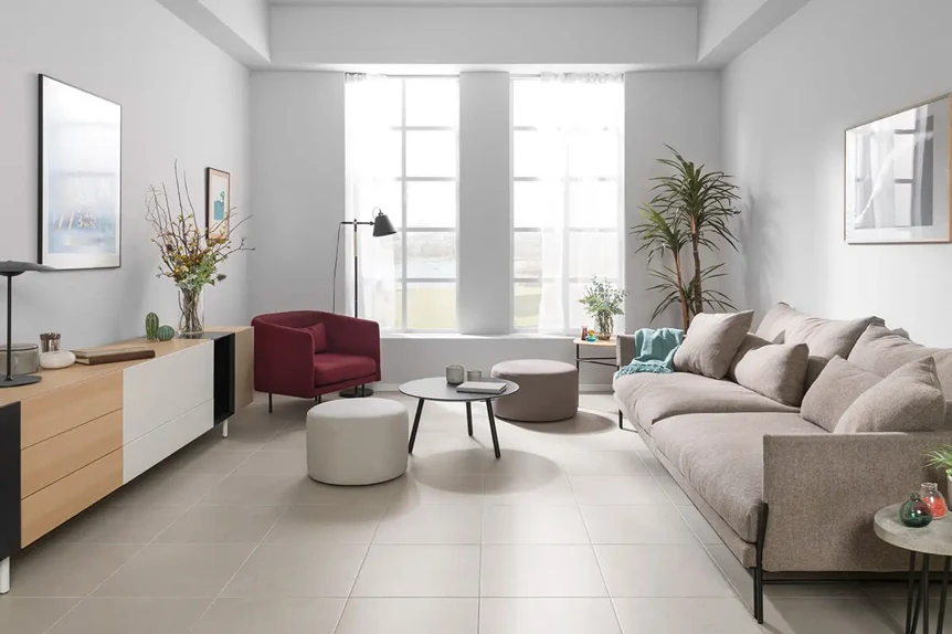
Soft gray walls with a blue undertone, white or pale gray upholstery, a charcoal rug, and navy or forest green as the accent. It suits north facing rooms, where a warm white can go dull and a cool gray reads clean instead, and rooms in hot climates that benefit from a visual drop in temperature. Repose Gray by Sherwin Williams and Pale Powder by Farrow and Ball both sit in the right range.
The risk is coldness: without at least one natural material, a cool minimalist room reads as a waiting area. A wool rug, a pale oak coffee table, or an oatmeal linen curtain brings the temperature back without breaking the undertone rule.
Monochrome neutral
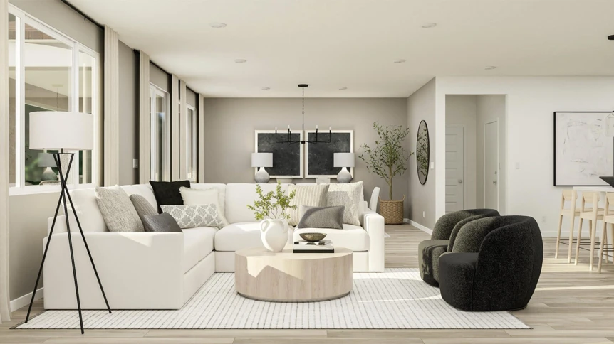
One color family, usually greige or beige, run from light on the walls to deeper on the rug and textiles, with black hardware and picture frames for definition. This is the quietest scheme and the right one for an open plan where the living room shares sight lines with a kitchen and dining area; the paint color combinations for open concept homes guide covers how to carry it across the whole floor.
Monochrome lives or dies on texture. Bouclé against linen, a jute rug against a lacquered table, matte plaster against glazed ceramic: the shifts in surface do the job color does elsewhere. In flat cotton and painted MDF, the same scheme looks like a rental listing.
Black and white
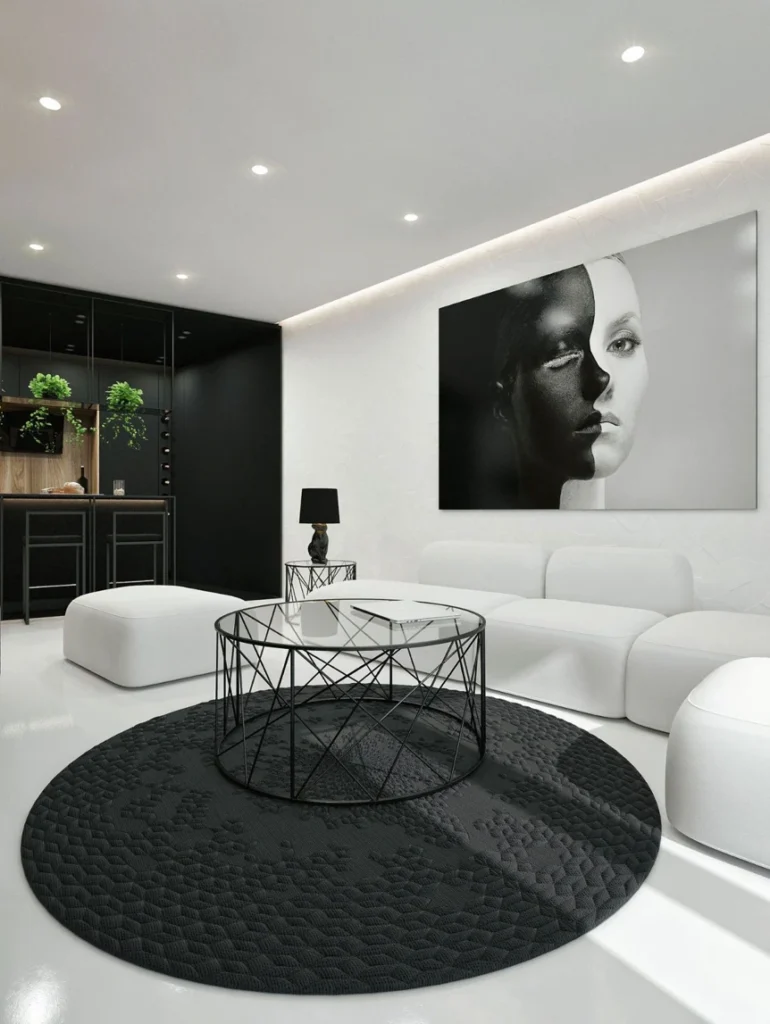
Bright white walls, black furniture or a black rug, black and white art, and natural wood as the only relief. It is the most graphic of the six and the one most often regretted, because it depends on architecture most living rooms do not have. Tall ceilings, strong windows, or good original detail carry it; a low ceilinged room with a television as its focal point does not.
For anyone committed to it, choose a soft black over a true one. Tricorn Black by Sherwin Williams or Railings by Farrow and Ball read as deep charcoal in daylight and avoid the flat, inky look of pure black. Let the wood be generous: a pale oak floor or a walnut credenza is what stops the room from feeling like a showroom.
Warm with one accent
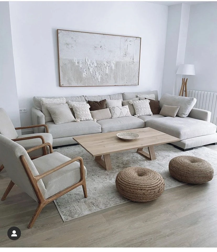
The warm minimalist base with one deliberate accent carried further: navy, forest green, or terracotta at roughly ten percent, in an accent chair, a large piece of art, and two or three textiles that repeat it. It is the scheme for homes that want warmth and a point of view, and it is forgiving because the base is neutral enough to absorb a change of accent later.
The discipline is one accent, not two; navy and terracotta together turn a scheme into a pattern. Pick the accent by what already exists in the room: a walnut credenza wants navy or forest green, a pale oak room can take terracotta.
Cool with one accent
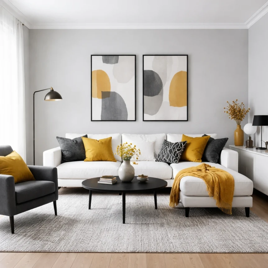
Soft gray walls, white upholstery, charcoal textiles, and one soft accent: blush, sage, or mustard. The cool base keeps the room calm and the single warm accent keeps it from going clinical. It works best in rooms with one obvious place for the accent to live, such as a reading chair by the window.
Mustard is the boldest of the three and the hardest to get right; a small dose in one chair or a throw is enough. Sage is the most forgiving and pairs with almost any gray. Blush reads sophisticated against charcoal and saccharine against white, so keep the charcoal generous when using it.
Which Accent Colors Work in a Modern Living Room?
Six accents show up again and again in rooms that hold their look. Each pairs with a specific set of neutrals and has a form it is best carried in.
Navy
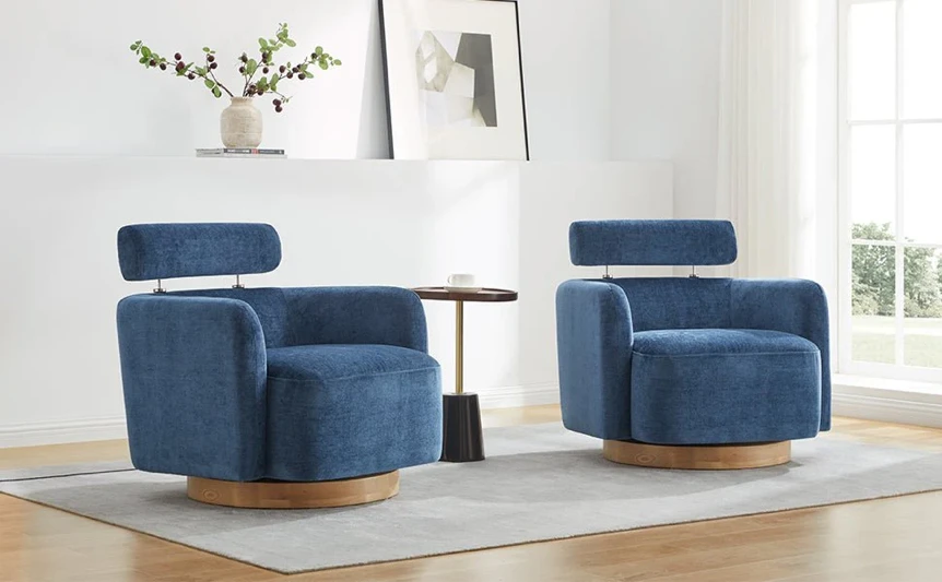
The closest thing to a neutral among the accents, which is why it rarely dates. Navy works against warm whites, cool grays, and any natural wood. Carry it in an upholstered chair or a pair of them, with pillows and art repeating it; a navy sofa pushes it past the ten percent and turns the room blue.
Forest green
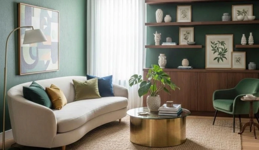
Green is the one accent that plants can carry on their own, which makes it the cheapest to test. It sits well with warm whites and warm grays and reads slightly cold against blue grays. A deep green velvet chair, green painted shelving, or a large plant and two pillows all work; the shelving photographs best and is hardest to undo.
Terracotta and rust
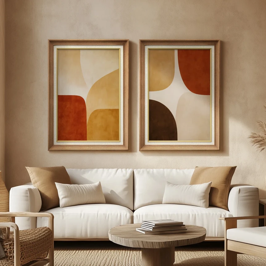
The warmest accent and the one that belongs only in warm schemes. Against a cool gray it looks like a mistake; against a warm white with oak it looks inevitable. Art, ceramics, and pillows are its natural forms, and the warm earthy paint colors guide covers the deeper versions for anyone tempted to take it onto a wall.
Blush
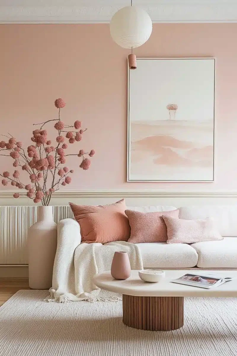
Blush reads as a neutral when it is dusty enough and as a nursery when it is not. Pick the version with visible gray or brown in it, pair it with charcoal rather than white, and carry it in velvet or linen. Two pillows and one piece of art is the full dose.
Sage
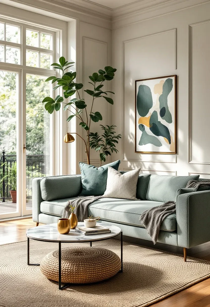
The most forgiving accent on the list. Sage works with warm whites and soft grays alike, sits beside almost any wood, and is calm enough to carry on a sofa without breaking the ten percent rule in spirit. Its limit is that a sage room is pleasant rather than memorable, which for a living room is often the right call.
Mustard
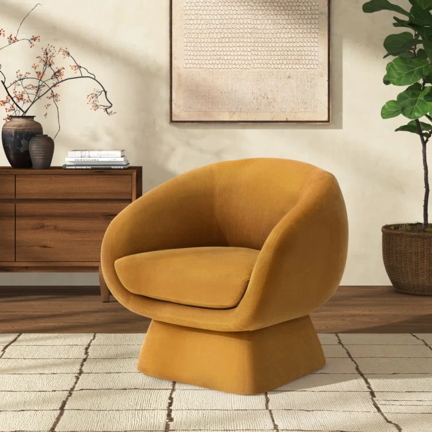
Mustard brings energy and dates fastest, so keep it in the pieces easiest to change: one swivel chair, a throw, or a single large print. It flatters warm whites and warm grays, clashes with blue grays, and pairs unusually well with walnut, which is why it turns up in so many mid century rooms.
How to Choose a Living Room Color Scheme in Five Steps
1. Start with the light, not the wall. Note which way the main windows face and when the room is used most: north light is cool and even and flatters soft grays, while south and west light is warm and strong and flatters warm whites. A room used mostly in the evening can take a deeper wall than one used in the morning.
2. Pick the dominant neutral. This is the wall color and it sets the undertone for everything else. When in doubt, a warm white is the safer bet; White Dove is the one to reach for when the room has no strong reason to go cool.
3. Choose the sofa in the same undertone. The sofa is the second largest color surface in the room, so its undertone has to agree with the wall. A neutral sofa in oatmeal, warm gray, or charcoal works in almost every scheme above; the modern sofas guide covers the fabrics that hold their color.
4. Add the secondary neutral through the rug and curtains. A rug two or three steps deeper than the wall grounds the seating area and carries most of the thirty percent. Curtains should sit close to the wall color so the windows recede rather than frame themselves; the modern area rugs guide covers sizing and material.
5. Test before committing. Paint two foot squares of the final two wall candidates on two different walls, look at them in the morning, at midday, and under the room’s lamps at night, and hold the sofa fabric swatches against them. The full commitment without the trial is the version I would advise against.
What Most People Get Wrong
Too many colors. Four is the ceiling: dominant neutral, secondary neutral, accent, and the wood tone, which counts. A fifth color, however small, reads as indecision.
Mixed undertones. A warm white wall, a cool gray sofa, and a greige rug are each fine and together look muddy. Decide warm or cool once and apply it to every neutral in the room.
The accent on the biggest surface. A forest green sofa or a navy wall is not an accent; it is a dominant color, and the whole scheme has to be rebuilt around it. Accents belong on the pieces easiest to change.
Choosing under store lighting. Paint chips and fabric swatches get judged under cool, bright retail light that no living room has. Make every color decision in the room, at the hour it is used most; the modern lighting for living rooms guide covers how bulb temperature shifts a wall color after dark.
Buying the trend at full scale. The color of the moment is fine as two pillows and expensive as a sofa. If a trending shade is tempting, buy it in the form that costs the least to replace.
How to Change a Color Scheme Without Repainting
Most living rooms that feel wrong do not need a new wall color; they need the thirty and the ten percent reworked. Swapping the rug shifts the secondary neutral in an afternoon and is the highest impact change short of paint. New pillows, a throw, and one piece of art move the accent entirely for a few hundred dollars.
Art is the underused lever. A single piece at least two thirds the width of the sofa can introduce or retire an accent on its own, and the modern wall decor and art ideas guide covers scale and placement. Rearranging furniture so the accent chair sits in the window light rather than a corner changes how much of the accent the eye registers without buying anything.
Where to Go Next
Once the scheme is settled, half the furniture options rule themselves out. The complete guide to modern living room design takes the palette chosen here through layout, seating, and lighting in order. The modern bedroom color schemes guide applies the same undertone rules to the room next door.
Frequently Asked Questions
What is the most popular modern color scheme for a living room?
Warm minimalist: warm white walls, natural oak or walnut, warm gray textiles, and a terracotta or rust accent. It suits the widest range of light conditions and existing furniture, which is why it appears more often than any other scheme in design publications. Cool minimalist, with soft blue gray walls and white upholstery, is the most common alternative for north facing rooms.
How many colors should a modern living room have?
Three or four, counting the wood tone. One dominant neutral on the walls and largest upholstery, one secondary neutral in the rug and curtains, one accent carried by pillows, art, and a small chair, and the wood of the floor and furniture. A fifth color reads as clutter no matter how small the dose.
What is the 60-30-10 rule for living room colors?
About sixty percent of what the eye sees is the dominant color, thirty percent is a secondary color, and ten percent is an accent. In a living room the walls and the sofa carry the sixty, the rug, curtains, and secondary seating carry the thirty, and pillows, art, and one small chair carry the ten. The most common way to break it is putting the accent color on the sofa, which pushes it to thirty or forty percent.
Should living room walls be warm white or cool gray?
Warm white in rooms with south or west light and in most homes with wood floors and natural materials. Cool gray in north facing rooms, where a warm white can look dull, and in rooms that run hot. Whichever is chosen, the sofa, rug, and curtains must share the same undertone, or the room reads as slightly off.
What accent color goes with a gray living room?
Sage, blush, or mustard against a soft gray wall with white upholstery, and navy or forest green against a deeper or bluer gray. Sage is the most forgiving, mustard the boldest. Terracotta and rust belong with warm whites rather than gray, where they tend to look like a mistake.