Paint & Color
By Tereza Hower | Published May 30, 2026 | Updated May 29, 2026
When does color drenching actually work, and when does it read as a paint mistake? The technique (painting walls, trim, doors, and sometimes ceiling all in the same color) has been the most discussed modern paint move of the last several years. It is also the most misapplied. The same approach that creates a cocooned, intentional powder room can produce a flat, oppressive living room.
The technique has earned space in nearly every recent design publication feature on modern paint, often presented as a kind of default move for adding depth to a space. The reality is more selective. Color drenching is one of the most context dependent paint decisions in residential design, and it succeeds or fails based on a small set of room conditions rather than on the color choice itself.
This guide covers when color drenching genuinely works, when to skip it, and how to choose the color when the answer is to commit. The framework is built around the room itself: its size, its enclosure, and the light it receives. Get those three right and the drench will read as architectural. Get any one wrong and the room becomes a candidate for a costly repaint.
Color drenching is the practice of painting walls, trim, doors, and frequently the ceiling all in the same paint color. The technique eliminates the typical wall to trim transitions and creates a continuous color envelope around the room. The intent is to make the room feel enveloping rather than a series of contrasting surfaces.
The technique works because contrast is what makes a room read as a series of parts (wall plus trim plus ceiling plus door). Removing the contrast collapses those parts into a single read. A drenched room feels intentional and contained in a way that a room with separate trim color does not.
Color drenching works under three specific conditions. When all three are present, the technique is reliable. When any one is missing, the result is unpredictable.
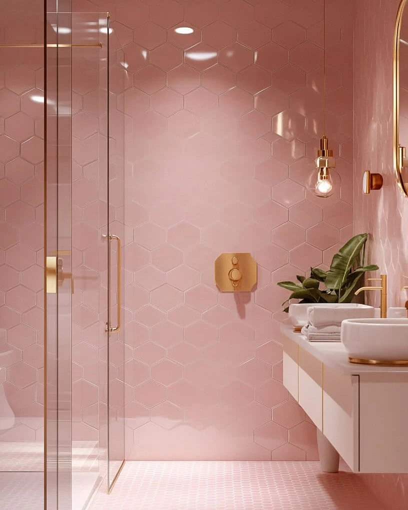
The technique depends on the room being small enough for the envelope to feel intentional. Powder rooms (5 by 6 to 6 by 8 feet), studies, small home offices, dressing rooms, and reading nooks are the ideal scale. A drenched powder room feels cocooned. A drenched 14 by 18 living room feels heavy.
The enclosed quality matters as much as the size. A small room with a doorway out to a larger room reads as a distinct space, which gives the drench room to operate. A small zone within an open plan does not have that architectural definition and the drench will read as inconsistent rather than as enveloping.
Drenching works with colors that have enough depth to read as architectural. Deep neutrals (Hale Navy, Iron Ore, Tarrytown Green) and warm earthy plasters (Setting Plaster, Hague Blue, Stiffkey Blue) are the most reliable choices. Pale colors usually fail at drenching: a drenched room in a soft warm white reads as a missing trim color rather than as an intentional choice.
The exception is when the drenched color is part of a deliberate quiet treatment, like a small office drenched in Pale Oak with walnut shelving. In that case the depth of the wood provides the contrast that the paint does not.
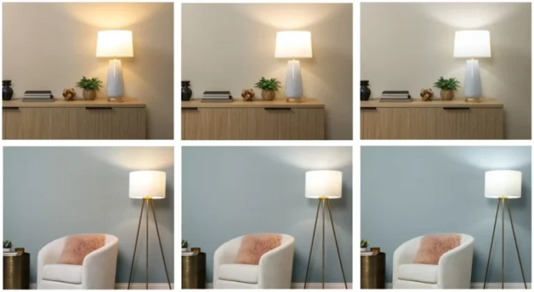
Color drenching amplifies the way paint behaves in light. If a navy reads too cool in north light, the drench will exaggerate the cool. If a pink reads too warm in west light, the drench will read distinctly pink. Test the candidate color in the room at multiple times of day before committing to the full drench.
Color drenching fails in predictable conditions. If any of the following apply, skip the drench and use conventional wall and trim color instead.
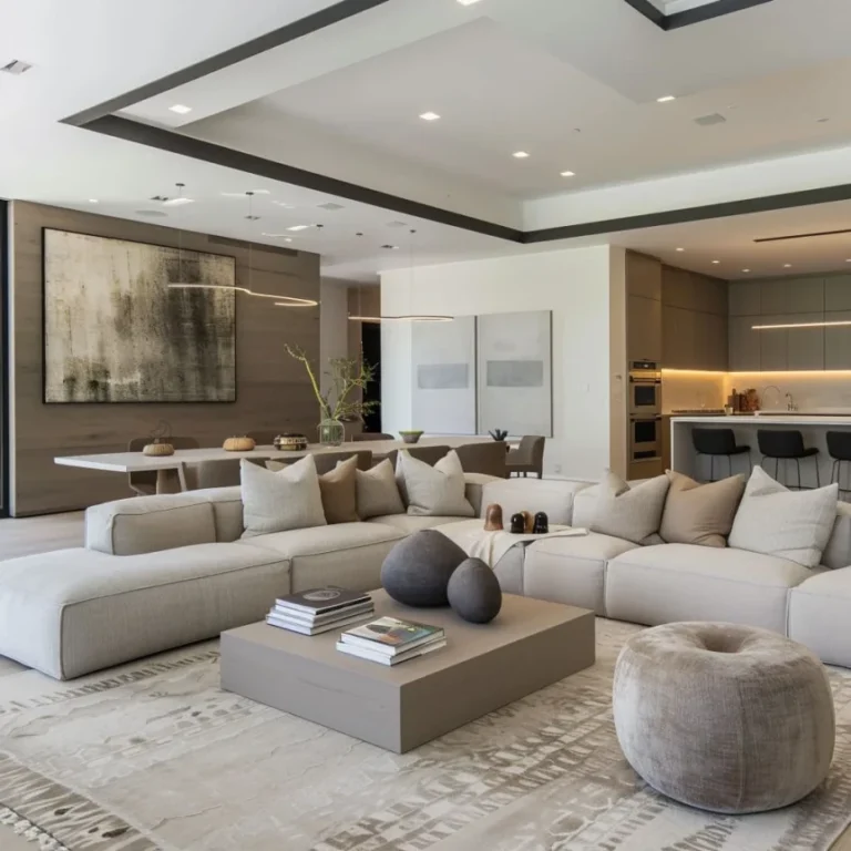
A large drenched room reads as flat rather than enveloping. The volume is too big for the envelope effect to register. The eye reads the color as a wall treatment rather than as a containing surface. Living rooms, primary bedrooms over 12 by 14 feet, and any room with ceilings above ten feet are typically too large to drench successfully.
Drenching a zone within an open plan creates the same problem as painting a single accent wall. The drench has no architectural reason to stop where it does, and the eye reads the transition between drenched zone and adjacent zone as a paint disagreement. The framework for open plan paint is in our guide to paint color combinations for open concept homes.
Drenching works best in rooms with controlled or limited natural light. Strong direct sun amplifies the temperature shifts in the drenched color and reveals every imperfection in the paint application. South facing rooms with large windows are usually better candidates for conventional wall and trim paint.
Drenching is the most committed paint move. Repainting a drenched room is more expensive than repainting a conventional wall and trim treatment because the drench requires multiple coats on more surfaces. If the color has not been tested at scale in the actual room, do not drench.
Five color families produce the most consistent drench results. Each one has a specific mood and room type where it shines.
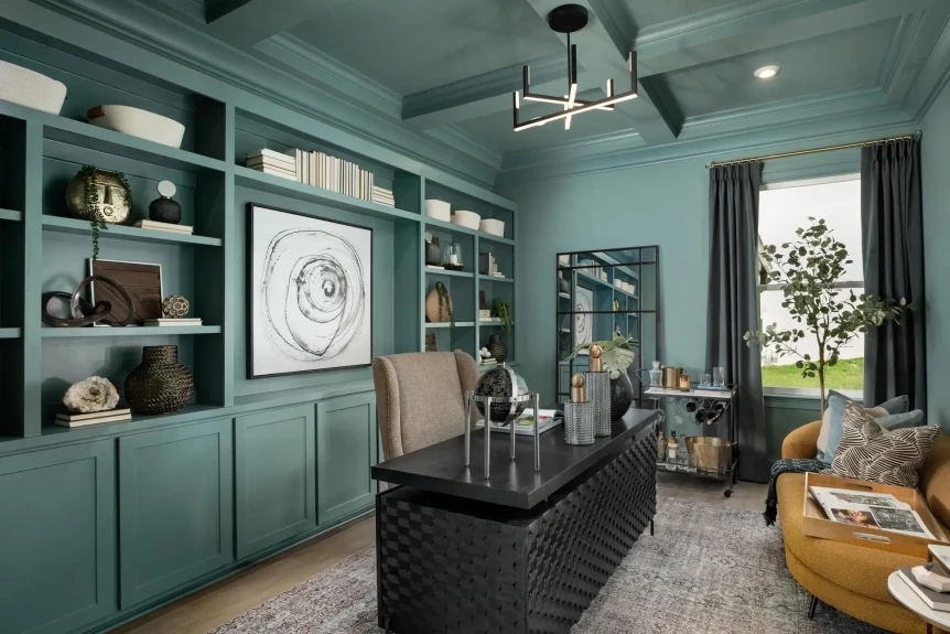
Hale Navy (Benjamin Moore HC-154) and Hague Blue (Farrow & Ball No. 30) are the reference deep navies for drenching. Best in powder rooms, studies, and small home offices with warm wood and brass details to balance the cool depth.
Tarrytown Green (Benjamin Moore HC-134), Studio Green (Farrow & Ball No. 93), and Treron (Farrow & Ball No. 292) are the strongest deep greens for drenching. Best in libraries, dining rooms (when small enough), and reading nooks.
Setting Plaster (Farrow & Ball No. 231), Templeton Pink, and other dusty plaster tones drench beautifully in small rooms. The plaster pinks read as warm rather than as feminine when drenched, and they pair well with brass, dark wood, and matte black fixtures.
Iron Ore (Sherwin Williams SW 7069) and Off Black (Farrow & Ball No. 57) drench successfully in small enclosed rooms with sufficient artificial lighting. Best in dressing rooms, photography studios, small home offices, and powder rooms where the dramatic envelope is the intent.
Evergreen Fog (Sherwin Williams SW 9130), Mizzle (Farrow & Ball No. 266), and Saybrook Sage (Benjamin Moore HC-114) drench well in slightly larger rooms than the deeper colors above. The muted depth gives enough envelope without the heavy quality of the deeper greens or navies.
| Room Type | Best Drench Color Family | Reference Colors | Pair With |
|---|---|---|---|
| Powder room (5 by 6 to 6 by 8 feet) | Deep navy, warm plaster, or charcoal | Hague Blue, Setting Plaster, Iron Ore | Brass, ceramic, dark wood vanity |
| Small home office or study | Deep green or warm plaster | Studio Green, Tarrytown Green, Setting Plaster | Walnut desk, brass lamp, linen curtain |
| Reading nook or alcove | Muted earthy green | Evergreen Fog, Mizzle, Saybrook Sage | Linen upholstery, oak shelving |
| Small dining room (under 12 by 12) | Deep green | Treron, Tarrytown Green, Hague Blue | Walnut table, brass pendants, matte ceramic |
| Dressing room or closet | Charcoal, deep navy, or warm plaster | Off Black, Hale Navy, Templeton Pink | Brass hardware, mirrored surfaces, soft lighting |
For the full envelope effect, yes. A drenched room with a white ceiling reads as half drenched. The eye recognizes the temperature shift at the wall ceiling transition, and the envelope quality breaks. The full drench includes the ceiling in the same color as the walls and trim.
The exception is rooms with very low ceilings (under eight feet) where the drenched ceiling can feel oppressive. In those cases, a slightly paler version of the wall color on the ceiling reads as integrated without compressing the room. The trim should still match the walls.
For the broader paint conversation including how drenching fits with the modern paint families, see the complete guide to modern paint colors. For the deeper accent colors that work in drenches, see our guide to accent wall paint colors that do not feel dated. For the warmer drench options, see our warm earthy paint colors reference.
Color drenching is the practice of painting walls, trim, doors, and often the ceiling all in the same paint color. The technique eliminates the typical contrast between wall and trim and creates a continuous color envelope around the room. It is most reliable in small enclosed spaces like powder rooms, studies, and reading nooks.
Small enclosed rooms work best, typically 5 by 6 feet to roughly 12 by 12 feet. Powder rooms, studies, small home offices, dressing rooms, and reading nooks are ideal. Rooms larger than 12 by 14 feet or with ceilings above ten feet usually read as flat rather than enveloping when drenched, which defeats the purpose of the technique.
The most reliable drench colors are deep neutrals and warm earthy plasters: Benjamin Moore Hale Navy (HC-154), Farrow and Ball Hague Blue (No. 30), Benjamin Moore Tarrytown Green (HC-134), Farrow and Ball Setting Plaster (No. 231), Sherwin Williams Iron Ore (SW 7069), and Sherwin Williams Evergreen Fog (SW 9130). Pale colors typically fail at drenching.
For the full envelope effect, yes. A drenched room with a white ceiling reads as half drenched because the temperature shift at the wall ceiling transition breaks the envelope quality. The exception is rooms with ceilings under eight feet, where a slightly paler version of the wall color on the ceiling reads as integrated without compressing the room.
Color drenching remains current when applied in small enclosed rooms where the envelope quality is the intent. The technique is more durable than the single accent wall it replaced because it commits fully to the color and uses architectural definition to contain it. It does become dated when applied in large rooms or open plans, where it reads as a misjudged paint choice rather than as a deliberate envelope.
Color drenching is the most committed paint move in modern interiors and the most rewarding when applied correctly. The framework is straightforward: small enclosed room, deep color, careful light testing. If those three are present, the drench will read as intentional and durable. If any one is missing, the room is a better candidate for conventional wall and trim treatment. Return to the complete guide to modern paint colors for the broader picture or to the accent wall paint colors guide for the alternative strategies.