Japandi Color Palettes That Set the Tone
By Tereza Hower | Published April 7, 2026 | Updated April 6, 2026
Color in Japandi design is never loud. It doesn’t compete with the furniture, the architecture, or the natural light in the room. Instead, it serves as a quiet backdrop that enhances everything around it. The right Japandi palette makes a room feel grounded, warm, and effortlessly cohesive.
This guide explores the most effective Japandi color combinations, explains the thinking behind each palette, and shows you how to apply them in different rooms throughout your home.
The Logic Behind Japandi Color
Japandi color draws from two complementary traditions. Scandinavian design leans toward light, airy tones that maximize the feeling of natural light. Japanese design incorporates deeper, earthier tones that add weight and a sense of grounding. The Japandi palette lives in the overlap: warm but not bright, muted but not dull, light but with enough depth to feel substantial.
Most Japandi palettes share a few structural elements. A dominant warm neutral covers the majority of the room, usually on walls and larger furniture. One or two muted accent colors add gentle interest. And a darker grounding tone provides contrast and visual weight, often through wood finishes, accent furniture, or small decor pieces.
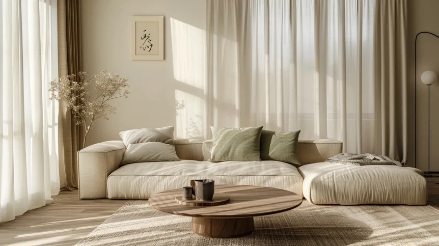
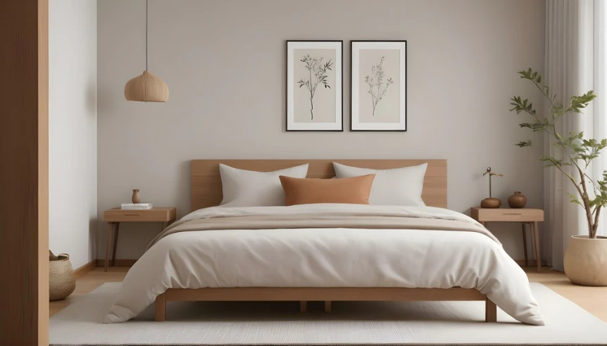
The Warm Neutral Palette
Core Colors
Warm white, soft cream, light sand, natural linen, and pale oatmeal. This palette is the purest expression of Japandi calm. It relies almost entirely on texture and material variation for visual interest, making it ideal for bedrooms and spaces where you want maximum tranquility.
How to Apply It
Use warm white or cream on the walls. Choose larger furniture in light natural wood. Dress the room in linen, cotton, and wool in varying shades of cream and sand. The variation between a cream wall, an oatmeal sofa, and a light wood coffee table is subtle but creates enough depth to keep the room from feeling flat. For bedroom applications specifically, see our Japandi bedroom ideas guide.
Where to Add Depth
Even the lightest Japandi palette benefits from a grounding element. A single piece of dark wood furniture, a charcoal throw pillow, or a dark ceramic vase prevents the room from looking washed out. This is where the Japanese influence matters most. Without at least one darker element, the palette tips toward pure Scandinavian and loses its Japandi character.
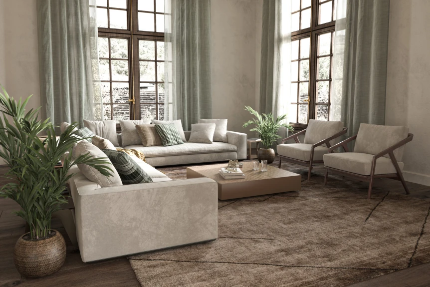
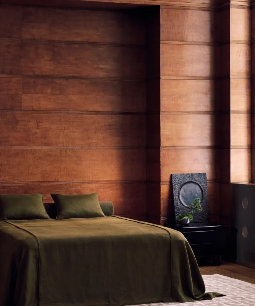
The Earth and Stone Palette
Core Colors
Warm taupe, soft clay, muted terracotta, stone gray, and warm brown. This palette pulls from the natural world, specifically from the tones of unfinished stone, dried earth, and weathered wood. It’s warmer and slightly richer than the neutral palette, making it well suited to living rooms and dining areas.
How to Apply It
Start with a warm taupe or stone gray on the walls. Bring in clay and muted terracotta through textiles like cushions, a throw, or a rug. Use warm brown wood for furniture. The stone gray acts as a bridge between the warmer earth tones and the cooler neutral foundation, keeping the palette balanced.
Balancing Warmth and Cool
This palette works because it balances warm tones (clay, terracotta, brown) with cooler tones (stone gray, taupe). If the room starts feeling too warm, add more stone gray or introduce a muted blue gray accent. If it feels too cool, lean into the clay and terracotta with additional textiles or ceramics.
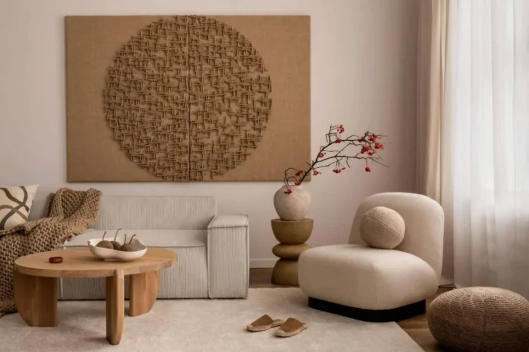
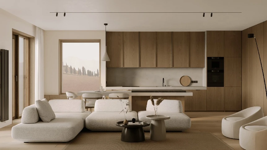
The Sage and Walnut Palette
Core Colors
Muted sage green, warm white, dark walnut, soft cream, and charcoal. This palette is one of the most popular Japandi combinations because it hits every note: warm, grounded, natural, and sophisticated. The sage green adds a gentle connection to nature, while the dark walnut provides the depth and seriousness that the Japanese side of the equation demands.
How to Apply It
Warm white or soft cream walls serve as the base. Introduce sage green through a few cushions, a ceramic vase, or a piece of art. Use dark walnut for key furniture pieces like the coffee table, bed frame, or a statement shelf. Charcoal appears in smaller doses through a throw pillow, a candle, or a picture frame.
Best Rooms for This Palette
This combination works beautifully in every room. In the living room, it creates a sophisticated, collected feel. For detailed living room application, see our guide to Japandi living room ideas. In the bedroom, it’s calming with just enough depth to feel interesting. In the kitchen, sage and walnut complement natural stone countertops perfectly.
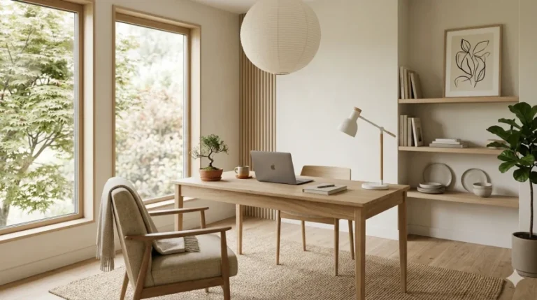
The Charcoal and Light Wood Palette
Core Colors
Charcoal, light ash or birch wood, warm white, soft gray, and black. This palette leans more heavily toward the Japanese side of Japandi, incorporating the contrast between light and dark that’s central to traditional Japanese aesthetics. It’s more dramatic than the other palettes but still maintains the overall feeling of calm.
How to Apply It
Use warm white or very light gray on the walls. Choose furniture in light ash or birch wood. Introduce charcoal through a sofa, a rug, or an accent wall. Use black sparingly for definition, perhaps in a picture frame, a lamp base, or a few hardware details. The high contrast between light wood and dark textiles creates visual energy without bright color.
When to Use This Palette
This palette works especially well in modern apartments and spaces with clean architectural lines. It also suits home offices and studies where a slightly more serious, focused atmosphere is appropriate. The drama of the contrast keeps it from feeling sleepy or bland.
The Dusty Warm Palette
Core Colors
Dusty pink, warm beige, soft mushroom, light wood, and gentle mauve. This is the softest and most feminine of the Japandi palettes, though it avoids anything that reads as overly sweet or pastel. The tones are muted and mature, creating rooms that feel nurturing and serene.
How to Apply It
Use warm beige or a very soft mushroom tone on the walls. Introduce dusty pink through bedding, a cushion, or a ceramic piece. Light wood furniture keeps the room feeling airy. Mauve appears as a subtle accent, perhaps in dried flowers or a piece of textile art.
Best Rooms for This Palette
This palette is particularly effective in bedrooms, nurseries, and bathrooms. It’s also a good choice for reading nooks and personal spaces where comfort and calm are the primary goals.
Common Color Mistakes in Japandi Design
Going Too Cool
Pure cool whites and grays without any warm undertone create a clinical atmosphere that contradicts the warmth at the heart of both Japanese and Scandinavian design traditions. Always lean warm in your neutral choices.
Forgetting the Dark Element
A room that’s entirely light tones lacks the grounding quality that distinguishes Japandi from other neutral styles. Include at least one element of dark wood, charcoal, or black to bring depth and contrast.
Introducing Too Much Color
One or two muted accent colors is enough. Introducing three or four, even in muted tones, starts to feel busy and works against the visual quiet that defines the style. If you love color, consider a style like bohemian that embraces it more fully.
Ignoring Material Tone
The tone of your materials matters as much as your paint colors. A cool toned gray sofa next to a warm toned wood table can feel disjointed. Make sure your wood tones, fabric tones, and wall colors share a consistent warm or cool undertone. For help styling these elements cohesively, see our Japandi decor ideas and styling tips guide.
Conclusion
Japandi color palettes are built on subtlety, warmth, and a deep connection to natural tones. The quiet restraint of these palettes isn’t about playing it safe. It’s about creating environments that support calm, focus, and well being. Choose a palette that resonates with how you want your home to feel, and let the natural materials and textures in the room bring it to life.
For the complete framework of Japandi design, from principles and furniture to room by room strategies, visit our complete guide to Japandi interior design.
Frequently Asked Questions
What are the main colors in Japandi design?
Japandi palettes center on warm whites, soft creams, and natural wood tones as a base. Accent colors include muted sage green, soft clay, warm taupe, and dusty terracotta. Darker tones like charcoal, walnut brown, and black add grounding depth. All colors lean muted and earthy rather than bright or saturated.
Can a Japandi room have color?
Yes, but color is used sparingly and always in muted tones. Sage green, dusty pink, soft clay, and muted blue are all appropriate Japandi accent colors. The key is introducing one or two gentle accents against a warm neutral base, never enough color to disrupt the calm, grounded atmosphere.
What is the difference between Japandi and Scandinavian color palettes?
Scandinavian palettes tend to be lighter overall and may include soft pastels. Japandi palettes incorporate more warmth and include darker grounding elements like walnut wood, charcoal, and black that are borrowed from Japanese design. Japandi whites also lean warmer than the cooler whites common in Scandinavian interiors.
Should Japandi walls be white?
Warm white is a popular choice, but it’s not the only option. Soft cream, light sand, warm greige, and very light taupe all work well as Japandi wall colors. The important thing is to choose a warm undertone rather than a cool or stark white, which can feel too clinical for the style.