Boho Color Palettes for Every Room

By Tereza Hower | Published April 3, 2026 | Updated October 12, 2026
Most rooms that miss the boho look have the right objects and the wrong colors: a rattan chair and a kilim pillow against cool gray walls, or six saturated hues fighting with no neutral to rest on. A boho color palette works when the colors share warmth and one of them is clearly in charge. Below are five palettes that do that, each with paint colors to start from and the rooms they suit.
Key Takeaways
- Build every boho palette from a warm base, one or two supporting colors, and a single bolder accent.
- Keep undertones consistent: warm whites and clays together, never terracotta against a cool gray.
- Put the strongest color on textiles and one wall, not on every surface.
- Choose deeper palettes for bright rooms and lighter, warmer ones for north facing rooms.
What Colors Are Boho?
Boho colors are warm, earthy, and drawn from natural materials and handmade textiles: terracotta, rust, ochre, olive, sand, and cream, with jewel tones such as teal, emerald, and burgundy as accents. What makes a palette bohemian is shared warmth and visible texture rather than any single hue.
That warmth is the difference from modern and minimalist schemes, which usually hold a room to two or three closely related tones. Boho rooms carry more colors, but they agree with each other because they come from the same family: clay, dried grass, aged wood, and dyed wool.
How Is a Boho Color Palette Built?
Use the 60/30/10 split as a starting point. About 60 percent of the room is the base color, on walls and large furniture. About 30 percent is one or two supporting colors, in the rug, curtains, and upholstery. The last 10 percent is the accent, in pillows, pottery, and art.
The split is looser than in a modern room, since a vintage rug may carry five colors at once. What matters is that the eye can tell which color leads. When every color is given equal weight, a boho room stops reading as layered and starts reading as cluttered.
Which Boho Color Palette Fits Your Home?
| Palette | Base | Supporting | Accent | Paint to start with | Best rooms |
|---|---|---|---|---|---|
| Earth tone | Warm beige | Terracotta, rust | Ochre, olive | Accessible Beige SW 7036, Cavern Clay SW 7701 | Living room, dining room |
| Jewel tone | Warm white | Deep teal or emerald | Burgundy, amber | White Dove OC-17, Hague Blue No. 30 | Dining room, bedroom |
| Neutral boho | Warm white | Sand, light tan | Natural wood, cognac leather | Alabaster SW 7008 | Small rooms, bathroom, entry |
| Desert | Warm sand | Dusty pink, sage | Burnt sienna, coral | Setting Plaster No. 231, Evergreen Fog SW 9130 | Bedroom, bathroom |
| Global | Warm neutral | Indigo, terracotta red | Saffron, turquoise | Naval SW 6244, India Yellow No. 66 | Living room, dining room, porch |
SW codes are Sherwin-Williams, OC codes are Benjamin Moore, and numbered names are Farrow and Ball. Treat them as starting points: always test a large swatch on two walls and look at it morning and evening before committing.
The Earth Tone Boho Color Palette
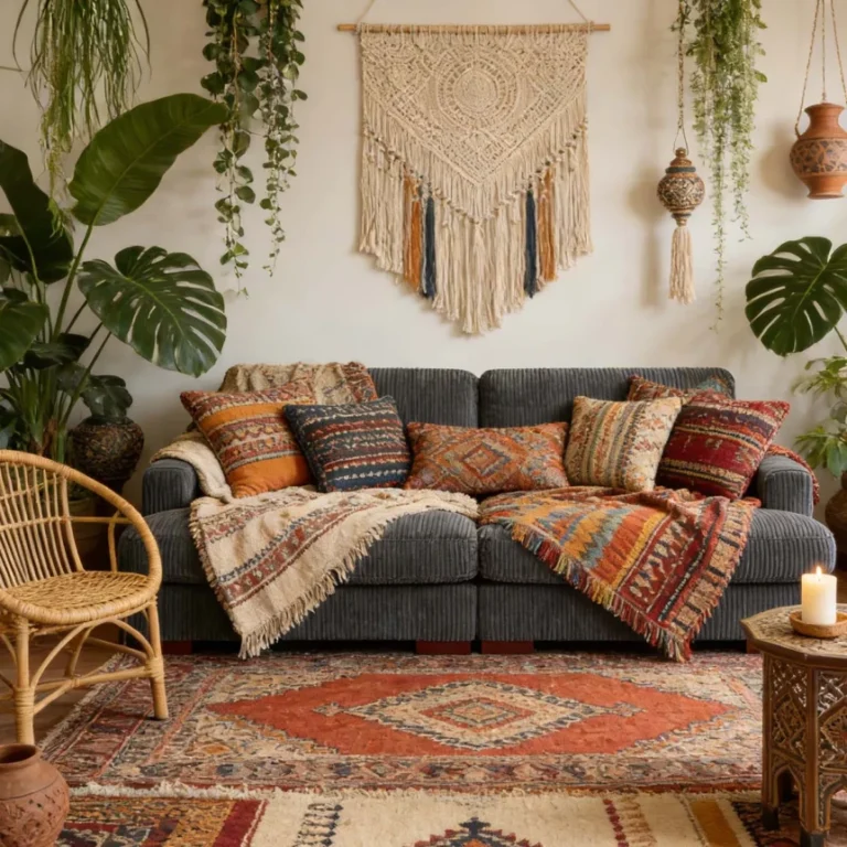
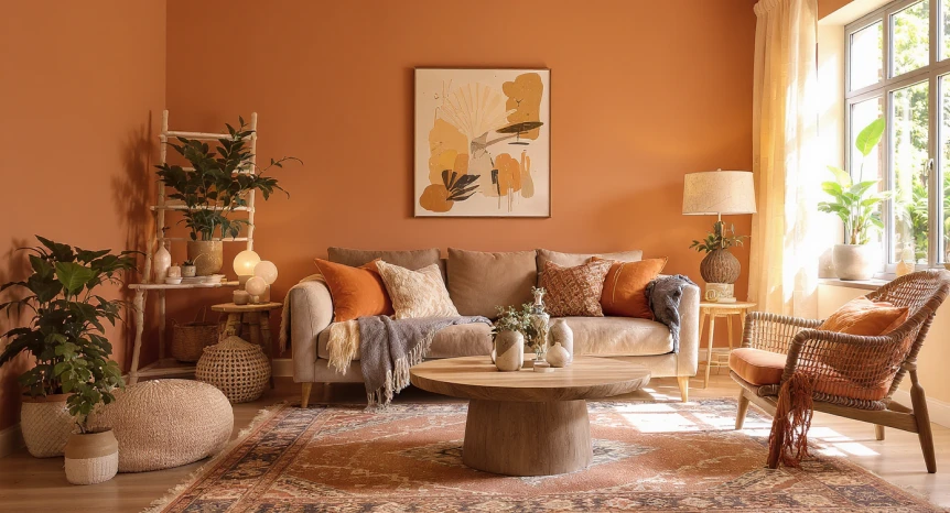
Warm beige, terracotta, rust, ochre, olive, and chocolate brown make up the most recognizable boho scheme. These are the colors of clay, dried leaves, and old wood, and together they make a room feel grounded and lived in.
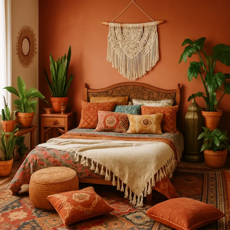
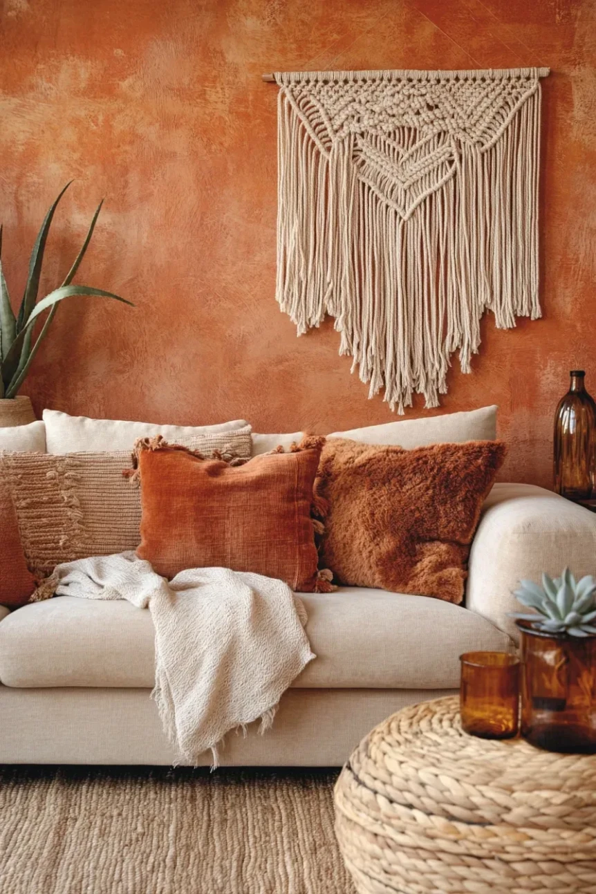
Paint the walls a warm beige such as Accessible Beige, or go further with a single wall in Cavern Clay, a muted terracotta that reads earthy rather than orange. Bring in rust and terracotta through an 8 by 10 foot rug or a velvet sofa, then add ochre and olive in smaller pieces: a throw, a lamp base, a few ceramics. Keep chocolate brown for one grounding piece, such as a leather chair or a dark wood side table.
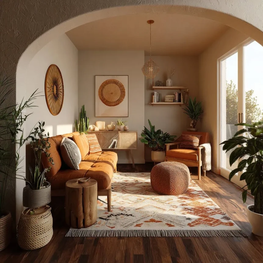
This is the most forgiving palette for living and dining rooms, and it suits rooms with moderate light, where warm walls make up for the lack of sun. For furniture and layout to go with it, see boho living room ideas and inspiration, and for more wall colors in the same family, warm earthy paint colors.
The Jewel Tone Palette
Deep teal, emerald, burgundy, burnt orange, sapphire, and amber bring the richness of vintage textiles and old glass. They give a boho room depth and a little drama that earth tones alone cannot.
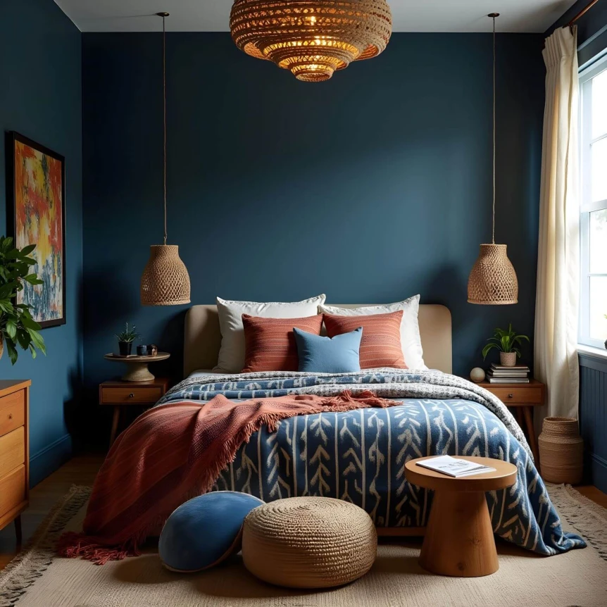
Jewel tones work as accents against a warm white such as White Dove. The strongest single move is one wall in a deep blue green such as Hague Blue, usually the wall behind the bed or sofa. Add burgundy through velvet cushions or a vintage rug and amber through glass, a lamp, or brass.
Restraint is what makes this palette work. Pick one or two jewel tones to lead and let warm neutrals carry the rest; using all six at once turns rich into loud. Dining rooms and bedrooms suit it best, and rooms with good light or high ceilings keep dark walls from closing in. The bohemian bedroom decor ideas guide shows how deep colors behave in a sleeping space.
The Neutral Boho Palette
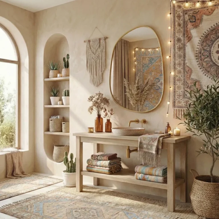
Warm white, cream, sand, light tan, and natural wood make up the quietest version of boho. Interest comes from texture and material rather than contrast: rattan, jute, linen, wool, and raw wood do the work that color does in the other palettes.
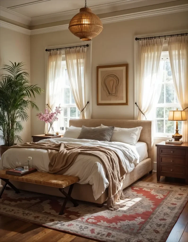
Start with a warm white such as Alabaster, which has enough yellow in it to avoid looking clinical. Layer at least three textures in every zone, for example a jute rug, a linen duvet, and a chunky wool throw, and add one darker note such as cognac leather or walnut so the room does not wash out.
Neutral boho is the right choice for small rooms, bathrooms, and entryways, and for anyone who wants the look without committing to strong color. It also blends easily with Scandinavian and Japandi pieces, a crossover covered in Scandinavian vs Nordic vs Scandi boho.
The Desert Boho Palette
Dusty pink, warm sand, burnt sienna, sage, and muted coral take their cue from arid landscapes. The palette is soft and warm without tipping into pastel.
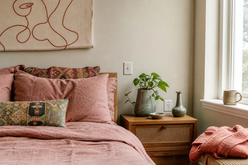
Use a warm sand or a pale plaster pink such as Setting Plaster on the walls. Bring dusty pink into bedding and throws, and sage into ceramics and plants, or into a painted shelf or door in a gray green such as Evergreen Fog. Keep burnt sienna and coral to art, candles, and one or two pillows.
Bedrooms and bathrooms suit this palette best. It gives a calm room that still reads as boho, without the intensity of jewel tones or the weight of a full earth tone scheme. Pale oak, cane, and unglazed terracotta suit it better than dark woods, which can look heavy against the soft pinks.
The Global Boho Palette
Indigo, saffron, terracotta red, turquoise, and warm black draw on textile traditions from Morocco, India, Mexico, and West Africa. It is the most colorful of the five, and it needs the most structure to hold together.
Keep the walls and large furniture neutral, or paint one wall in a deep indigo such as Naval, and let textiles carry the color: an indigo block print bedspread, saffron cushions, terracotta pottery, turquoise tile. A yellow such as India Yellow works on a door, a cabinet, or a single shelf rather than four walls. Warm black arrives through wrought iron, dark wood frames, and old brass.
Living rooms, dining rooms, and covered porches suit it, especially with collected and handmade pieces. When several patterns share the room, how to mix patterns in bohemian style covers scale and repetition so the result stays cohesive.
Which Boho Colors Work in Each Room?
Each room asks something different of a palette. Use this as a quick guide, then adjust for the light the room actually gets.
- Living room: earth tone or global. The room gets the most use and the most varied light, so it can carry the warmest and busiest scheme.
- Bedroom: desert or jewel tone. Choose desert for calm, or a deep teal wall behind the bed for a cocooning room.
- Dining room: jewel tone. Rooms used mostly in the evening suit dark, rich walls, which glow under warm lamplight.
- Bathroom: neutral or desert. Small, often windowless rooms need light walls; add color through towels, a rug, and terracotta tile.
- Entryway: neutral boho, with one strong accent in a runner or a painted door, since the space is seen briefly and often.
Carry one color from room to room so the house reads as a whole: a terracotta pot in the hall, a rust pillow in the living room, a clay toned throw in the bedroom. The complete guide to modern paint colors explains how to test and compare wall colors across connected rooms.
How Should Light Change Your Palette?
Light changes boho colors more than most. North facing rooms get cool, even light that makes terracotta look muddy and warm whites look gray, so choose lighter, warmer bases there. South and west facing rooms get warm light that can push earth tones toward orange, so they handle deeper, cooler accents such as teal and indigo.
Bulbs matter too. Lamps around 2700K flatter every palette in this guide; cool daylight bulbs above 4000K flatten clay and rust into brown. Before buying anything large, pull the palette from something already in the room, such as a rug or a piece of art, so the scheme starts from a color you already like.
Common Boho Color Mistakes
Playing it too safe. A boho room in all beige and white can read as bland rather than relaxed. Add at least one layer of stronger color through a rug, a set of pillows, or art.
Too many bold colors with no anchor. Every colorful boho room needs somewhere for the eye to rest. Neutral walls, simple upholstery, and a few solid textiles among the patterns provide it.
Mixed undertones. A cool gray wall with warm terracotta textiles looks disjointed however good each piece is. Hold warm with warm; if the walls are already a cool gray, lean on teal and indigo rather than rust.
Color only on small things. Ten small colorful accessories in a neutral room read as clutter. One large rug or one painted wall in the same color does more, with less. For ways to bring color onto the walls without paint, see boho wall decor ideas for every room.
Choosing Your Starting Point
Pick one palette, commit to its base color, and let the rug and textiles carry the rest. A boho room is meant to evolve, so accents can change with seasons and finds while the base stays put. For the principles behind the style, from furniture to pattern, read the complete guide to bohemian interior design.
Frequently Asked Questions
What colors are considered bohemian?
Warm earth tones such as terracotta, rust, ochre, olive, and sand are the classic bohemian colors, with jewel tones such as teal, emerald, burgundy, and amber as accents. Most boho rooms set them against a warm white or beige base.
What is a good boho color palette for a bedroom?
A desert palette of warm sand, dusty pink, and sage is the calmest choice. For a richer room, keep the walls warm white and paint the wall behind the bed a deep teal, then add burgundy or rust in the bedding.
How many colors should a boho color palette include?
Usually four to six: one warm base, one or two supporting colors, and one or two accents. Use roughly 60 percent base, 30 percent supporting, and 10 percent accent so one color clearly leads.
What wall color works best for bohemian rooms?
A warm white or soft beige such as Alabaster or Accessible Beige is the most versatile. For more character, paint one wall in a muted terracotta such as Cavern Clay or a deep blue green such as Hague Blue.
Can a boho room be mostly neutral?
Yes. Neutral boho uses warm whites, sand, and tan, and relies on texture for interest: jute, rattan, linen, wool, and raw wood. Add one darker note, such as cognac leather or walnut, so the room does not look flat.