Bathroom Color Schemes That Work
By Tereza Hower | Published March 17, 2026 | Updated March 27, 2026
Choosing a bathroom color scheme feels particularly consequential because so much of the room is tiled, which means the colors are largely fixed once applied. Making the right call requires understanding how color behaves in small, often low-light spaces and knowing which palettes hold up over time rather than feeling dated after a few years.
This guide covers the approaches that consistently produce beautiful, livable bathroom color schemes and the principles behind why they work.
Why Bathrooms Respond to Color Differently
A few things make bathrooms behave differently from other rooms when it comes to color. They are typically smaller, which means colors read with more intensity than they do in larger spaces. They often have limited natural light, which shifts how colors appear compared to how they look on a sample card. And the dominant surfaces, tiles, are reflective to varying degrees, which changes the quality of light and the way color reads throughout the day.
Colors that look balanced in a living room or kitchen can feel overwhelming in a small bathroom. Conversely, very pale colors that seem timid in a larger room can look exactly right in a bathroom where the enclosed space gives them weight and presence.
The other important factor is the relationship between the wall color, the tile color, and the grout color. In most bathrooms these are three separate color decisions that all need to work together, and the grout in particular, which is often treated as an afterthought, has a surprisingly strong effect on the overall character of the finished room.
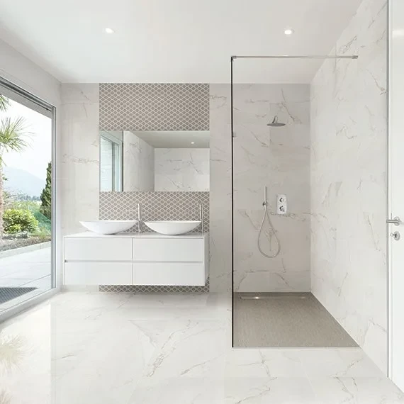
White and Off-White: The Enduring Standard
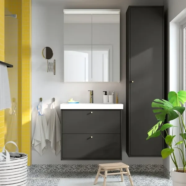
White and off-white bathrooms remain the most popular color choice, and they have earned that position. A well-executed white bathroom reflects light, feels inherently clean, works with almost any hardware finish, and provides a backdrop that is easy to refresh through accessories and towels as tastes evolve.
The key to making a white bathroom feel warm rather than clinical is in the details. The warmth of the white tone matters significantly: a white with a slight yellow or pink undertone reads very differently from a blue-toned white, particularly under the warm bulb temperatures most common in bathrooms. The texture of the tiles adds depth that a flat painted wall cannot: a slightly textured matte tile in warm white has a richness that a standard gloss tile in the same color does not. Hardware in brushed brass or warm chrome rather than cool silver shifts the whole palette toward warmth.
Off-white shades, including warm cream, linen, and pale stone, are often more interesting than pure white in a bathroom because they have more of an inherent character and tend to respond better to artificial light in the evenings.
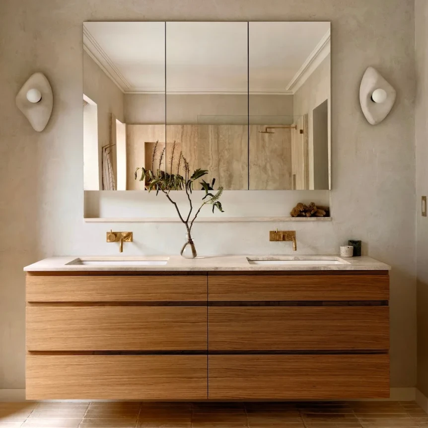
Earthy Neutrals: Warmth Without Strong Color
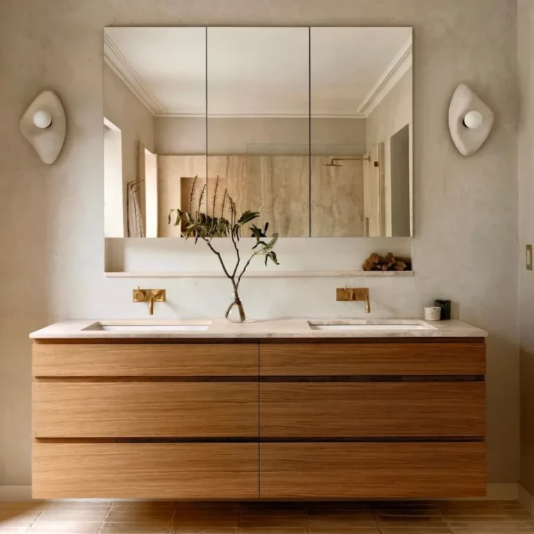
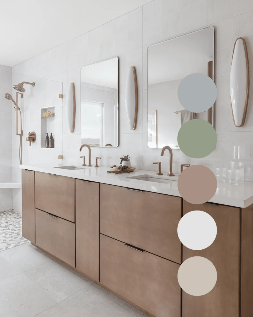
The category of bathroom colors that has seen the most growth in recent years is earthy neutrals: warm taupes, sandy beiges, pale terracotta, greige, and soft mushroom. These tones create a bathroom that feels naturally warm and grounded without the commitment of a strong color, and they age very well.
Earthy neutrals work particularly well in combination with natural materials. A sandy taupe tile alongside a timber-effect vanity, a concrete-look basin, and matte brass hardware creates a bathroom with a warm, organic quality that feels personal and sophisticated. The same sandy taupe alongside white fittings and chrome hardware would read as flat and undistinguished: the surrounding materials make as much difference as the color itself.
Grout color in earthy neutral bathrooms should complement rather than contrast. A warm sand or putty grout blends into stone-effect or beige tiles and keeps the surface looking seamless. A white or grey grout with a warm tile creates a grid pattern that draws attention to the individual tile shapes rather than allowing the surface to read as a whole.
Deep and Moody Tones
Deep bathroom colors have moved from a niche choice to a mainstream one, and the results when done well are some of the most striking bathrooms being designed today. Deep sage green, slate blue, rich forest green, terracotta, and warm charcoal all produce bathrooms with an atmosphere that lighter rooms simply cannot match.
The psychological effect of a deeply colored bathroom is the same as in a bedroom: the room feels cocooning, intimate, and calm in a way that a white or pale room does not. In a bathroom, where the primary purpose is rest and refreshment, this quality is a genuine asset.
Deep tones work best when they are carried across both walls and tiles rather than applied only to painted walls above a tiled dado. A bathroom where the tile and wall paint are the same color, or closely related tones, feels much more cohesive and intentional than one with a strong contrast between the two zones.
Lighting is especially important in a deeply colored bathroom. A dark room needs good ambient lighting and ideally a strong vanity light to ensure the space feels welcoming rather than gloomy. A backlit mirror or illuminated mirror is almost essential in a deep-toned bathroom to provide the face-level light that the darker surroundings absorb.
The Tonal Single-Color Approach
One of the most sophisticated bathroom color strategies is choosing a single color and working through its range across different surfaces and materials. A bathroom where the floor tile is a mid-tone sage, the wall tile is a slightly lighter sage in a different format, and the painted ceiling is the palest sage in the family has a depth and harmony that a mixed palette approach rarely achieves.
This approach requires more confidence than picking a neutral backdrop and adding accent colors, but it produces remarkably beautiful results. The variation in the scheme comes from texture, format, and finish rather than color contrast, which gives the room a quality of restraint that feels genuinely considered.
Practical Color Testing for Bathrooms
Because so much of the bathroom is tiled, the standard advice of painting large test patches is only partly useful. Before committing to a tile color, order large format samples of the actual tiles and look at them in the bathroom space under both natural and artificial light. Tile samples photographed in a showroom under retail lighting look significantly different from the same tile installed in a domestic bathroom with different light levels and surrounding materials.
Look at the sample at different times of day and specifically under the artificial light you plan to use in the finished bathroom. The bulb temperature and the finish of the tile interact in ways that are difficult to predict from a small sample viewed under different conditions.
Choose grout color at the same time as tile color. Many people choose their tiles and then pick grout almost as an afterthought, which often leads to regret. The grout color has a significant effect on how the finished surface reads: a matching grout creates continuity and makes the tiled surface feel like a single material, while a contrasting grout creates a visible grid that emphasises the tile format and scale.
With your palette decided, these related guides will help you pull the room together:
- Best Modern Bathroom Tiles and Flooring
- Best Modern Bathroom Vanities and Sinks for 2026
- Modern Bathroom Lighting: Complete Guide
- Modern Bathroom Accessories and Decor
- Small Bathroom Design Ideas
For the full guide to designing your bathroom, visit The Complete Guide to Modern Bathroom Design.