Dining Room Color Schemes That Work: How to Choose the Right Palette
By Tereza Hower | Published April 1, 2026
Color decisions in a dining room carry more weight than in most other rooms because the conditions are specific. Dining rooms are used primarily in the evening, under warm artificial light, and the people in them are seated close together facing each other. That means wall color, table finish, textile tones, and lighting all interact in a compact visual field where every choice is visible.
The good news: those constraints actually make color selection easier, not harder. This guide covers the palettes that work consistently in modern dining rooms, how to introduce bold color without overwhelming the space, and how to test colors under the light conditions that actually matter.
Why Dining Room Color Is Different
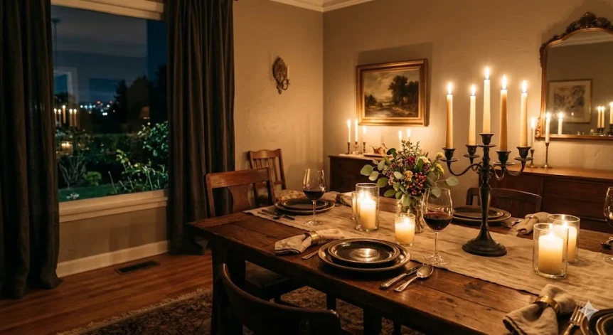
Most color advice assumes you’re looking at walls in daylight. Dining rooms don’t play by those rules. The room is at its most important when the sun is down, the pendant is dimmed, and candles might be lit. Colors shift significantly under warm, low level artificial light. Whites can turn yellow. Cool grays can look dull and lifeless. Colors that feel subtle in a paint swatch can become much more saturated in a dim, enclosed space.
This is why dining rooms are one of the best rooms in the house for bold color. What might feel heavy or imposing in a living room flooded with natural light becomes rich and enveloping in a dining room at 8pm. The space is already intimate by design, so the color can lean into that.
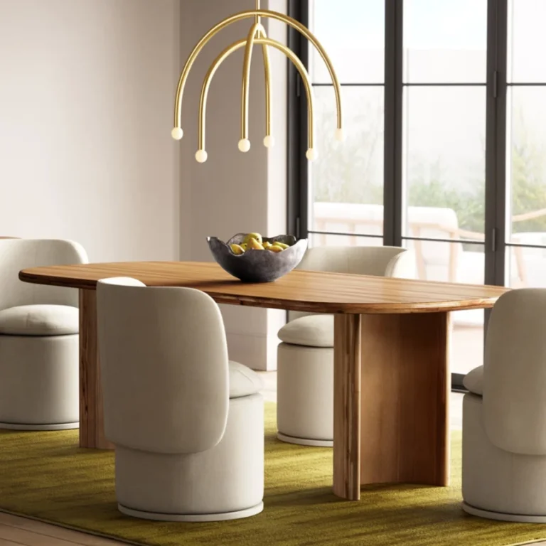
Neutral Foundations: The Safe and Effective Approach
A neutral palette is the most widely used approach in modern dining rooms, and for good reason. It’s versatile, timeless, and lets other elements like the table, chairs, art, and lighting do the visual work.
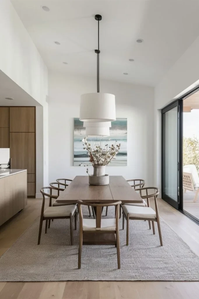
Warm Whites
Warm white walls are the most common choice and work in nearly every dining room. The key word is “warm.” A cool, blue toned white looks stark and clinical under warm pendant lighting. Stick with whites that have a yellow, cream, or slightly pink undertone. These read as clean and bright during the day and warm and inviting at night.
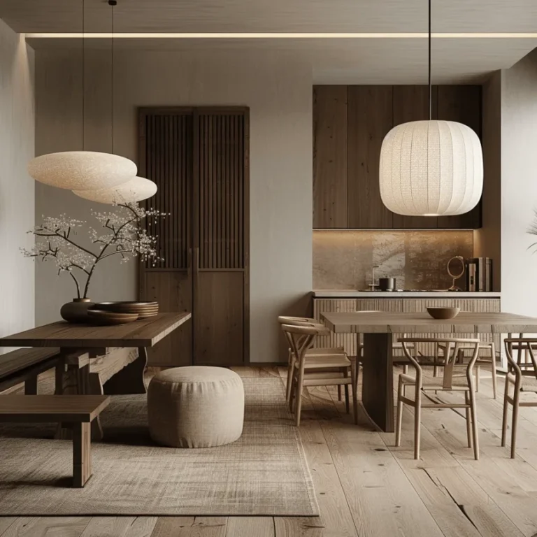
Soft Taupes and Plaster Tones
A step beyond white, taupe and plaster toned walls add depth without committing to a strong color. These warm, earthy neutrals have become one of the defining palettes of modern interior design. They pair naturally with wood, linen, and stone, which are the materials that dominate most modern dining rooms.
Light Warm Grays
Gray works in dining rooms only if it has enough warmth. A gray with a green or brown undertone holds up well under warm light. A gray with a blue or purple undertone can turn cold and flat when the sun goes down. Always test gray swatches under evening lighting before committing.
Bold Color: Where Dining Rooms Shine
If you’ve been hesitant about dark or saturated wall colors, the dining room is the place to try them. The controlled lighting, the evening use, and the naturally intimate scale of the room all work in favor of deeper tones.
Deep Green
Forest green and deep olive tones are among the most successful bold colors in modern dining rooms. Green reads as organic and calming, pairs beautifully with wood furniture and brass or gold fixtures, and becomes richer and more complex under low warm light. It’s a color that feels sophisticated without being aggressive.
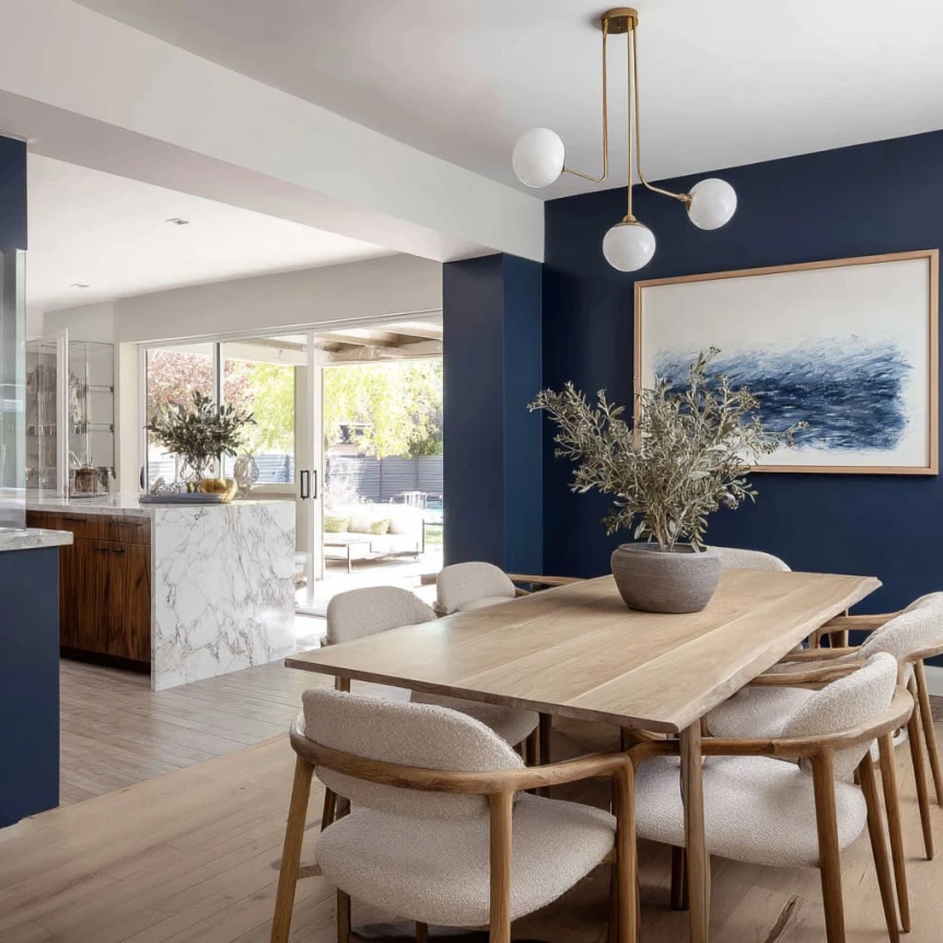
Navy and Deep Blue
Navy walls create a sense of depth and enclosure that works especially well in rooms with higher ceilings or large windows. Blue is universally calming and recedes visually, which makes the room feel slightly larger even as the color adds drama. Pair navy with warm wood tones and cream or white textiles to prevent the room from feeling too dark.
Charcoal
A deep charcoal is less stark than black and more sophisticated than medium gray. It creates a strong backdrop that makes white tableware, candle flames, and metallic accents pop. Charcoal works particularly well in formal modern dining rooms where the mood is intentionally dramatic.
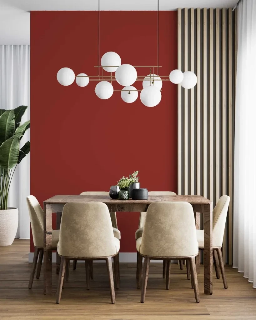
Burgundy and Terracotta
Warm reds and earth tones are classic dining room colors for a reason: they stimulate appetite and conversation. Modern versions lean toward muted terracotta, dusty rose, or deep burgundy rather than bright reds. These colors are warm and inviting without feeling dated, especially when balanced with cooler neutral furnishings.
Accent Color Strategies
If you prefer neutral walls but want color in the room, there are several effective approaches that introduce visual interest without a full commitment to a bold wall.
The Accent Wall
Painting one wall in a deeper or more saturated tone creates a focal point. In a dining room, this is typically the wall most visible from the table or the wall behind a sideboard. The accent wall works best when the remaining walls are a lighter neutral that relates to the accent color without matching it exactly.
Color Through Furniture and Textiles
Upholstered chairs in a rich fabric, a colored rug, or linen curtains in a tonal shade can bring color to the room without touching a paintbrush. This approach is more flexible because textiles are easier to change than wall paint, and it keeps the room’s backdrop neutral and adaptable.
Art as the Color Source
A single large piece of art with a dominant color can set the palette for the entire room. The advantage of this approach is that the color feels curated and intentional rather than applied. Our guide to Dining Room Wall Decor Ideas covers how to choose and place art effectively.
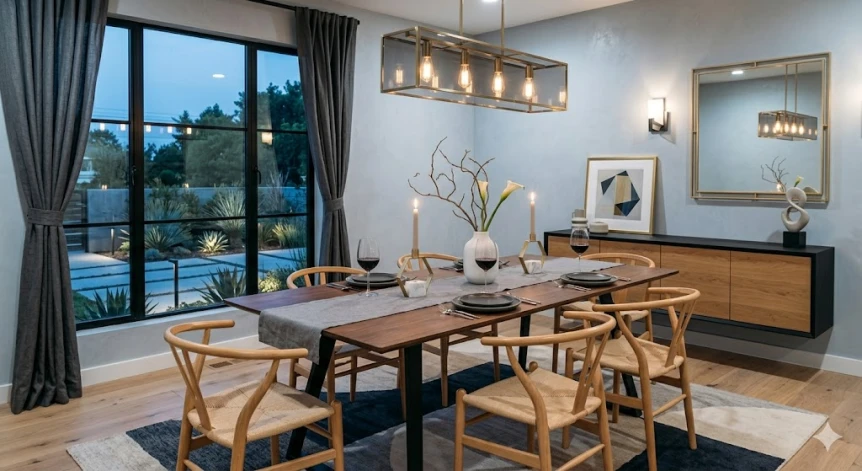
How to Coordinate Color Across the Room
A cohesive dining room palette typically has three to five colors that appear across different elements. Here’s how that usually breaks down:
- Wall color: the dominant tone that sets the backdrop
- Wood tone: the table, chairs, and any wood accents create a secondary warmth
- Textile tone: chair upholstery, curtains, and table linens introduce a softer element
- Metal finish: hardware, light fixtures, and candleholders add a reflective accent
- Optional accent: a single pop of color through art, a rug, or a vase
The key is that no single element stands in isolation. Every color should have at least one echo somewhere else in the room. This creates a sense of intention rather than randomness.
Lighting plays a major role in how your chosen colors actually appear. Our Dining Room Lighting Guide covers how bulb temperature and fixture placement affect color perception.
How to Test Colors for a Dining Room
Paint samples on the wall in at least two locations: the wall that gets the most daylight and the wall that gets the least. Then evaluate at three different times: midday with natural light, early evening with the pendant on at full brightness, and after dark with the pendant dimmed to your typical dinner setting.
The after dark test is the one that matters most. A color that looks beautiful at noon can look completely different under warm, dimmed pendant light. Paint companies sell large peel and stick samples that make this process easier and less wasteful than buying multiple sample pots.
Color Schemes for Different Room Sizes
Small Dining Rooms
The conventional wisdom that small rooms must be white is outdated. Dark colors can actually make small dining rooms feel more intimate and deliberate rather than cramped. That said, if the room has limited natural light and feels genuinely closed in, lighter neutrals with warm undertones will keep it feeling open while still inviting.
For more strategies on making compact dining rooms work, see our guide to Small Dining Room Ideas.
Large Dining Rooms
Large dining rooms sometimes struggle with feeling cold or impersonal. Warmer colors, whether neutral or bold, help counteract that. A deeper wall color in a large room creates a sense of enclosure that brings the scale down to a more human, comfortable level.
Open Plan Dining Areas
When the dining area shares space with a kitchen or living room, the color palette needs to relate to the adjacent spaces. This doesn’t mean everything has to match, but the tones should feel like they belong in the same conversation. A rug or a set of chair upholstery can help distinguish the dining zone while maintaining visual continuity.
Frequently Asked Questions
What is the best color for a dining room?
There’s no single best color, but warm whites, soft taupes, and deep greens consistently work well in modern dining rooms. The best choice depends on your lighting, the room’s size, and whether you want a neutral backdrop or a bold atmosphere. Always test colors under evening lighting before committing.
Can you paint a small dining room a dark color?
Yes. Dark colors can make small dining rooms feel more intimate and intentional rather than cramped. The key is good lighting — a warm pendant on a dimmer and supplementary sconces or accent lights prevent the room from feeling like a cave.
How do I choose a dining room color scheme?
Start with the wall color as your foundation, then coordinate three to five tones across the wood furniture, textiles, metal fixtures, and any accent pieces. Every color should have at least one echo elsewhere in the room. Test paint samples under evening light since that’s when the room is used most.
Choosing Color with Confidence
The dining room rewards bold color choices more than almost any other room in the house. Its evening use, its intimate scale, and its warm lighting conditions all work in your favor. Start with a palette that fits the mood you want to create, test everything under the light you’ll actually use it in, and trust that a considered choice will look even better once the room is furnished and lit.
For the full design roadmap, read The Complete Guide to Modern Dining Room Design.
Related guides worth reading next:
- Dining Room Lighting Guide
- Dining Room Wall Decor Ideas
- Formal vs. Casual Dining Room Design
- Dining Table Buying Guide