Boho Color Palettes for Every Room
By Tereza Hower | Published April 3, 2026
Color is one of the most powerful tools in bohemian design. It sets the mood of a room before you even notice the furniture, textiles, or art. The right boho color palette can make a space feel warm and grounding, vibrant and energizing, or calm and serene, depending on the direction you choose.
This guide breaks down the most effective bohemian color combinations, explains how to apply them in different rooms, and gives you the confidence to move beyond safe neutrals into richer, more expressive territory.
Understanding Boho Color Theory
Bohemian color palettes draw heavily from nature and global textiles. Unlike modern or minimalist design, which often limits a room to two or three closely related hues, boho style embraces a wider range of color. The trick is that these colors are unified by warmth, saturation, or tonal family rather than by being identical shades.
Most successful boho palettes follow a simple structure: a dominant base color (usually a warm neutral), one or two supporting accent colors, and pops of a bolder contrasting tone. This layered approach creates depth without chaos.
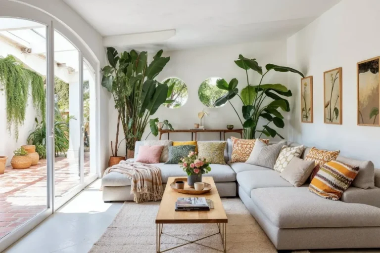
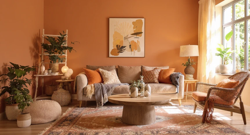
The Classic Earth Tone Palette
Core Colors
Warm beige, terracotta, rust, ochre, olive, and chocolate brown form the foundation of the most recognizable bohemian color schemes. These are the colors of clay, dried leaves, warm sand, and aged wood. Together, they create rooms that feel organic and grounded.
How to Use It
Start with warm white or soft beige walls. Introduce terracotta and rust through a large area rug, throw pillows, or a statement piece of pottery. Layer in ochre and olive through smaller accents like candles, vases, and textiles. Use chocolate brown sparingly as a grounding element, perhaps in a leather chair or a dark wood side table.
Best Rooms For This Palette
Earth tones work beautifully in living rooms, bedrooms, and dining areas. They’re especially effective in spaces that receive moderate natural light, where the warm tones compensate for any lack of sunlight. For ideas on applying this palette in a living room, see our guide to boho living room ideas and inspiration.
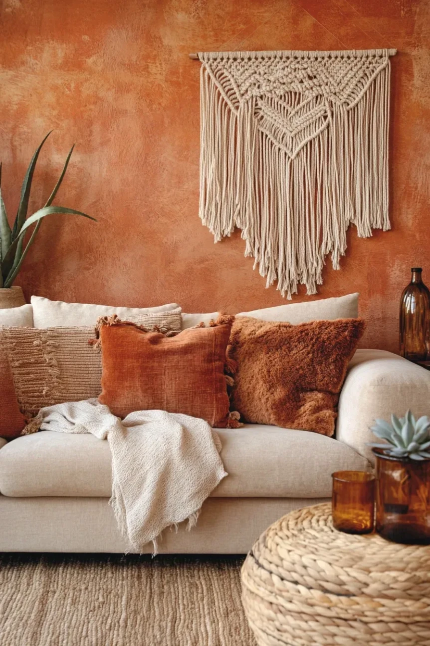
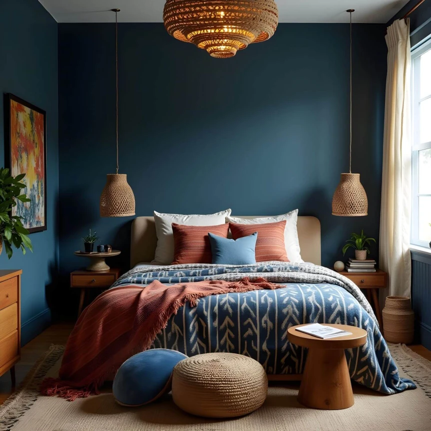
The Jewel Tone Palette
Core Colors
Deep teal, emerald green, burgundy, burnt orange, sapphire blue, and amber bring richness and sophistication to bohemian rooms. These are the colors of gemstones and vintage textiles, and they carry a sense of luxury and depth that earth tones alone can’t achieve.
How to Use It
Jewel tones are best used as accents against a neutral backdrop. Paint an accent wall in deep teal or forest green. Introduce burgundy through velvet cushions or a vintage rug. Add amber through glassware or a table lamp. The key is restraint. One or two dominant jewel tones supported by warm neutrals is more effective than using all of them at once.
Best Rooms For This Palette
Jewel tones shine in living rooms, dining rooms, and bedrooms where you want a sense of warmth and drama. They’re particularly striking in rooms with high ceilings or plenty of natural light, which prevents the deep colors from making the space feel small. Our guide to bohemian bedroom decor ideas includes more tips on using rich, moody colors in sleeping spaces.
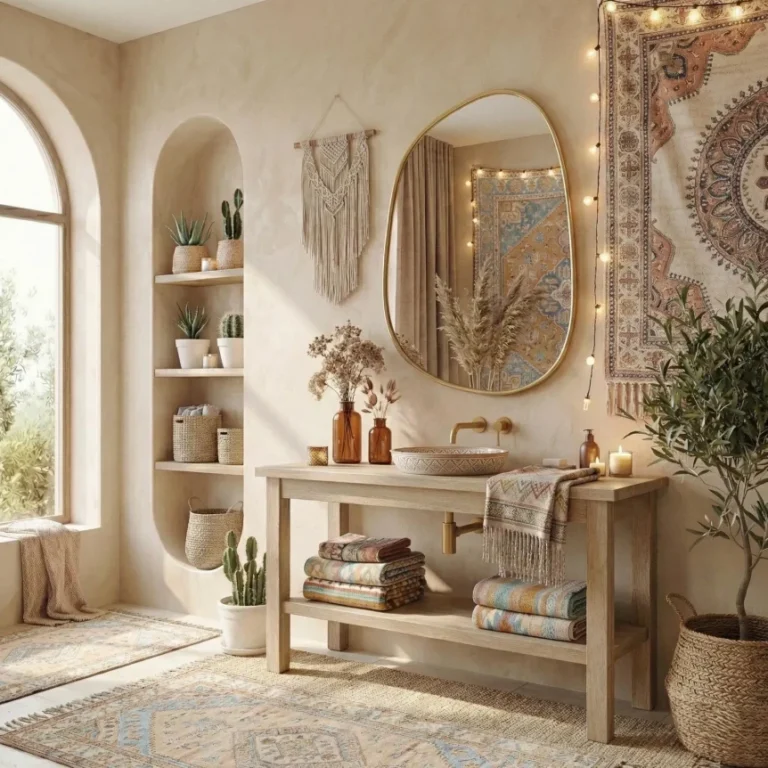
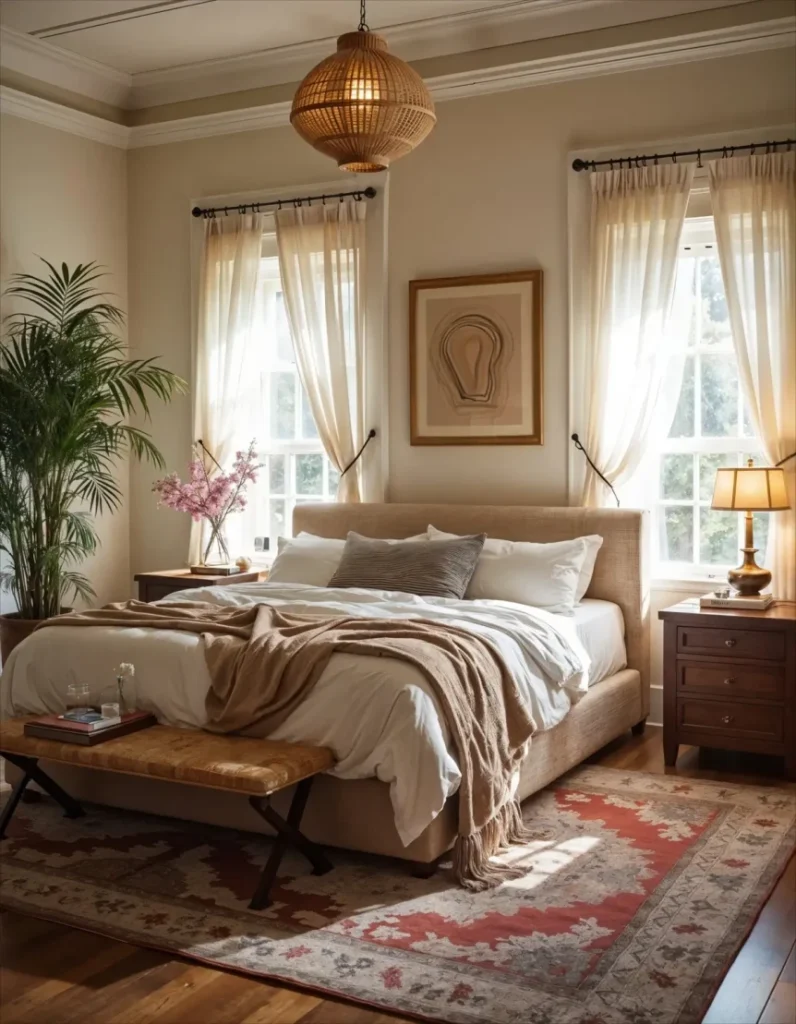
The Neutral Boho Palette
Core Colors
Warm white, cream, sand, light tan, and soft gray form the basis of neutral bohemian design. This palette relies on texture and natural materials rather than color contrast for visual interest. It’s a more restrained, contemporary take on the boho aesthetic.
How to Use It
Layer different shades of white and cream throughout the room. Use natural wood, rattan, jute, and linen to add warmth and prevent the space from feeling sterile. Introduce subtle tonal variation through off white pillows, a cream chunky knit throw, and a sand colored rug. The variation in texture and material keeps the room from looking flat.
Best Rooms For This Palette
Neutral boho works well in any room but is especially popular in bedrooms, bathrooms, and entryways. It’s ideal for small spaces where a bold color palette might feel overwhelming. It also blends well with Scandinavian and Japandi design elements.
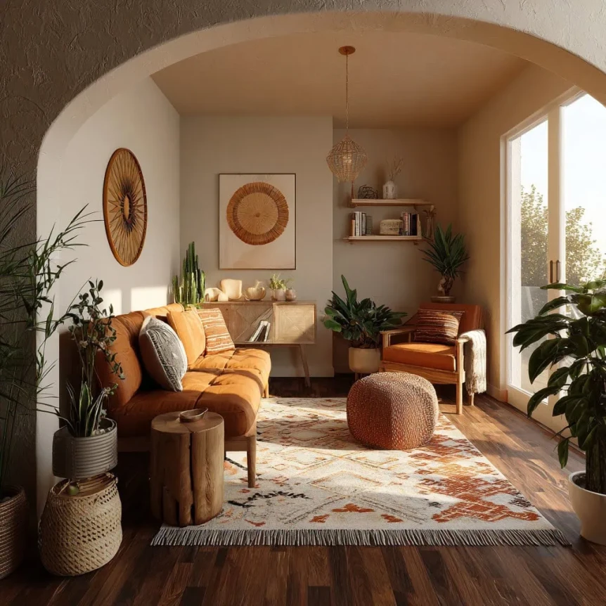
The Desert Boho Palette
Core Colors
Dusty pink, warm sand, burnt sienna, sage green, and muted coral draw inspiration from arid desert landscapes. This palette feels warm and feminine without being overly sweet or pastel.
How to Use It
Use warm sand as your base and introduce dusty pink through textiles like pillows and throws. Sage green appears naturally through plants but can also be brought in through ceramic pieces or a painted accent shelf. Burnt sienna and muted coral serve as accent colors in smaller doses, through art, candles, or decorative objects.
Best Rooms For This Palette
Desert boho is perfect for bedrooms, nurseries, and bathrooms. It creates a soft, calming atmosphere that feels distinctly boho without the intensity of jewel tones or the saturated warmth of full earth tone palettes.
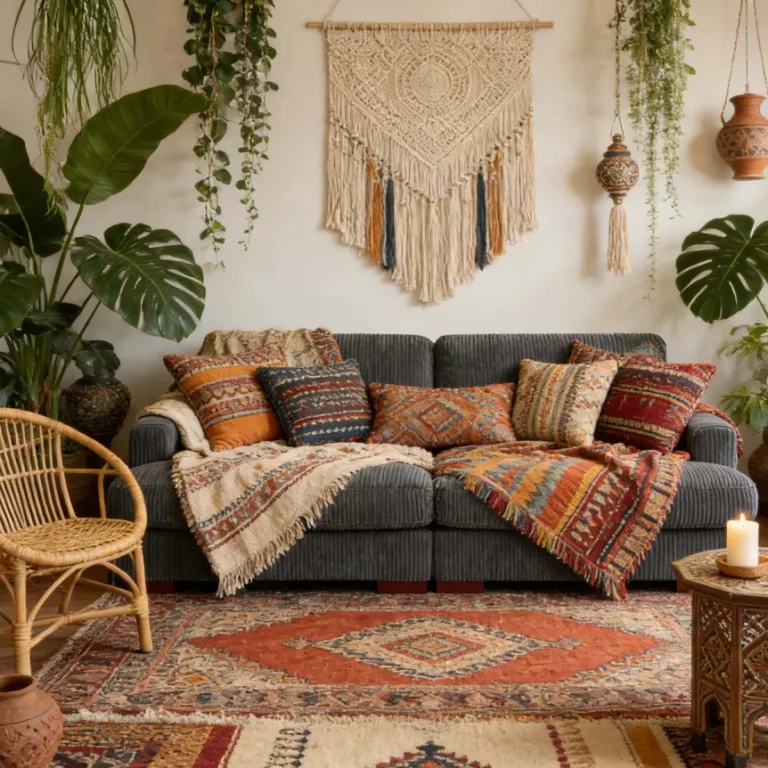
The Global Boho Palette
Core Colors
Indigo, saffron yellow, terracotta red, turquoise, and warm black create a palette inspired by global textiles and traditional crafts. This is the most colorful and energetic of the boho palettes, drawing from Moroccan, Indian, Mexican, and African design traditions.
How to Use It
Anchor the room with warm neutrals on the walls and larger furniture pieces. Introduce color through textiles: an indigo block print bedspread, saffron yellow cushions, a terracotta pottery collection, and turquoise ceramic tiles or accessories. The warm black comes through in wrought iron details, dark wood frames, or a vintage brass tray with a dark patina.
Best Rooms For This Palette
Global boho palettes thrive in living rooms, dining rooms, and outdoor spaces. They pair well with collected objects from travel and handmade artisan pieces. If you’re combining bold patterns from different traditions, our guide on how to mix patterns in bohemian style will help you keep the look cohesive.
How to Choose the Right Palette for Your Space
Consider the Light
Rooms that get plenty of natural light can handle deeper, more saturated colors without feeling closed in. North facing rooms or spaces with limited windows benefit from warmer, lighter palettes that compensate for the lack of sunlight.
Think About Function
Bedrooms generally call for softer, more calming palettes, while living rooms and dining areas can handle bolder, more stimulating color choices. Bathrooms often work best with the neutral or desert palettes, where the spa like quality of soft tones enhances relaxation.
Start With What You Have
If you already own a rug, a piece of art, or a statement furniture piece that you love, pull your palette from those existing colors. This grounds the new palette in something tangible and ensures the room feels cohesive from the start.
Common Color Mistakes in Boho Design
The most common mistake is going too safe. A boho room that’s entirely beige and white can feel bland rather than bohemian. Don’t be afraid to introduce at least one layer of stronger color through a rug, a set of pillows, or a piece of art.
On the other end, using too many bold colors without a neutral anchor creates visual confusion. Every colorful boho room needs breathing room. That breathing room comes from neutral walls, simple furniture, and some solid colored textiles mixed in with the patterns.
Another common issue is forgetting about undertones. A cool gray paired with warm terracotta can create a disjointed feel. Stick to colors with similar undertones (warm with warm, cool with cool) for a palette that feels harmonious. For more ideas on filling your walls with the right colors and decor, explore our guide to boho wall decor ideas for every room.
Conclusion
Your boho color palette is the emotional foundation of every room you design. Whether you lean toward the classic warmth of earth tones, the richness of jewel tones, or the calm of a neutral scheme, the key is to choose colors that resonate with you personally and layer them with intention.
Start with one palette that feels right and let it guide your choices in textiles, furniture, and accessories. As your space evolves, you can introduce new accents and refine the balance. The beauty of bohemian design is that it’s always in progress.
For the complete picture of bohemian design, from foundational principles to room by room strategies, visit our complete guide to bohemian interior design.
Frequently Asked Questions
What colors are considered bohemian?
Earth tones like terracotta, ochre, rust, and olive are the most classic bohemian colors. Jewel tones such as deep teal, burgundy, emerald, and amber are also widely used. Many boho spaces use a warm neutral base and layer in color through textiles and accessories.
Can a boho room be mostly neutral?
Yes. Neutral boho is a popular and elegant approach that uses whites, creams, tans, and light wood tones. The key is to add plenty of textural variety through materials like linen, rattan, jute, and natural wood so the room doesn’t feel flat or sterile.
How many colors should a boho color palette include?
A well balanced boho palette typically includes one dominant neutral base, two to three supporting accent colors, and one or two bolder contrasting tones. This gives you enough variety for visual interest without creating chaos.
What wall color works best for bohemian rooms?
Warm white or soft beige walls are the most versatile choice for bohemian rooms. They provide a clean backdrop that lets textiles, art, and furniture stand out. For a bolder approach, a single accent wall in deep teal, terracotta, or forest green adds drama without overwhelming the space.