Kitchen Color Schemes That Work: How to Choose the Right Palette
By Tereza Hower | Published March 28, 2026 | Updated March 30, 2026
Color decisions in a kitchen feel higher stakes than in other rooms, partly because they cost more to change, and partly because the kitchen is seen so often. Get the palette right and the room feels effortless. Get it wrong and it’s a constant low-level irritation.
The good news is that kitchen color schemes follow some reliable principles. Light matters more than most people account for. Undertones matter more than the color name on the paint chip. And the most successful kitchens tend to use restraint, two or three well-chosen tones rather than a complicated palette that competes with itself.
This guide walks through the main approaches to kitchen color, from neutral-led schemes to bolder choices, and covers how to make them work in practice.
Why Light Is the Most Important Variable
Before you choose any color, assess the light in your kitchen. The same paint color can look dramatically different in a north-facing kitchen with cool, indirect light versus a south-facing one with warm afternoon sun. This is the main reason paint swatches rarely look the same on the wall as they did in the store.
North-Facing Kitchens
These receive cool, indirect light throughout the day. Cool grays and stark whites can read as cold or flat in these spaces. Warm whites, creams, and greige tones will perform better since they compensate for the lack of warmth in the natural light. Avoid colors with strong blue or green undertones unless the kitchen has supplementary warm artificial lighting.
South-Facing Kitchens
Warm, consistent light gives you more flexibility. Cool whites read well here, and bolder colors like deep greens, navies, or charcoals are easier to use without making the space feel heavy. South-facing kitchens are forgiving; almost any palette can work with good light behind it.
East and West-Facing Kitchens
These change character throughout the day. East-facing kitchens have bright morning light that turns cooler in the afternoon. West-facing ones are cooler in the morning and warmer in the evening. Choose a palette that works reasonably well in both conditions, and test samples at different times of day before committing.
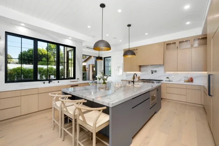
Neutral Palettes: The Reliable Foundation
Neutral kitchens account for the majority of modern kitchen color schemes, and not because people lack imagination. A well-executed neutral kitchen, one where the tones are chosen thoughtfully and layered through materials and textures, is one of the most satisfying kitchen aesthetics available.
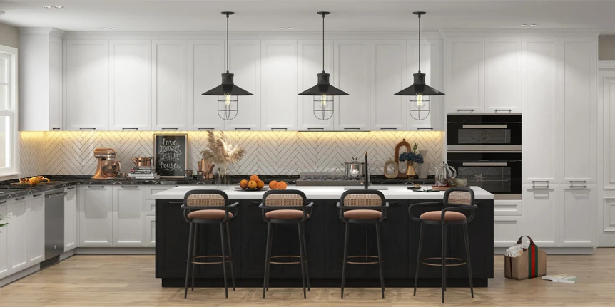
White Kitchens
White is the most used kitchen cabinet color for good reason. It maximizes light, works with almost any countertop or flooring, and has strong resale appeal. The challenge with white is undertone. Whites range from cool and crisp (with blue or green undertones) to warm and creamy (with yellow or red undertones). A cool white in a warm-toned kitchen reads as jarring, and vice versa.
The most universally flattering whites for kitchens are those with a very slight warm undertone. They avoid the harshness of blue-white without reading as yellow. Test in your specific light before committing.
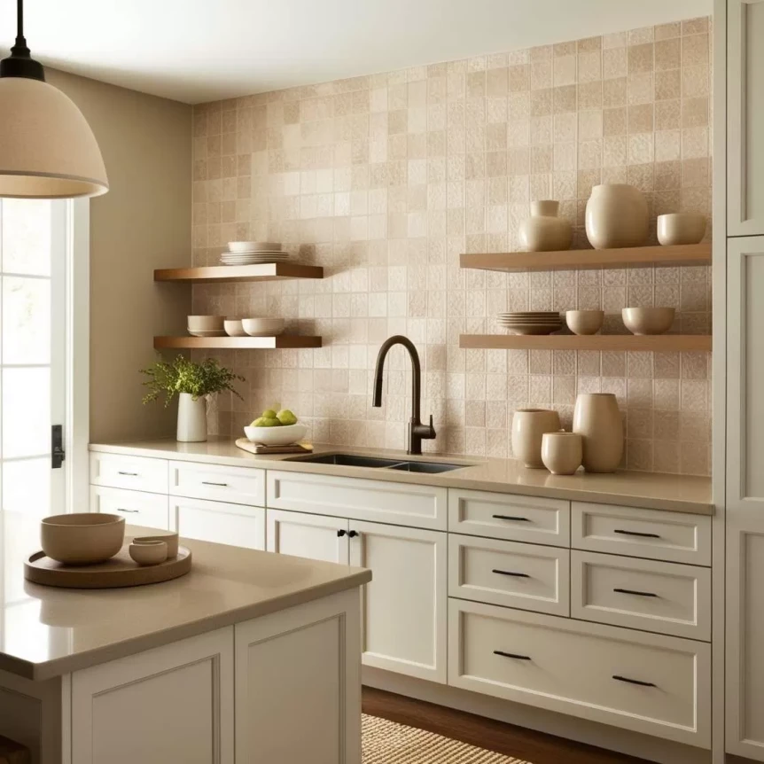
Off-White and Cream
Off-white and cream cabinets have a lived-in warmth that pure white doesn’t provide. They suit kitchens with natural wood flooring or warm stone countertops particularly well, and they tend to be more forgiving of the visible wear that comes with daily kitchen use. The risk is looking dated if the undertone isn’t chosen carefully. Avoid creams that lean too strongly yellow or pink.
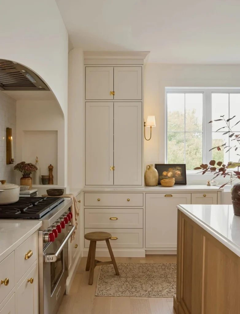
Greige and Warm Gray
Greige (gray-beige) is one of the strongest performing cabinet colors in contemporary kitchens. It reads as sophisticated and current without the commitment of a bold color, and it sits comfortably with both cool and warm secondary tones. Warm gray, which has a slight brown or taupe quality rather than a blue cast, performs similarly and tends to look better in spaces with limited natural light than a cooler gray would.
Bold Cabinet Colors: How to Use Them Well
Bold cabinet colors have moved from feature-magazine territory into mainstream kitchen design. Navy, forest green, charcoal, and deep terracotta are all in regular use in contemporary kitchens. The key to using them well is understanding what makes them work and what makes them look wrong.
Navy Blue
Navy is the most popular bold cabinet color and the easiest to work with. It reads as grounded and sophisticated rather than flashy, pairs naturally with brass and gold hardware, and works well in both modern and transitional kitchens. It’s most successful on lower cabinets or an island base, where the darker tone feels anchoring. Full navy throughout requires a well-lit kitchen and confidence in the choice.
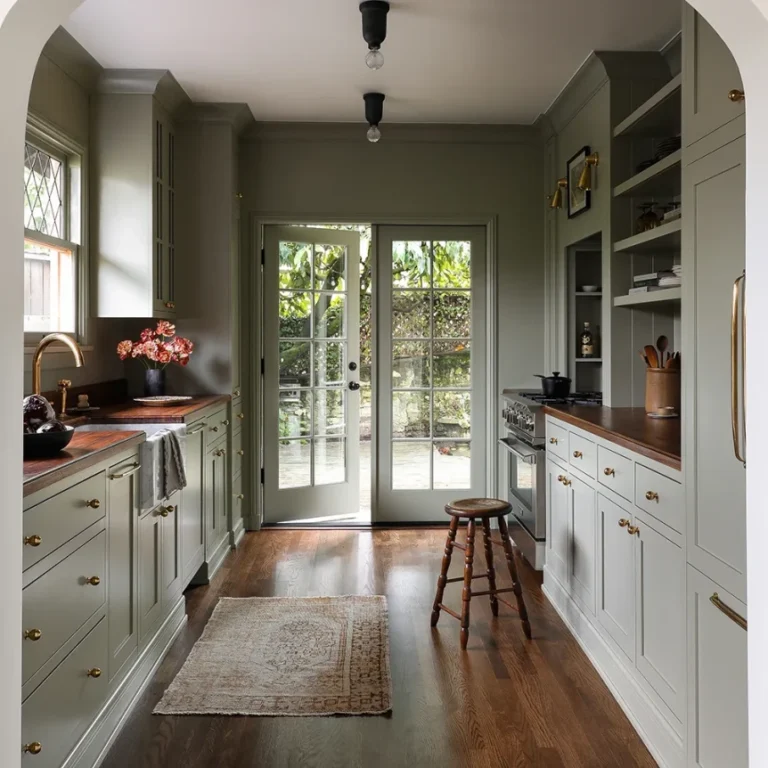
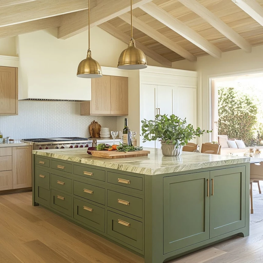
Forest Green and Sage
Deep forest green has established itself as a genuinely enduring kitchen color rather than a passing trend. It works particularly well with natural stone countertops, warm wood flooring, and brass fixtures. Sage green is a softer, more muted alternative that suits smaller or lower-light kitchens where deep green might feel heavy. Both pair well with natural wood open shelving as a contrast element.
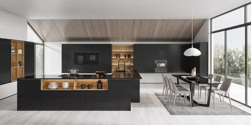
Charcoal and Near-Black
Dark charcoal or near-black cabinets create a high-contrast, dramatic kitchen when paired with light countertops and walls. They require good natural or artificial light to avoid feeling oppressive, and they tend to show fingerprints and dust more than lighter colors. In a well-lit, well-ventilated kitchen though, they can produce a result that feels genuinely distinctive.
Terracotta and Warm Earth Tones
Warm earth tones, terracotta, rust, and burnt orange, are less common but worth considering for kitchens that lean toward a Mediterranean or earthy aesthetic. They work best in smaller doses: a single accent wall, an island base, or a section of lower cabinets rather than throughout.
Two-Tone Kitchen Color Schemes
A two-tone kitchen uses different colors or finishes for the upper and lower cabinets. It’s one of the most effective design moves in a contemporary kitchen, adding depth and visual interest without the full commitment of a single bold color throughout.
The Logic Behind Two-Tone
The most successful two-tone combinations follow a simple principle: lighter on top, darker on the bottom. This reflects how we naturally perceive weight. Darker tones feel more grounded and stable when positioned lower, and the eye reads the contrast as deliberate rather than mismatched.
Proven Two-Tone Combinations
- White uppers with navy lowers
- Off-white uppers with forest green lowers
- Light gray uppers with charcoal lowers
- White uppers with a warm wood island base
- Greige uppers with slate or deep olive lowers
Treating the Island Separately
In kitchens with an island, the island base is often treated as its own color element, separate from both upper and lower cabinets. This creates a natural focal point and is a low-risk way to introduce a bolder tone. A white kitchen with a navy or black island base is a combination that works almost universally.
How Countertops and Flooring Interact with Cabinet Color
Cabinet color doesn’t exist in isolation. It’s always read against the countertop, the flooring, the backsplash, and the walls. Before committing to a cabinet color, consider these relationships carefully.
Countertop Undertones
A warm white cabinet with a cool gray countertop will fight. A cool white cabinet with a warm beige countertop will also fight. The undertones of cabinet color and countertop material need to lean in the same direction, both warm or both cool. This is one of the most common sources of kitchen color schemes that feel slightly off without an obvious reason.
Flooring
Dark wood flooring with dark cabinets creates a very heavy look. If your flooring is dark, keep at least the upper cabinets light. Light or medium-tone flooring gives you more flexibility throughout. Tile flooring in a neutral tone is the most flexible base for any cabinet color scheme.
Wall Color
In open-plan kitchens, the wall color connects the kitchen to the wider living space, so it needs to work for both areas. A separate wall color that’s clearly different from the cabinet color can be used to delineate the kitchen zone, but it needs to be chosen as part of the full palette rather than independently.
Backsplash as a Color Accent
The backsplash is one of the few places in a kitchen where a small area of color or pattern can have a disproportionately large visual impact. A neutral kitchen with a colored or textured backsplash gets personality without requiring bold cabinet colors throughout. Zellige tile in a soft terracotta, handmade subway tile in a dusty sage, or fluted white tile with visible texture are all examples of backsplash choices that bring interest to an otherwise restrained palette.
For more detailed guidance on planning your kitchen as a whole, visit The Complete Guide to Modern Kitchen Design (2026). Your color choices will inform cabinet selection, so see Kitchen Cabinet Styles and Colors for how door styles work with different palettes. For surface material color considerations, read our Kitchen Countertop Materials Guide. Open shelving introduces another color element worth planning for, so our guide to Open Shelving in the Kitchen covers how shelf materials interact with cabinet and wall color. And for lighting’s effect on color perception, see Kitchen Lighting Ideas.
Frequently Asked Questions
What is the most timeless kitchen color scheme?
A white or off-white kitchen with warm neutral countertops and natural wood accents has shown consistent staying power across decades of kitchen design. It’s not the most exciting choice, but it doesn’t date, suits a wide range of tastes, and performs well at resale.
How do I know if a paint color will look good in my kitchen?
Test it in your specific space before committing. Buy a small sample, paint a large section of cardboard or directly on the wall, and observe it at different times of day and under different lighting conditions. A color that looks perfect in the store can read very differently in your kitchen’s specific light.
What color makes a small kitchen look bigger?
Light colors, particularly whites, off-whites, and pale neutrals, reflect more light and make a small kitchen feel more open. Keeping the cabinets, walls, and countertop in similar tonal ranges reduces visual fragmentation and makes the space read as larger. Glossy or semi-gloss finishes also help by reflecting additional light.
Can I use dark cabinet colors in a small kitchen?
Yes, with some consideration. Dark colors in a small kitchen can feel intentionally dramatic rather than heavy if the kitchen has decent natural light and the countertops and walls are kept light. Avoid dark cabinets, dark countertops, and dark flooring all at once in a compact space since that combination is genuinely difficult to make work.
What wall color works best with white kitchen cabinets?
Warm whites, soft off-whites, and pale greige tones are the most reliable wall colors with white cabinets because they create a cohesive, layered look rather than a stark contrast. If you want more contrast, a soft sage green, dusty blue, or warm clay tone can work well as a wall color against white cabinets, particularly on a feature wall or in an open-plan space.
Start with Light, End with Confidence
The most common kitchen color mistake is choosing a palette in isolation, from a paint chip, a magazine, or a showroom, without accounting for how it will actually look in your specific space. Light, adjacent materials, and room scale all shape how a color reads.
Start by understanding your light. Then choose a palette that works with your countertop and flooring. Test before committing. And don’t underestimate the impact of a bold choice used selectively. A single navy island in a white kitchen often does more for the space than an all-neutral approach throughout.
For the full kitchen design roadmap, head back to The Complete Guide to Modern Kitchen Design (2026).